The outdoor type: Project Zero
A postwar house has been renovated and extended by BVN to create a functional family home that embraces the Queensland climate and makes a memorable statement about sustainability and re-use.
Project Zero started with a proposition that soon evolved into a profoundly collaborative process. The clients, a couple who run a construction and property firm, were searching for an old home to renovate for their young family to live in. The idea was to use the project as a benchmark for future developments that showcased a sustainable re-use agenda and would help to establish the firm as an expert in zero energy consumption. (The Zero moniker is a pun on the firm’s energy-consumption aspirations as well as the project’s inaugural status.) As with many homebuyers in Brisbane, the romance of the old Queenslander had taken hold, and their search had been focused on colonial homes in inner suburbs. Financial and climatic realities eventually undermined the dream.
As architect and BVN principal Brian Donovan observes, “Old Queenslanders are not a value proposition.” Elegance and charm aside, the exigencies of the subtropical climate are not well catered for between their thin-skinned walls and gloomy inner rooms. Brian was employed by the clients to assist in finding a solid home that could be re-used and developed with the “zero” agenda in mind. It was a case of form follows function, where aesthetic decisions were secondary to the practical brief. Brian’s eyes turned quickly to the more pedestrian postwar housing stock that fills the “second ring” suburbs of Brisbane. While inner-city cottages are now unaffordable for a majority of new purchasers, the less gentrified next ring of ’burbs offers humble timber homes on wide blocks of lawn. They are fast becoming the new hip.
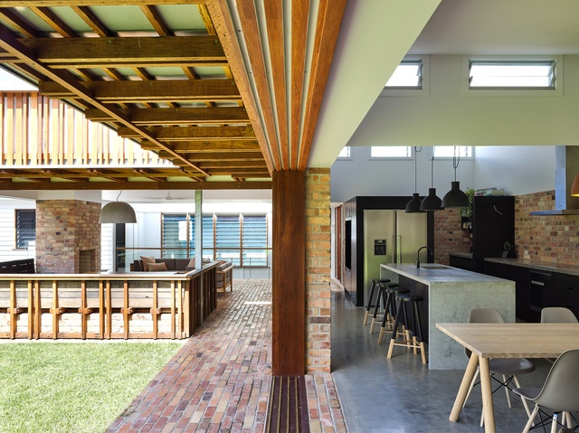
“The homes are inherently valuable, with their hardwood floors and walls, and solid roof forms,” says Brian. “So many rooms in a home need only be conventional and ordinary, so these spaces can be utilized without much change.”
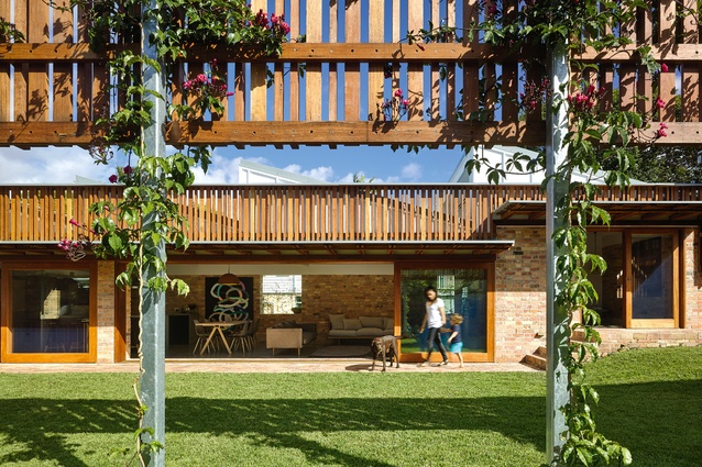
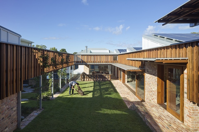
Moreover, the site is slightly elevated in a quiet suburban street and enjoys a northern aspect. In typical format, the home sat like an island in the centre of its eight-hundred-square-metre block. The first intervention was moving the existing house to the rear of the site. This released a tract of land at the north and east. A new wing was added along the western edge, connected to the original dwelling at the ground plane. The L-shaped plan opens to generous garden courtyards, a forest and an emblematic outdoor room.
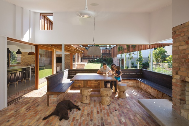
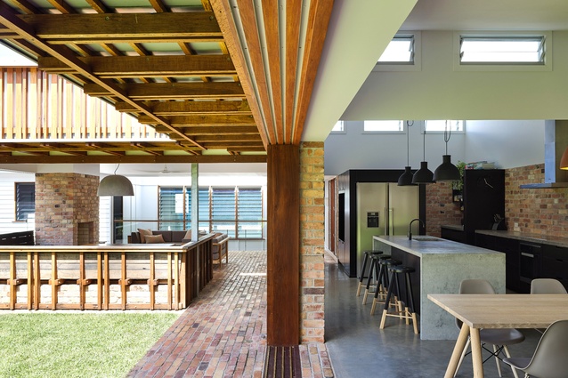
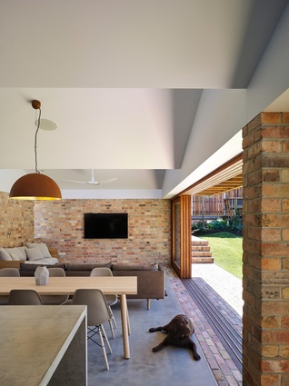
The transition between indoor and outdoor spaces is ambiguous, with the outdoor brick floors penetrating the interior, flush with its concrete floors. Glazed walls slide away to connect the two spaces, and deep eaves wrapped in staggered timber battens form a protective parapet around the central space. The covered outdoor fireplace and landscape of brick ledges appear as suggestive remnants of something once more solid. Beyond the room, a pool sits on the next ledge. A long vine-encrusted trellis bisects the garden and separates the lower, grassed court from an upper level of planted forest. A timber arrival deck on the street edge allows for surveillance of all the different levels, materials and ecosystems at once.
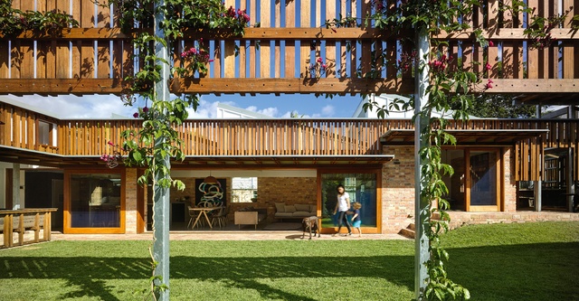
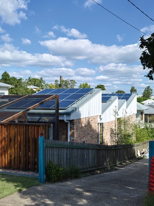
The new western wing, accommodating living, kitchen, office and dining areas, sits under a sawtooth roof. Solar cells were installed on each of the roofs, which tilt their faces to the northern sun. Gentle southern light filters into the glazing on the vertical sides. The form is a neat reference to the industrial context of the neighbouring area, which boasts a plethora of similar forms.

The main attempt at thermal control is made through the use of double-cavity brick. The thermal mass of the walls and the ability to seal up the spaces allow for more thermal control than spaces that breathe and leak air. “The Germans are the leaders in this area,” says Brian. “Reducing energy consumption through utilizing contained volumes that you can adjust within is an agreed paradigm.”
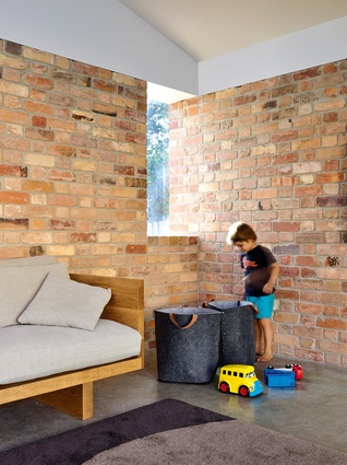
Windows on the western wall appear carved out of its thickness, their glazing and timber surrounds sitting proud of the exterior. Skylights pierce through at key moments.
Material choices were made with reference to availability rather than aesthetics. The bricks were sourced from second-hand cast-offs discovered at the Boral factory. Their mottled surfaces had sent them to the reject pile. A laying pattern was determined that minimized the number of cuts required. The bricks’ coarseness and stippling is a moment of celebration in contrast to the refinement of the rosewood timbers placed judiciously around the building.
The project began and endured with a determination by both owner and architect to “get it right.” Part of the process involved the education of a group of young architects in the firm who could experience and learn from the builder, and vice versa. The collaboration has resulted in a beautifully functional building.

