The patterns of Barcelona
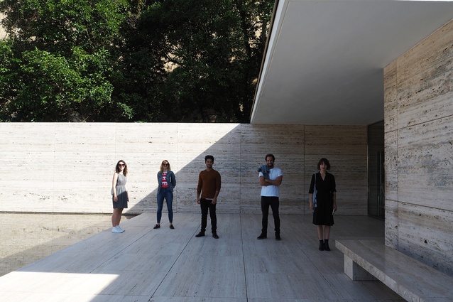
The 2017 Dulux Study Tour group visited Barcelona on the first leg of the trip, exploring the city's tangled patterns of pathways and streets and how a 19th century city plan has influenced the city’s contemporary architecture.
Barcelona is a city with flair, seen in its people, its public spaces, its colours and its architecture. The city puts people and social interactions first, so it’s no surprise that it is being overrun by tourists. For the participants of the 2017 Dulux Study Tour, it was experiencing the patterns of Barcelona – urban, aesthetic and otherwise – that gave insight into why it is such a delightful and attractive place.

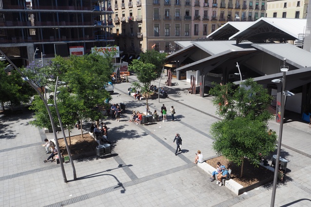
The tangled patterns of pathways and streets in the old city of Barcelona are punctuated with irregularly shaped plazas bustling with people of all ages. In contrast to this informality is Catalan engineer Idelfons Cerdà’s grid-like extension to Barcelona’s city centre. Consisting of hollowed blocks chamfered at the corners, the scheme focuses on hygiene, ease of mobility and transportation through the city.
When the walls of Barcelona were demolished in the mid-19th century, this city extension aided in uniting the old city with seven peripheral villages and also aimed to improve the health of the city’s inhabitants. It was revolutionary at the time (although not particularly well received) and through Cerdà’s research for Barcelona he coined the term “urbanisation.”
At the core of Cerdà’s scientific thinking was a desire to improve the living conditions and therefore the health of the population with a deep sense of equality. As Dulux Study Tour participant Claire Scorpo said, “It’s interesting that the planning has actually evolved from a sociological point of view”.
Cast at 45 degrees to the 100 by 100 metre grid of blocks is the Avinguda Diagonal avenue that, as Dulux Study Tour participant Imogene Tudor said, “forces a geometric disruption with curious corner wedges, parks and plazas negotiating the orthogonal leftovers.” This was also designed by Cerdà, but only approved in 1859. It was important in allowing the planning to reach more of its potential, with some of Cerdà’s original intents discarded along the way.

For example, the negative space of the blocks was intended for the planting of gardens and circulation zones, but instead evolved into parking or storage areas. More recently, there has been a decision by the city to try to fulfill the original plan, with more than forty blocks introducing a garden into the centre of the block.
The planning of Barcelona determines how the city is used – it’s the incidental spaces that are most popular, such as the implied public space on the corners of the Cerdà blocks, or the irregular-shaped plazas in the old city. “It’s the serendipitous public spaces that are the most successful – the avenue with the generous middle median strip – people jogging, cycling and dog walking,” Dulux Study Tour participant Alberto Quizon observed. Barcelona has an urban plan that is “about the negative space, rather than the positive space,” said Scorpo.
In contrast to the vibrancy of the incidental public spaces, the more prescriptive and ordered recreation spaces are empty – such as Jean Nouvel’s controlled Parc Central del Poblenou or the Forum area by Herzog and de Meuron.
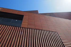
The urban pattern of Barcelona is highly respected by contemporary Catalan architects. On a site visit to the almost-complete Massana School of Arts building, architect Carme Pinos explained her scheme for Gardunya Square, enclosed by a series of her building designs. Priority and respect were given to the existing patterns of movement through and within the plaza. As Scorpo said, these new buildings are “of the city itself.”
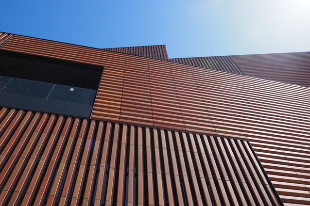
In some ways, the architecture is secondary to the response to the urban condition. Although connected to its square, the school building is screened with a lattice pattern of terracotta-coloured ceramic tiles to “protect the students from the tourists.” Pinos also discussed the original intent for the public to walk into and through the building – an idea that was abandoned due to the influx of tourists to the area.
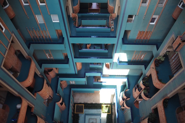
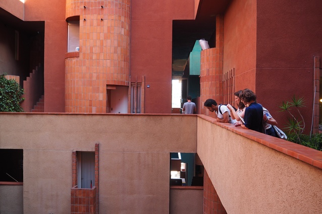
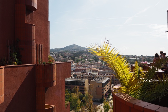
In contrast to the city buildings that are designed “of the city itself” is Walden 7, a housing development by Ricardo Bofill that is perhaps designed “within itself.” In a more isolated location outside the city, this building creates its own internalized movement patterns and public spaces that aim to enhance quality of life – based on a vision of utopia.
Again designed from a sociological standpoint, it appears as more of a slave to an overarching diagram than the buildings we saw in the city centre – it is more prescriptive. Dulux Study Tour participant Louisa Gee commented that it is “a bossy building – it has bad manners.”
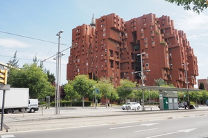
As we moved through the complex system of bridges and balconies we discovered new views and vistas, and a sharp contrast between light and dark spaces that is remarkably delightful. It’s almost like moving through a city, with 18 towers, seven courtyards and thousands of inhabitants. It’s a visual feast at every turn. While we were assured that the public spaces within the building were often inhabited, it was empty during our time there, which was during business hours.
At our visit to the architectural practice OAB, architect Borja Ferrater spoke of the time he spent at Walden 7 as a child: “I lived close by to Walden 7 when I was growing up and a lot of my classmates lived there so I would visit them. It was amazing – the swimming pool on the roof was great for parties and birthdays. A lot of the families who lived there were young with small children. It was really a utopia.” Apparently Walden 7 had more recently gone through a period where the prices of apartments had lost value and people started to move out, but Ferrater felt that it was beginning to return to its former glory, or at least he hoped it would.
The work of Ferrater and his colleagues at OAB uses geometry as a foundation for design, layering systems or patterns that give a complexity to the architecture. Ferrater believes geometry is “the weapon we have, it makes the irrational rational.” An example of this way of thinking is the design for the Barcelona Botanical Garden.
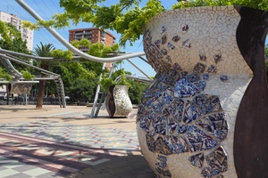
Designed by Carlos Ferrater (now OAB) with architect Josep Lluis, landscape architect Bet Figueras, horticulturalist Artur Bossy and biologist Joan Pedrola, the scheme is based on a triangular network or grid. When it was first built, it was the paths and walls that formed the structure of the park, with the plants forming the ornament. However, over time this has reversed so that the plants are the structure and the path is the ornament – “the real identity of the park is the plants.”
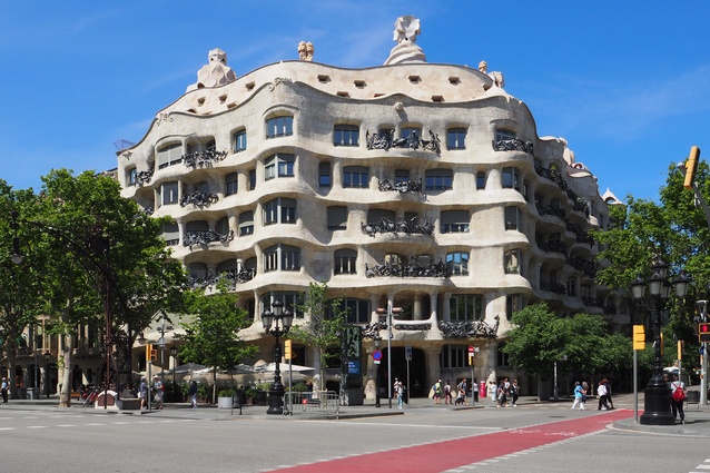
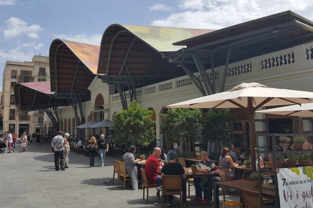
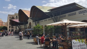
Surface pattern is also a distinctive element of Barcelona – the colourful patterns of ceramic tiles by Antoni Gaudi have, of course, been highly influential in the evolution of the city fabric. In particular, work by Miralles Tagliabue EMBT embraces a similar free-flowing aesthetic. The undulating roof form of the Santa Caterina Market by this practice is covered in a vast mosaic of coloured ceramic tiles that represent the fresh fruit and vegetables sold beneath the structure. Even the footpaths are lined with various decorated stone tiles.
When analysing the various patterns of Barcelona, “there is something interesting about the contrast between the straight line and the free line,” noted Tudor. “You have the regiment of the Cerdà grid, but then you have architects such as Gaudi and Miralles who take licence with the line. And then there is Jean Nouvel, who has designed a park with all trees planted on a grid.”
For Quizon, Barcelona is a city that reminds us of “the value of irrationality and whimsy.” The chaos of the old city plan is often referenced as a starting point for new architecture, and as Dulux Study Tour participant Morgan Jenkins reflects, “there is so much to respond to in this city, so much complexity.” Irrational and rational, straight or meandering, brightly coloured or neutral, Barcelona is a city that keeps an appetite for visual stimulation completely satisfied.
Katelin Butler is travelling with the Dulux Study Tour. Follow #2017DuluxStudyTour on social media and the blog.

