The simple life: Myrtle Tree House
Renovations have breathed new life into a Californian bungalow, stitching it into the garden, while respecting the character of the much-loved existing dwelling.
Take a close look at any bustling city centre, suburban street or even remote outpost and soon enough startling variations in the local character will emerge from the seemingly homogeneous mass. The change may come through increased land parcels, trees on the nature strips or something as subtle as the quality of the footpaths. Whatever the cause, the essence of a place can change dramatically from street to street or even house to house, occasionally throwing up surprising little pockets that homebuyers dream of finding.
Deep within densely packed Balaclava, wedged between major arterials, train lines and busy shopping strips in Melbourne’s inner south-east, is such a surprising pocket. Wide-fronted homes on a generous, tree-lined street form a quiet oasis in a gritty context. It was no surprise to discover that the client had previously lived just around the corner, choosing to upsize only when this house appeared within her idyllic microcosm. Perhaps just a little surprising was that a former neighbour from a street over had now bought the dwelling across the road from her new house – it really seems no-one can bring themselves to leave.
Having secured a new foothold in this urban sanctuary and spent a few years tinkering with and forming a deep fondness for the Californian bungalow and its quirky charms, the client engaged Make Architecture to breathe new life into the home while asking that its character and spirit be respected. The brief called for a pragmatic, simple and honest approach – in the client’s words, “something appropriate for the site and never fussy.” To this end, director Melissa Bright and her team have triumphed.
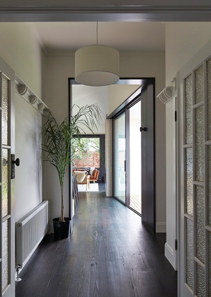
The project is divided into two neat parcels: a minimal inter-vention to the existing front four rooms and a complete rethink of the rear half. The first two rooms off the central hall were given a lick of paint and some new carpet to complement the client’s dark-stained timber floors. Behind these rooms a clever reconfiguration has created a generous bathroom in crisp white and warm timber tones and a comfortable guest bedroom or study to one side of the hall, while opposite these is a new main bedroom with a private southern courtyard and a link through to the new walk-in robe and ensuite.
Beyond these rooms the hallway terminates with a subtle yet important detail that marks the threshold between the existing home and its new extension. This oversized doorframe “portal” signifies a move into the new space and is one of a suite of clever details that Make Architecture continues to develop as its residential folio grows. It also turns out to be a handy way to cut in a new door and accommodate the typically deep decorative skirting boards of older homes.
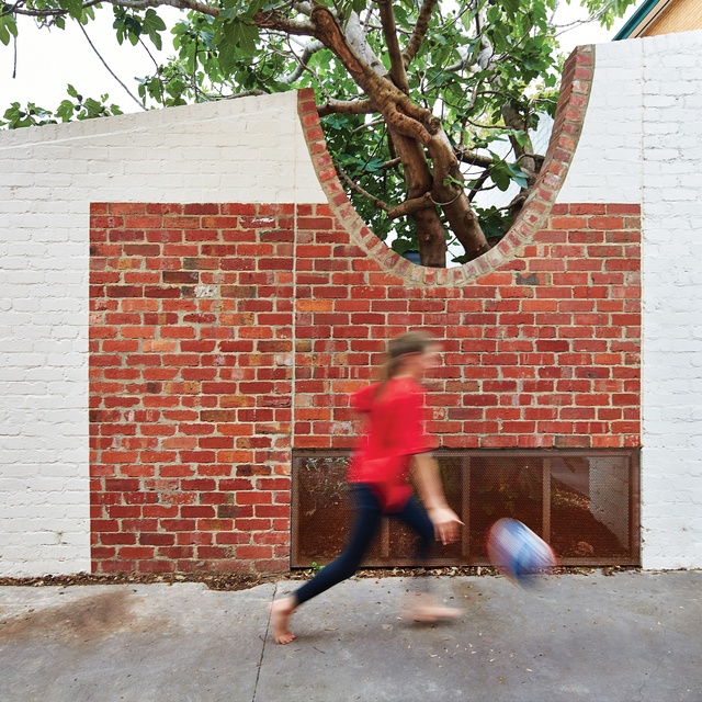
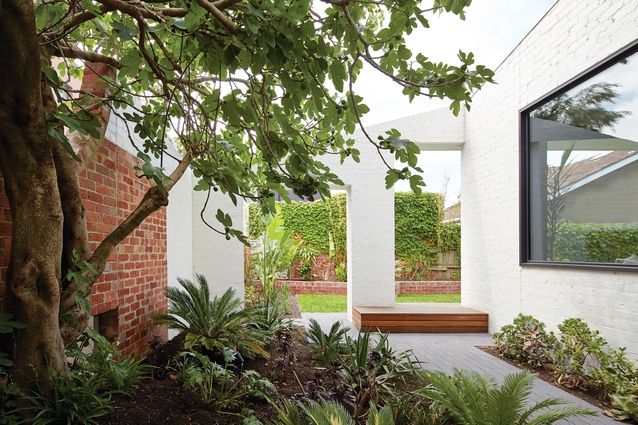
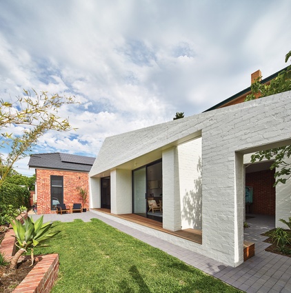
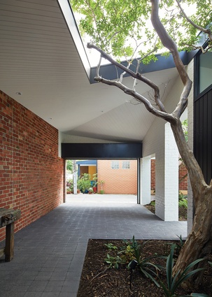
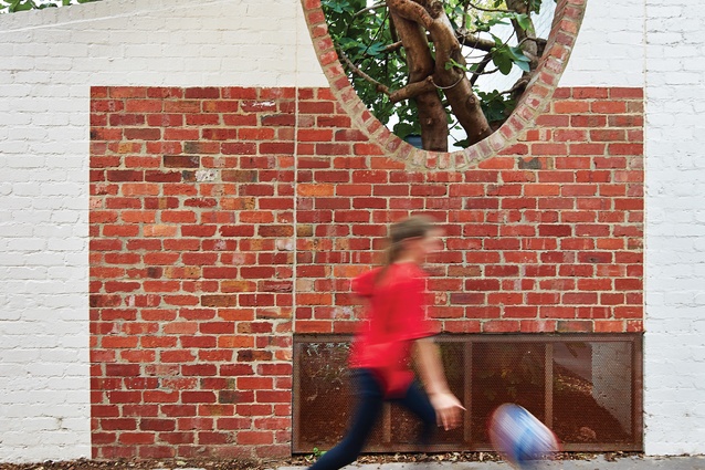
Melissa refers to the new rear extension as a “walled condition that just happens to contain some spaces for living in,” an approach in which the architects have “stitched” new walls to the existing brick boundaries, doubling the apparent volume of the internal spaces by forming a series of notional outdoor rooms, one for the outdoor studio (or emergency carport) that connects to a lively rear lane proudly “owned” by the local neighbours, one seemingly reserved purely to celebrate a beautifully gnarled fig tree and one containing lawn to capitalize on the northern aspect.
This stitching is sometimes abstract and sometimes very literal. In the abstract, the dissolving of window detailing and meticulous aligning of junctions in the ceiling and wall planes project internal corners through to the boundary walls and create a psychological connection between the two. Against this is the literal lifting and lowering of new walls as they spring between boundary and house, or the careful, almost reverential way in which a new brick wall accepts the shape of the fig tree.

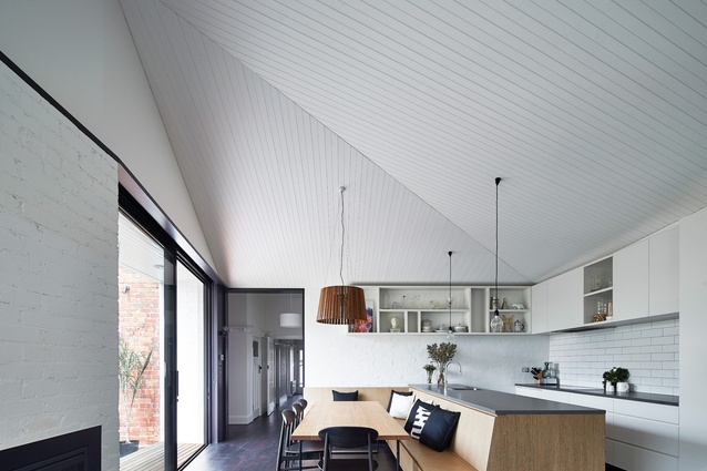
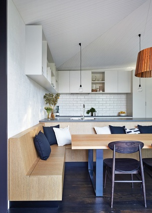
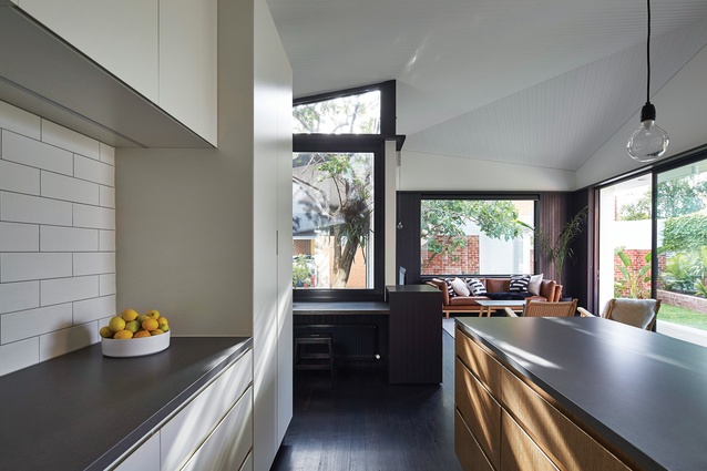
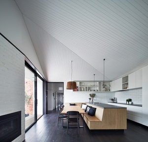
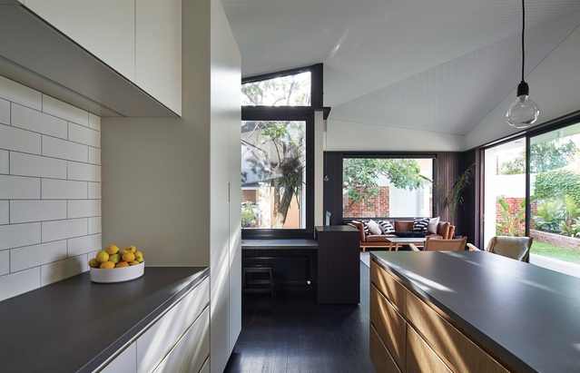
The extension is essentially a long, single space positioned to enjoy northern light through large glazed openings that fold curiously inward in plan, creating deep external niches that both invite occupation and shade the tall expanses of glass. A kitchen had previously occupied a central position in the house, creating a rabbit warren out of the circulation around it. This was demolished and a new kitchen positioned to open a new axis from the front door right through the home, reinforced by latching a banquette seat onto the back of the kitchen bench, fixing the dining table in place and therefore maintaining the axis. It also gave the architects the chance to explore alternatives to the ubiquitous trend of island benches.
Keeping to the brief for simplicity, pragmatism and respect, the kitchen is sharply detailed and thoughtful without being burdened by flashy finishes or trendy kitchen paraphernalia. This is true of the whole project, where pared back and durable finishes such as the incredibly precise, painted lining boards replace plasterboard, or where a rendered brick finish in the kitchen acknowledges the extent of the existing house. Similarly, a high dado rail from the existing half of the house is reinterpreted as a black band, creating a datum line through the new volume, another way in which Make Architecture has crafted this uncompromisingly modern addition to celebrate the original home rather than turning it into the poor cousin.

