The Sugar Club
Interior designers Judy Court and Jonathan Goss of Jasmax were charged with designing a signature restaurant for Peter Gordon with a familiar moniker: The Sugar Club. This is the fourth iteration of the restaurant. It first took up residence in Vivian Street in Wellington (1986), moved to Notting Hill in London (1995) and later West Soho (1998). This itinerant has now elegantly alighted on the 53rd level of the Sky City Tower.
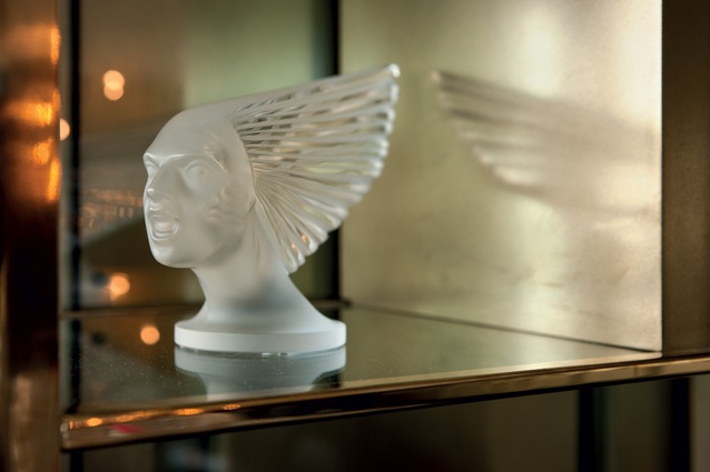
The design brief was to ‘provide a world class experience’ where people would come for ‘outstanding food that is complemented by the destination.’ Gordon is credited with pioneering a form of fusion cuisine that uses techniques and ingredients from two or more ethnic or regional cuisines. He wanted this version of The Sugar Club to make reference to design elements taken from the 1930s. This period marked the beginning of the golden age of travel, and the designers investigated spatial designs that were emblems of glamour.
At Gordon’s request they studied the film I am Love , directed by Luca Guadagnino and starring Tilda Swinton. They carefully analysed the form and content of the interiors of the 1930s Italian house that featured in the film, its elegant, imperious demeanor rivaling the luminous Swinton for attention. The Villa Necchi Campiglio (1932-1935) is a work of rationalist architecture by Piero Portaluppi. The Villa is punctuated by exquisitely detailed brass joinery, wide spans of marble and walnut veneer paneling, porthole windows and lozenge-shaped stucco ceilings. In the film, the architecture’s obdurate complexion acts as a counterpoint to the brittle relationships of the haute-bourgeoisie contained within it.
The designers also investigated a diverse array of design precedents in the concept design phase of the project. These included postcards that showed a Zeppelin landing at a docking station atop the spire of the Empire State Building (1929-31) for an elegant dinner in the observatory restaurant (though in reality high winds made this transition impossibly dangerous). They also looked at the Müller Villa (1930) by Adolf Loos, resplendent with its crenellated walls of deeply veined marble and eclectic furniture choices. The singer and dancer Josephine Baker was another influence: her spectacular performances and extravagant costumes made her a muse for artists and writers of the period. They looked too at the interiors of flying clippers ships with their curved walls, reminiscent of railway carriages. The interiors of these Pan American flying boats were designed by the master of streamlining Norman Bel Geddes and colour expert Howard Ketchman.
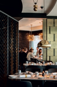
This project reinterprets these historical quotations and puts them to work in answering the specific requirements of the clients brief. In this way, the eclectic array of design influences integrated into the scheme parallels the form of fusion cuisine for which the restaurant was already celebrated.
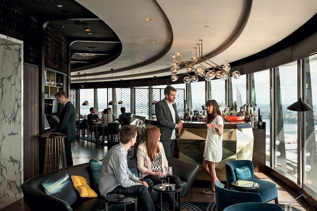
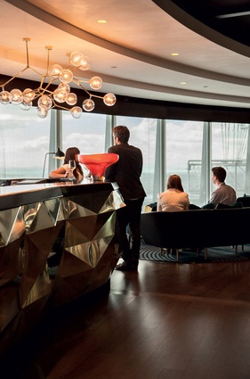
On exiting the lift you proceed through glass doors to discover the cocktail lounge, with floor-to-ceiling views of the harbor. The blue-velvet club chairs and sofas in this area are low to the ground and, once seated, patrons feel as though they are coincident with the horizon line, luxuriating in the view.
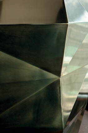
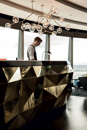
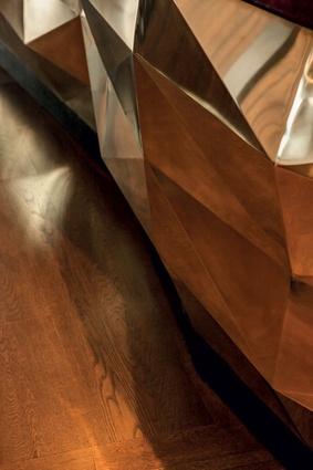
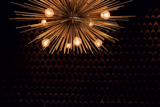
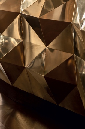
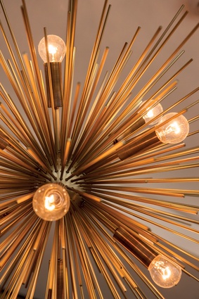
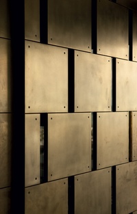
The faceted-brass-plate bar adds an element of syncopation to the curvilinear plan. It is a sculptural object within the space that is complemented by a custom-made brass light fixture above it, reminiscent of the atomic age. The oblique planes of the bar’s crystalline surface reflect and refract the patrons and their surroundings to great effect. This feature is repeated in aluminium in the open kitchen area, which is lined in marble and offers a theatrical element to the dining experience.
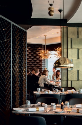
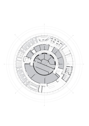
The designers worked to achieve an interior layout that provided a level of aesthetic coherence but also variation within the circular plan. The modulation of round and oblong dining tables in Atlantic corestone introduces variety and distinguishes the formal and less formal spaces for dining.

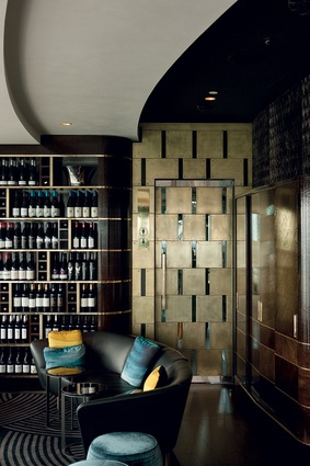
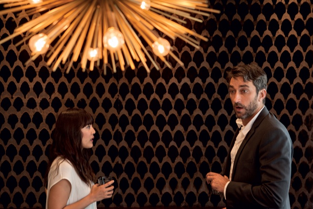
Freestanding chevron-patterned metal screens are used to demarcate separate areas and also minimise some of the glare in the space. The screens make reference to paving patterns found in the film and also to the feathers used to clad Josephine Baker during her cabaret performances. An allusion to feathers is also made in the acoustic paneling ribboning the upper core of the structure. This mink fabric, titled Avalanche by Andrew Martin, changes as you move through the space, and, depending on the daylight levels, offers a kaleidoscopic palette ignited on the pile of the velvet.
The central core of the space was required for building services. To add additional interest, the surface of the core was punctured by a series of cut outs designed to hold Murano glass vases purchased by Gordon for these niches. Finely crafted cabinetry to store tableware is also integrated into the space, rendered in immaculately pattern-matched oak veneer with brass joinery to recall the elaborate marquetry furniture produced in the art deco era.
This project celebrates the bespoke detail. This can be seen in the stepped white ceiling with a handcrafted crackle finish that directs patrons around the space and also creates a forced perspective that draws attention toward the view. This attention to detail can also be seen in the private dining area, which is edged by sliding ‘privacy screens’ that mimic the proportions of similar doors found in the Villa Necchi Campiglio. The carpets, designed by Court, are also bespoke and make reference to the geometries found in art deco textiles and in particular those found within Eltham Palace (1933).
What is most impressive about this project is the manner in which a diverse range of influences have been curated and brought together in one space to successfully achieve the project brief. The bathrooms alone are worth scaling the 53 floors. The women’s bathroom houses a bespoke wall of red and white tiles that recalls a pattern from the artist Sonia Delaunay’s pattern books and porthole windows which frame the spectacular view. These details are also quotations from the film.
The men’s bathrooms incorporate black basins and urinals offset by a mosaic of black and white horizontal stripes recalling the radical model of a house for Josephine Baker proposed by Adolf Loos in 1927. Spaces that are often underwhelmingly detailed are here considered carefully and deliberately as spaces in which to further delineate a strong formal, material and conceptual grasp of the project brief.
The designers intended to produce a design that was “elegant, timeless, feminine, dramatic and modern but not stuffy, historic, monotonous or angular.” They have succeeded in constructing an atmosphere unique to this extraordinary situation. The interior is formally complex and embraces a diverse range of materials and surface finishes while still managing to maintain the primary focus on panoramic views of the harbor from its magnificent vantage point.
The fitout for The Sugar Club is a perfect complement to the food that is served within it: bringing elements of diverse provenance together in a formally inventive manner.

