A journey through spaces: The University of Waikato Law and Management Building
WSP Opus Architecture’s dramatic new building at The University of Waikato’s Hamilton campus navigates you through a series of solids and voids.
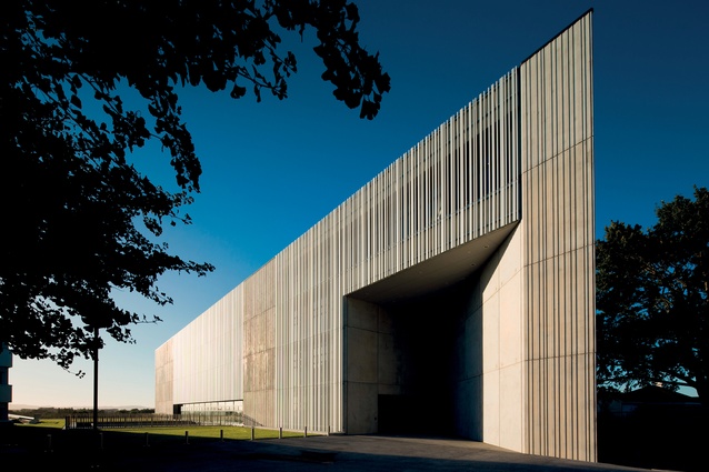
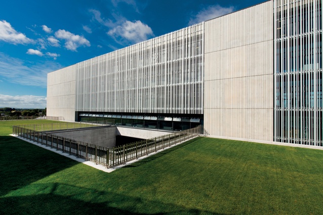
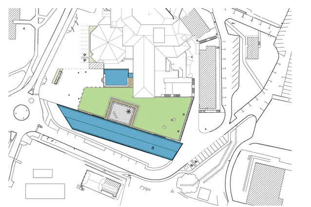
You can’t miss this new Law and Management School Building at The University of Waikato; it is a massive concrete block next to the southern Hillcrest Road entrance. This university is well known for its modernist campus dating from 1964, with many buildings in a brutalist style, so the concrete simplicity of this building fits in but I wouldn’t call it retro-modern at all.
Design architect Eqo Leung describes his design ethos as “simple but not ordinary” and this building is quite different from many other institutional buildings, stuffed as they are with classrooms and offices.
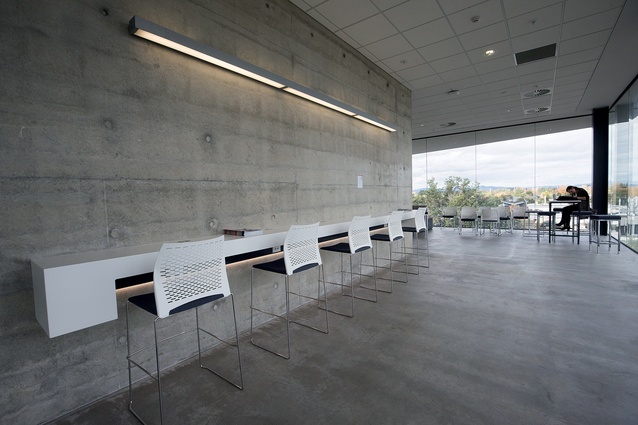
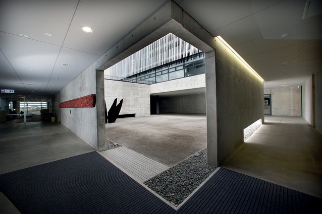
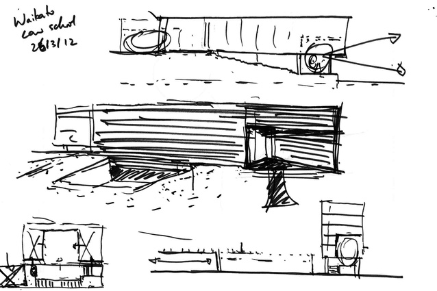
It has an elemental quality, in which you navigate through a series of solids and voids, venturing underground then climbing up to look out across the Hamilton hinterland to distant ranges – a “journey through spaces” as project architect Hendrik Vermeulen puts it. It has won a few awards and, as the judges have said, photographs don’t do it justice; you need to wander around and experience its sculptural effect.

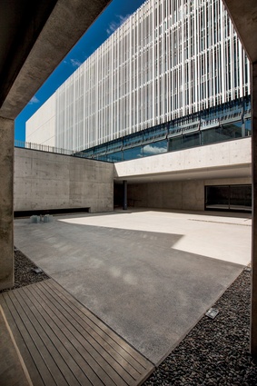
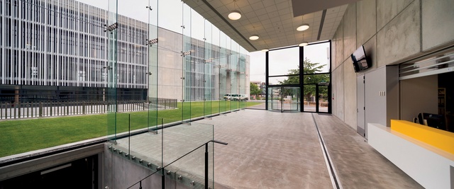
At first glance, it seems like one big, severe mass but much is actually concealed by a grass roof. Walking across the forecourt, looking out over that lawn, there is little sign of conventional humanistic gestures, such as windows and doors, with the glazing hidden behind cage-like screens that have a verticality that blends with the texture of the pre-cast panels. The maw-like entrance is certainly severe, with its angled wall, high portico and low door.
A passer-by saw me taking photos and, likening its stern façade to that of a prison, said it could give would-be lawyers a sense of what it’s like to walk into jails. But I don’t see it that way; to me, it has a gravity about it and the architect, WSP Opus, has referred to it as being like a cornerstone, not just for its key location on campus but as a metaphor for law’s position as fundamental to a just society.

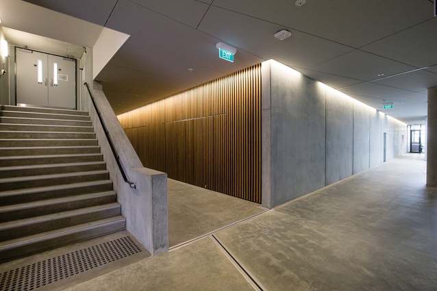
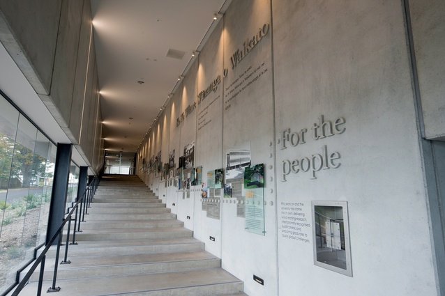
I hesitate to place the building in such lofty company as Kahn’s Salk Institute or Pei’s National Gallery East Building but it has the same serious, intensely focused forms and atmosphere as those places do. Perhaps the university has a sense of this as well; after passing through a rather spartan lobby, one walks down a long and somewhat ceremonial stairway to the lower floor. The university has chosen to erect a display of its history along these walls: not just a history of the Law School but of the entire institution.
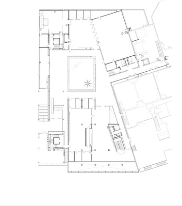
The building sits on a slope to the east but, as mentioned earlier, the lower floor’s grass roof gives the impression that this level is underground. A large Barragán-esque courtyard, empty except for the haunting presence of a Brett Graham sculpture, like a silent bystander, reinforces this subterranean atmosphere. Down here are a few spaces that can do duty for teaching, meetings and events but, more importantly, there is a moot court: a practice courtroom, which is also increasingly used for actual Environment Court and tribunal hearings.
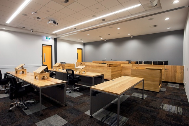
It is fitted out with refurbished furnishings, made redundant from real courtrooms, and it is interesting to hear project architect Hendrik Vermeulen discuss the detail of courtroom organisation. The judge should be elevated precisely 450mm above the rest of us but, here, that needed to be reduced to 350mm to fit in the accessible ramp; in turn, the stenographer’s station and the witness box had to drop proportionately.
At the root of this calibration is the fact that a sitting judge should still be higher than a standing lawyer who ‘approaches the Bench’. Beyond this strict adherence to courtroom protocol, though, the space has versatility; the Bench can be concealed by sliding doors and the witness box wheeled away to create another teaching space or venue. This level of adaptability and flexibility is repeated throughout the building.

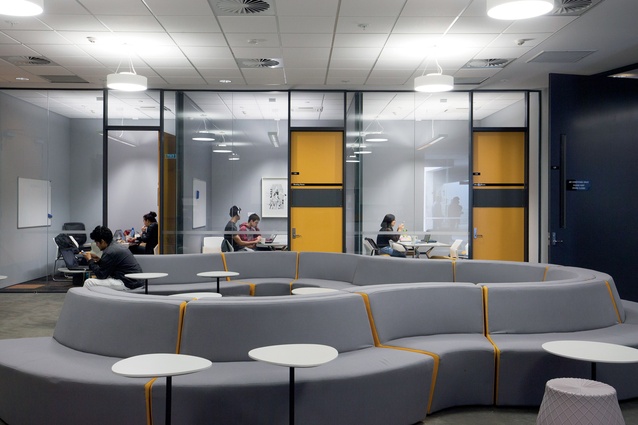
Apart from the arcane and rather underworldly domain of the courtroom, the rest of the building is a stack of floors housing teaching and break-out spaces, staff offices, admin, computer labs and so on. The solar screens over the glazing throughout are quite clever in that they are set about 600mm or more away from the glass, with little catwalks allowing maintenance access throughout and avoiding the need for abseilers or extra health and safety measures.
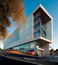
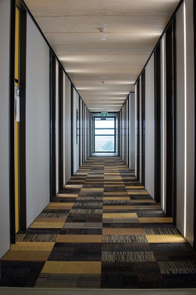
There are a few other tricks as well, such as wall rather than ceiling-mounted lights in corridors and serviceways behind plumbed walls. The building also sits right next door to the School of Management, matching its floor levels to allow a few connections through and enable future ones. Each floor also varies its colour scheme to enable better wayfinding.
It is hard to believe this site was once a sea of cars. The building seems to have hauled a sense of the landscape back into the campus, reinstating that modernist vision of buildings in a park-like setting.
What do the clients think of it? Staff members here know that they have something special and talk about how it is working well for them, especially in that the community and profession are using the building a lot, “allowing students to be exposed to others” – through real court proceedings and the human reality of law beyond the academic exercise.
However, what has really struck me about this building is the extent to which it rises beyond the exigencies of function, the provision of service and the needs of an institutional facility, to enter phenomenological territory.
At the back of my mind, I was somewhat worried about the overt lack of those expressions of Māori identity that badge public and institutional buildings these days. Design architect Eqo Leung explained to me that, at the very beginning, the Māori advisory group stated they did not want “stuff tagged onto the building”. They wanted the design to embody a sense of identity and closeness to the land and to create a series of spaces closely linked to ways in which Māori youth could be comfortable living and learning: “experiential and holistic” as Eqo puts it.
That is something that I think he has achieved in an intangible way – difficult to express in words but, I think, the wairua is present here. If your summer holidays have you pining for a bracing dose of architecture and you are in the Waikato, come and experience this building. And, while you are here, check out the whole campus; it is well worth downloading Andrew Barrie and Taylor Chan’s guide to the architecture of The University of the Waikato; you can read it here.

