The white house
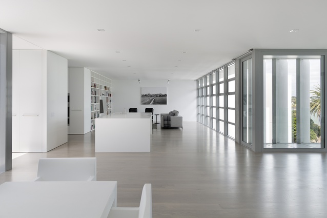
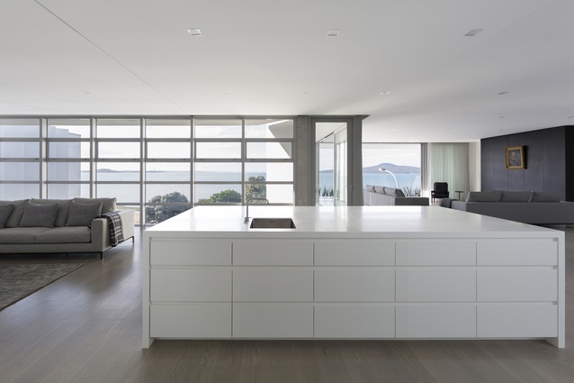
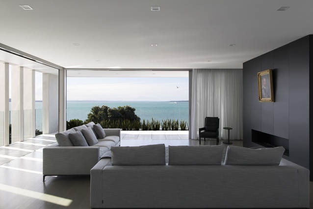
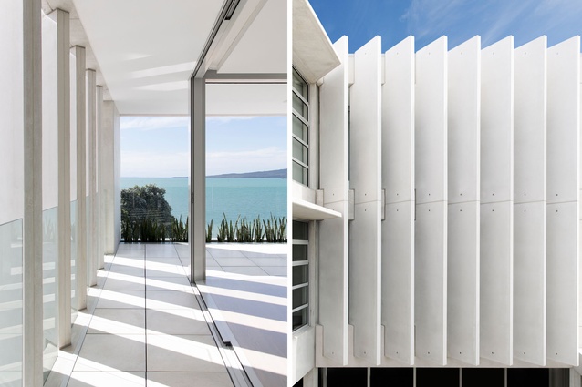
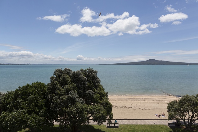
In some respects, this contemporary apartment is not too different to its owners’ former residence, a grand, cliff-top Victorian home. With its high ceilings and white-painted walls, the Tamaki Drive apartment, located within St Heliers village and directly opposite the beach, echoes the spaciousness of the family villa. And, the outlook from its kitchen and dining areas is as scenic and striking as the one from the previous house.
But that’s where the similarities end. The two-bedroomed apartment is minimalist and modern in both its construction and décor. That aesthetic, created by Ian Moore Architects, is a response to (and an attempt to avoid competing with) the area’s dramatic environs – the sandstone cliffs at its eastern end, the foreshore and the century-old trees that line Tamaki Drive.
The entire building was commissioned by the owners of the apartment, whose two-bedroomed space is on the top floor. They own the two apartments next to theirs as well, and the boutique commercial spaces and retail on the floors below.
The seeds for the project were first sown, conceptually at least, in the 1990s. The land had been in the clients’ family since the 1920s and housed a block of shops that were built soon after. The shops had become rundown over the years, so the clients decided to commission a completely new building.
They contacted Ian Moore in 1997, after attending one of his lectures. Moore, who is based in Sydney, Australia, but grew up on the shores of Auckland’s eastern beaches, knew the area well. Ten years later – the years of silence were a result of beaurocratic rope-jumping and opposition to the three-storey development, which was eventually allowed under the new zoning requirements of the proposed Auckland Unitary Plan – the clients contacted Moore again and the design and build of 387 Tamaki Drive got underway in earnest.
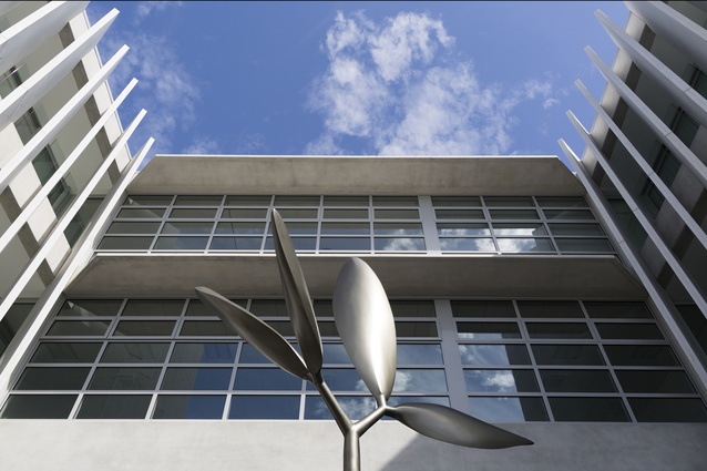
Dubbed the Maheke Monster by those opposed to its construction, the building, which corners Tamaki Drive and Maheke Street, stands out in its surrounds because of its height; at 12.5m, it is one of the tallest buildings in the area. Its distinctive concrete design – the building was constructed from off-white pre-cast concrete, a material Moore chose to complement the nearby sandstone cliffs – also sets it apart from the more traditional low-rise architecture of the village.
“The architecture is simply a response to a complex set of constraints, while allowing the building to be timeless in its setting on the waterfront,” says Ian Moore. “The location made the choice of simple, low-maintenance materials a starting point. Creating privacy while maximising outlook and creating a permeable building with courtyards and light wells was necessary to allow light and ventilation to enter all areas.”
At street level, the building features a central courtyard in which a sculpture, The Seedling by local artist Grant Williams, takes pride of place. It is accessible to anyone and offers a place for passersby to sit, pause and take in the surrounds. Because the whole building wraps in a U-shape around this public plaza, angled glass-reinforced concrete blades were incorporated on the parts of the apartment facing the central plaza to ensure privacy, while maintaining ocean views.
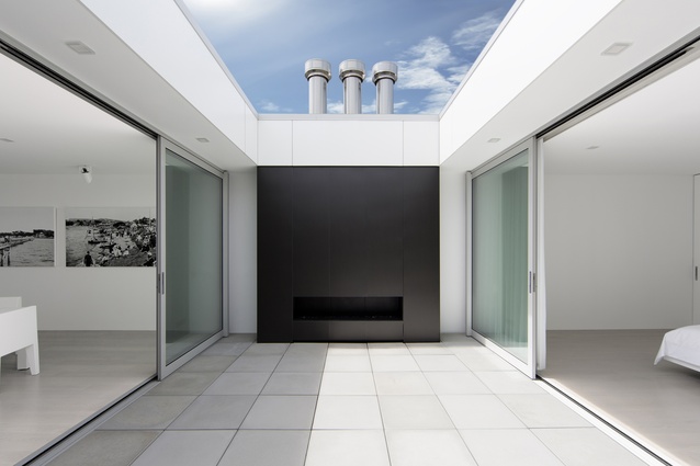
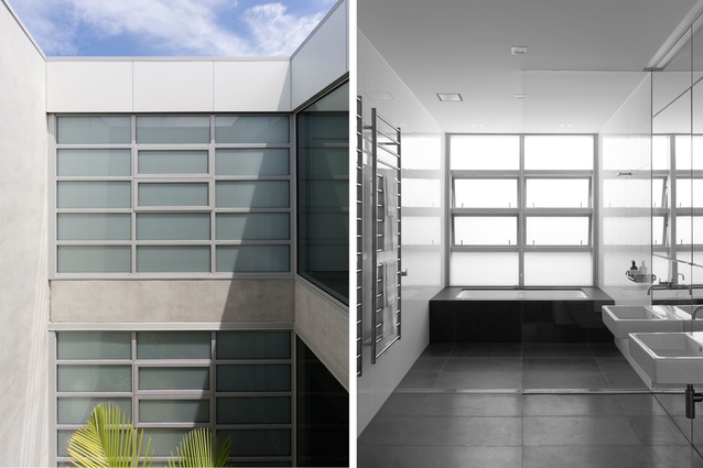
“The whole building is designed to overcome its main problem: the deep rectangular site is enclosed on two sides by adjoining developments, leaving only the two street frontages for light,” says Moore. “As a result, I decided to make it a permeable building by punching six lightwells into it, which became courtyards, as well as the public plaza. [On the top floor], every room in the apartment opens onto one of these outside courtyard spaces so natural light and ventilation are easy to obtain.”
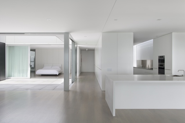
The apartment takes up a large footprint of 270m². A neutral palette and simple, serene spaces ensure the focus is always on the views.
“The owners collect art and love architecture. They entertain a lot and have grandchildren, so they wanted somewhere that could cater for all of the things they enjoy,” says Moore.
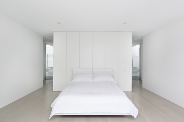
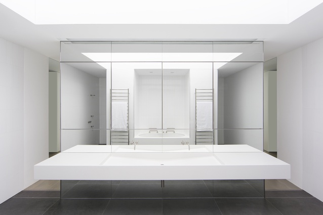
A courtyard runs from the open-plan, beach-facing dining and living areas at the front of the apartment through to the bedrooms at the rear. It was designed for use when the prevailing winds on the front balcony are too strong but it also allows ocean views from the rear of the apartment. “From the master bedroom, you can look through the courtyard, through the dining area and out to the water,” Moore says. “When you’re in the shower, you can see Rangitoto Island. It is my favourite element of the apartment because it allows light and ventilation into the very centre of the space.
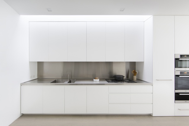
“The owners like to entertain and the large kitchen island bench is the point where everyone gathers, either to sit and talk while a meal is prepared or to have a drink and admire the view,” adds Moore. “From there, you can communicate with all other living spaces and it really does form the hub of the apartment.”
Volcanic basalt rock was chosen for the exterior paving and the laundry and bathroom floors, while soft-grey aluminium joinery throughout adds another level of neutrality.
“Good architecture is timeless and does not require overly complex or elaborate detail,” says Moore who, despite the initial opposition to his plans, won a prestigious International Architecture Award from The Chicago Athenaeum and European Centre for Architecture for the design in 2014.
For an interview with the architect, click here.

