Theatre of small intimacies
Materials are able to describe a narrative that can reflect human emotions – they can tell stories all by themselves, and they can create sensual responses in us,” says London architect Angus Pond. “Listening to the clients’ history and experiences, observing the original building and its method of construction – that’s really our design approach.”
This knack for weaving human stories and physical environs is put to good use in this project, an elegant but authentic apartment located in a 1930s shoe factory in Clerkenwell, in central London. The clients themselves – a film director and an opera director – were a rich source of inspiration.

“Their creative working lives come together within the apartment,” Angus says. “One client observes life through a lens in his work, and he has been strongly inspired by architecture in film. The second client is constantly inventive on stage, creating concepts and sets that tell powerful human stories. In this project, her storytelling narrative is slightly abstracted, applied more to the materials, textures, colours and forms in the design.”
This fascination with movement, with craftedness, infuses every element without descending into artifice. Rather, we find resolved design details, meticulous material selection and elements that celebrate their own construction. “It was less about a process, more about an attitude of craft. The level of detail is not so surprising when you consider the craft the clients apply to their own works,” Angus says.
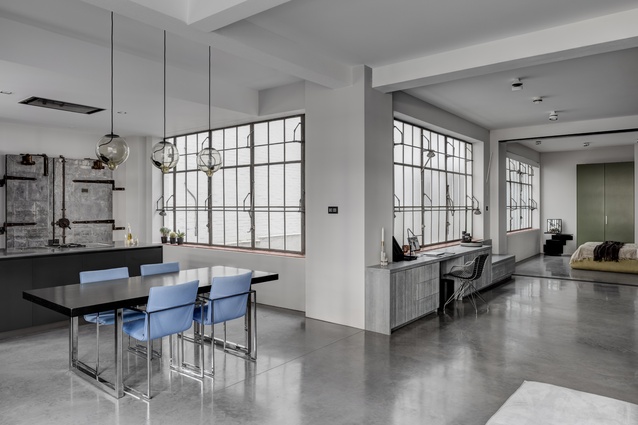
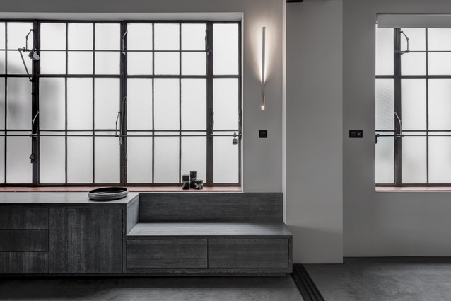
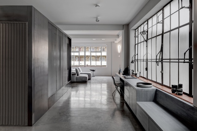
The building’s heritage offered a compelling starting point. Sturdy, almost monolithic construction and long banks of steel-framed windows evoke the building’s industrial past. A key part of the brief was to reconfigure the internal layout, improving sight lines and making the most of those magnificent windows. They are equipped with an intricate pivoting opening system that operates them in unison. Below, the sills retain their original quarry-tile finish.
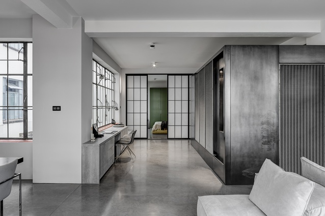
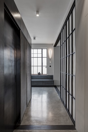
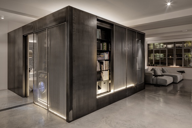
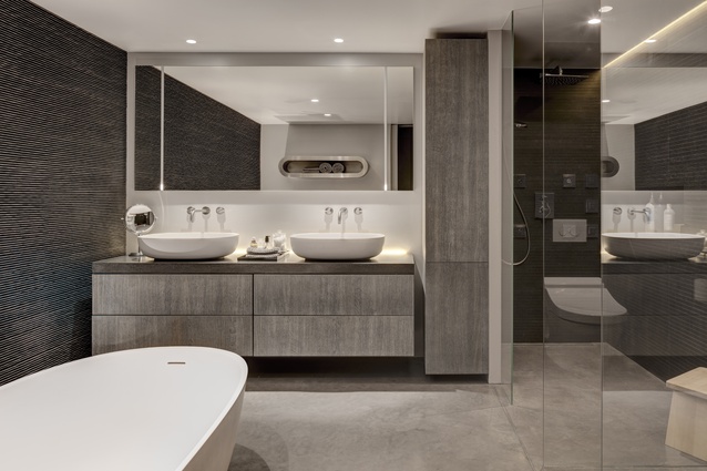
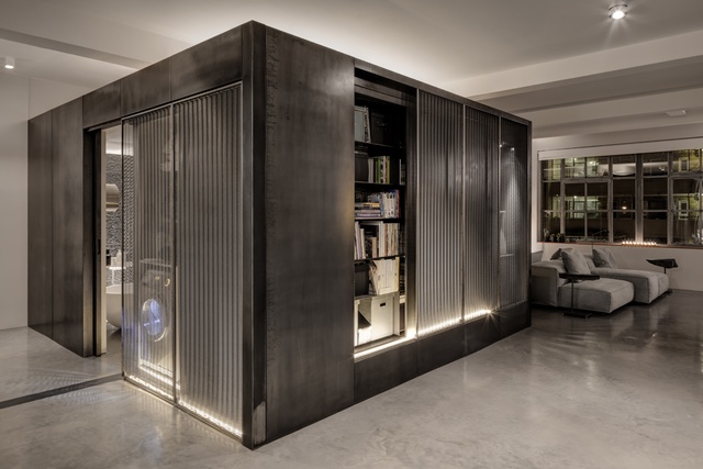
At the heart of the space, a black box becomes a dramatic insertion. Wrapped in a dark metallic skin, each face offers a different function. “The cube’s surfaces open and close, incorporating raw steel walls, blackened mesh screens, metal shelves, recesses, decorative niches and sliding doors. It is baroque in complexity but simple in function,” Angus says. It sits just shy of the ceiling, emphasizing its separateness from the building proper. Within the box, the bathroom is an intimate and private space, its enclosure contrasting with the light and airy ambience of the apartment itself.
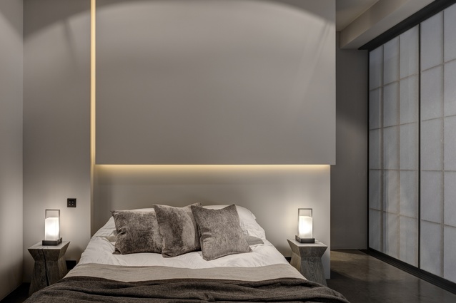
Alongside the entrance, the bedroom is concealed behind a wall of sliding shoji screens, proportioned to match the steel-framed windows. Above the bed, a sort of vertical bulkhead acts as a sculptural object – a narrow slot traces down one side and across the bottom, emitting a subtle illumination. Behind, a walk-in wardrobe takes care of quotidian clutter.
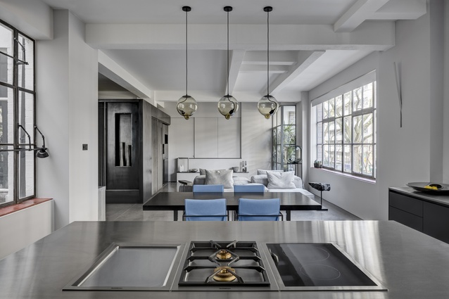
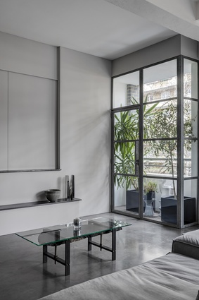
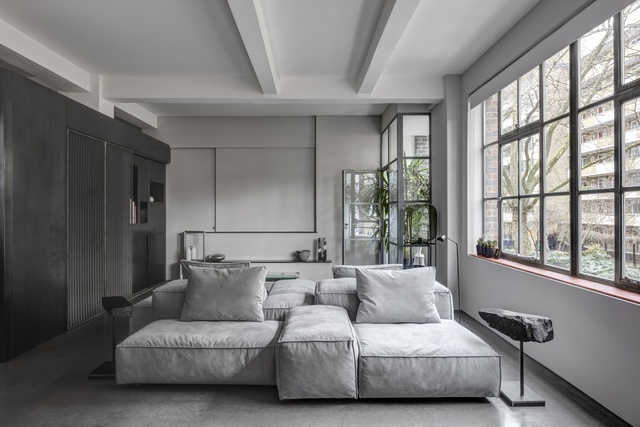
On the other side of the cube, past an in-built desk with stepped grey timber joinery, the open-plan living and dining zone is light-filled and finely textured. From a distance, the pale grey sofa could appear like a jumble of stones; up close, it is hefty and plush. In the corner of the lounge, a small balcony accessed via a steel-framed door houses a pocket of greenery.


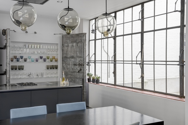
At the opposite end of this space, a streamlined kitchen is backed by a pair of magnificent steel-strapped vault doors. Their chipped and pitted surface contrasts with the smooth lines and midnight blue hue of the kitchen joinery. It is a good example of the architect’s mastery of colour, texture and materiality, accenting a predominantly monochrome palette with moments of rich olive green and steely blue. Above the dining area, a triptych of smoky glass pendants lights the space.
“We are very pleased that an interior made largely with hard materials – concrete, stone and metal – feels so soft and warm and sensuous,” Angus explains. “The concrete floor is almost buttery in texture and lightly heated, so it’s very comfortable in bare feet. It defies some preconceptions about hard materials.”
It is a calm and soothing space, where the existing structure and architectural elements are enhanced by the new additions. “The project exemplifies many of our ideas about materials, about using them with care and working with artisans who are masters of their craft,” Angus explains. “The new design elements are almost all reactions to the existing condition.”

