Thomas Building extension
The University of Auckland gets a new building extension.
Thanks to a century of Auckland dithering, the city’s University has ended up with a lot of good modern architecture. When the capital moved south in 1865, hopes for its return delayed any construction in the area; indeed the university camped for a time in the former parliament building. It was 40 years before the first purpose built building was constructed. And then plans to shift the campus out of town stalled development. Consequently we have a series of good modern buildings such as the Thomas Building, designed by KRTA in 1968. This is a serene four-storey structure of floating concrete and bands of steel glazing, with a beautiful lush atrium at its heart. Now the building has sprouted an addition designed by Stephenson and Turner.
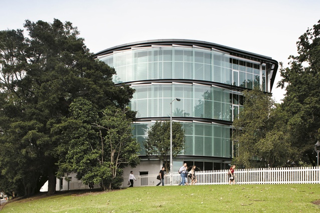
This is a centre for biotechnology research that combines both academia and industry together in one institute. It’s part of the Big Government Push for innovation and entrepreneurial effort in this area. Seen from Symonds Street it looks to be on a podium base, raised above its surroundings. It’s a tower for academics but not an ivory one like Lippincott did on the University’s other face. Steel and glass seem to be the new language of buildings that say “innovation housed here” and I’ve got no problem in the contrast with the Thomas Building’s trays of concrete from a less enterprising era. The faceted glass panels that face Symonds Street have a bit of the look of a ratchet or coiled spring about them; the building says mechanism or machine for innovating in to paraphrase Corb.
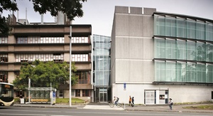
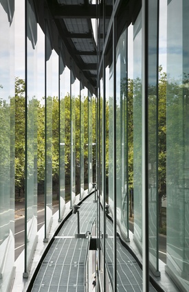
This site is a crucial one for the University and the city: an intersection bracketed by gardens and parks, and three historic buildings. The architects have wisely chosen not to fight it out with the neighbours. Most street corners need building up, but here the structure leaves the street, curving away into the gardens of Government House. This curve is not quite as originally envisaged before Historic Places intervention: originally more of a prow, it’s much blunter now but it still works well. This building marks one end of the University and also the end of a series of facades along Symonds Street. At this point Anzac Ave curls off down hill and the building reflects the panorama opening up for us over Constitution Hill to the harbour. The curve and the stepped panels seem to speak of the horizon, ticking off the degrees of the turn. Those glass panels are a sun and rain screen but their stepping is also quite a clever way to handle a curve with flat panels. As this went up I was a bit worried by the resemblance to a circular saw blade, but now I’ve come to appreciate the contrast with the trees and the way the repetition has a kind of sense of precision and calibration suitable for a building devoted to scientific research. And that’s a nice contrast to the famous piano curve of the more voluptuous Music School across the street.
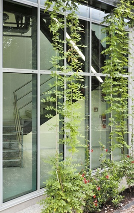
The addition is of the same scale and proportion as the Thomas building: where they meet, a glazed link separates the two structures. This introduces natural light and air into the south of the addition, while preserving it to rooms behind what was the Thomas Building’s north face. I’m not too keen on the large vertical concrete panels next to the link. I would have preferred the glass to come closer to the Thomas Building and increase the contrast between new and old. But it’s not the critic’s job to make aesthetic judgments, the critic isn’t an arbiter of taste these days. Indeed I sometimes feel there are too many voices in the architectural process: just as the Historic Places Trust took the point off this wedge, the Urban Design Panel was keen to maintain an “active edge”; so the fire service panels have been arranged to look like a little shop front. The latter wasn’t necessary either; this is where the street stops and parks start. Good architects welcome a critic, but advice you are compelled to take can blunt architecture as often as sharpen it.
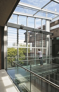
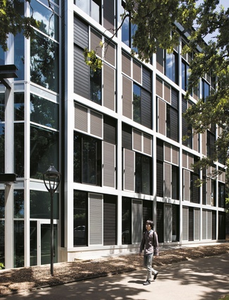
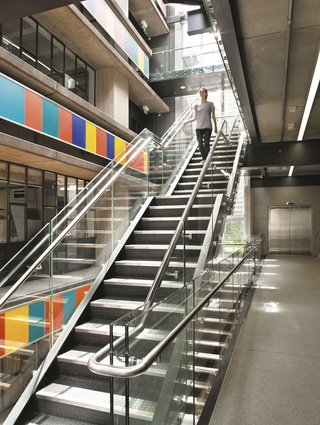
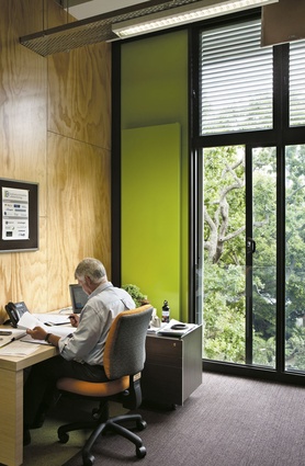
On the Government House gardens side of the building, the quiet side, the façade changes to a much more fine grained, almost residential texture, overlooking the tall deciduous trees to the west. Personally I find it a bit flat to look at but it works superbly on the inside. This elevation is lined with offices like little tree houses, each with opening glass doors and sliding screens. They are very pleasant indeed. Each floor of the building has much the same layout: offices to the west, open plan labs to the south (Thomas) end and open plan areas, mainly for post-graduate students, looking north and east through that big curving wall to the harbour. It’s a series of elevated floors with a contemplative character that seems to me conducive to research and thought; but what about that interaction between inhabitants that the Government’s keen on? That happens in the workspace of course, but the atrium link space contains bridges and a cantilevered series of stairs, cascading down through what is a very light and airy atrium that can also function as a space for social events. It is gratifying to see circulation made attractive these days. The grim old stair well seems to have disappeared from contemporary buildings, encouraging people to walk and with that allow the opportunity for casual social interaction. This atrium and its frontage to Symonds Street also preserve the possibility of a future entry to the new building at this point.
This addition is a neat piece of work on a tight site with plenty of constraints. It hasn’t buggered up the Thomas Building, always a good start. It’s intriguing to compare it with the University’s last completed building, the Business School’s Owen Glenn Building. That strives to be iconic with its outthrust blades, like hands proffered for shaking, and it gleams in the sun like a big grin. But it houses a different discipline and one that’s a recent addition to universities world-wide. This building is another face to a university with a diversity of buildings; it’s a more retiring, introspective building, a house of thought, but nevertheless a place of quiet accomplishment.

