Dark and stormy: Three Stories North

Click to enlarge
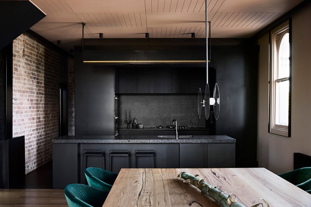
Fine perforated steel fixed to the kitchen's black joinery references the construction of the original building.

Fine perforated steel fixed to the kitchen’s black joinery references the construction of the original building. Image: Sharyn Cairns

1 of 15
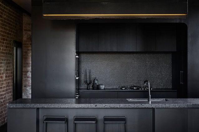
The island bench, with its leather-finish black granite benchtop, is a social space for family and friends to gather.

The island bench, with its leather-finish black granite benchtop, is a social space for family and friends to gather. Image: Sharyn Cairns

2 of 15
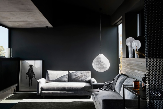
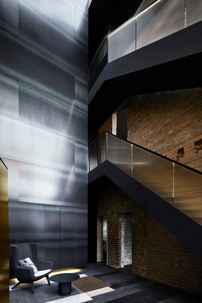
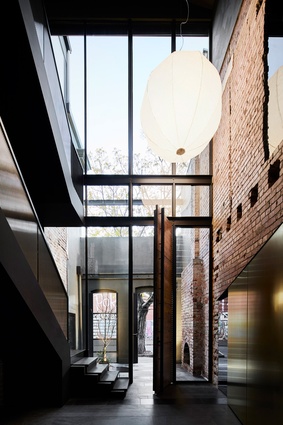
The strategic placement of skylights and windows lighten the dark robust palette.

The strategic placement of skylights and windows lighten the dark robust palette. Image: Sharyn Cairns

3 of 15
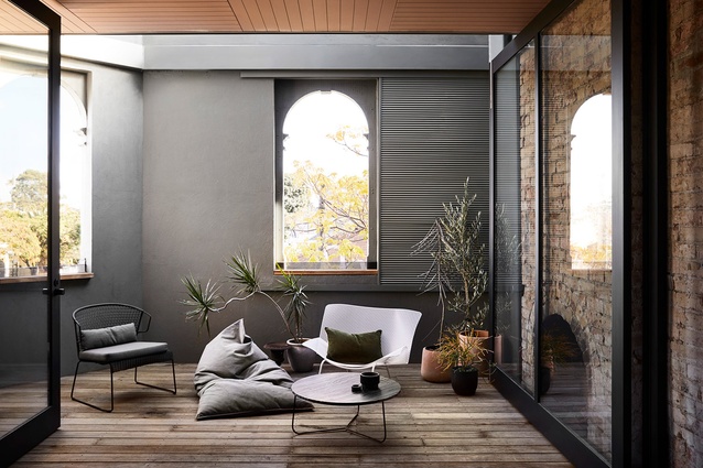
The strategic placement of skylights and windows lighten the dark robust palette.

The strategic placement of skylights and windows lighten the dark robust palette. Image: Sharyn Cairns

4 of 15
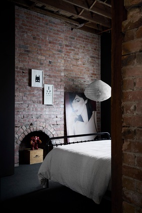
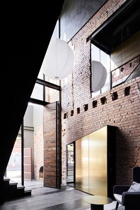
The architects stripped back the plaster to reveal the original brick walls, arches, fireplaces and timber ceilings.

The architects stripped back the plaster to reveal the original brick walls, arches, fireplaces and timber ceilings. Image: Sharyn Cairns

5 of 15
Variations in materials and textures create softness, tactility and warmth.

Variations in materials and textures create softness, tactility and warmth. Image: Sharyn Cairns

6 of 15
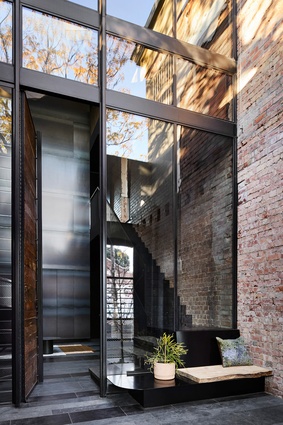
The contemporary insertions are designed to sit within the warehouse-like shell.

The contemporary insertions are designed to sit within the warehouse-like shell. Image: Sharyn Cairns

7 of 15
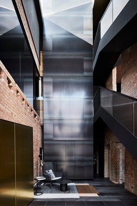
The contemporary insertions are designed to sit within the warehouse-like shell.

The contemporary insertions are designed to sit within the warehouse-like shell. Image: Sharyn Cairns

8 of 15
The contemporary insertions are designed to sit within the warehouse-like shell.

The contemporary insertions are designed to sit within the warehouse-like shell. Image: Sharyn Cairns

9 of 15
The contemporary insertions are designed to sit within the warehouse-like shell.

The contemporary insertions are designed to sit within the warehouse-like shell. Image: Sharyn Cairns

10 of 15
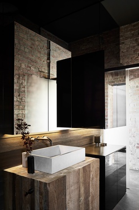
The ground floor vanity is made from original timber joists from the building, laminated together like a butcher’s block.

The ground floor vanity is made from original timber joists from the building, laminated together like a butcher’s block. Image: Sharyn Cairns

11 of 15
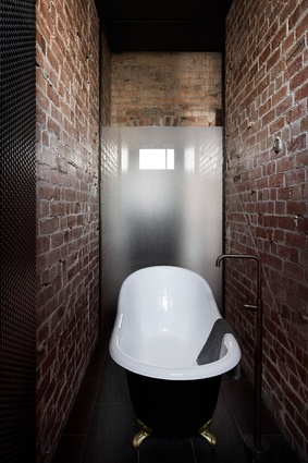
On the ground floor, another bathtub occupies a dramatic space compressed between four-metre-high brick walls.

On the ground floor, another bathtub occupies a dramatic space compressed between four-metre-high brick walls. Image: Sharyn Cairns

12 of 15
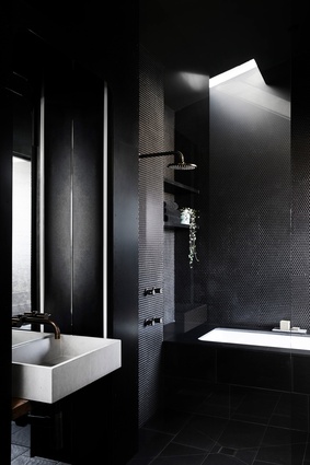
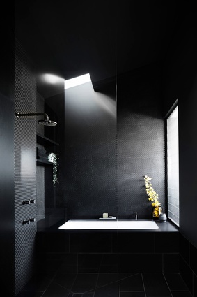
Washed in light from the skylight above, the upstairs bathroom features penny-round tiles.

Washed in light from the skylight above, the upstairs bathroom features penny-round tiles. Image: Sharyn Cairns

13 of 15
Washed in light from the skylight above, the upstairs bathroom features penny-round tiles.

Washed in light from the skylight above, the upstairs bathroom features penny-round tiles. Image: Sharyn Cairns

14 of 15
Three Stories North by Splinter Society.

Three Stories North by Splinter Society. Image: Sharyn Cairns

15 of 15

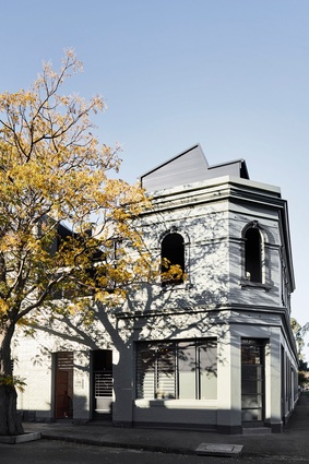
Three Stories North is not your traditional family home. Celebrating the character of the 1890s building it occupies, this house is dark, moody and industrial while still being imbued with softness and warmth. The clients engaged Splinter Society to transform two side-by-side three-storey townhouses – formerly a corner store – into their dream family home. Embracing its historic character, they stripped back plaster to reveal the original brick walls, arches, fireplaces and timber ceilings. “Joining the two townhouses gave a warehouse scale, but the building stills reads as domestic because of the small rooms and fireplaces,” says Chris Stanley, co-director of Splinter Society.

The architects stripped back the plaster to reveal the original brick walls, arches, fireplaces and timber ceilings. Image:  Sharyn Cairns

Planning the house around existing walls and openings resulted in unique and atmospheric spaces, while contemporary insertions are designed to sit within the warehouse-like shell. The strategic placement of skylights and windows lighten the dark, robust palette, and variations in materials and textures create softness, tactility and warmth.

Former circulation spaces have been adapted into bathrooms, with the original entry hallway now serving as a tall and narrow bathroom. The bathtub and shower occupy a dramatic space compressed between four-metre-high brick walls. Internal glass walls and doors bring light into this room and the washroom adjacent, where the timber vanity is made from original timber joists from the building, laminated together like a butcher’s block. The raw brick and rough timber are not typical finishes for a bathroom, but in combination with concrete basins, perforated steel and high-gloss cabinetry, they contribute to a tactile and layered aesthetic. In the main bathroom on the third floor, penny-round tiles envelop the walls of the bath and shower, which are washed with light from the window and skylight above.

On the ground floor, another bathtub occupies a dramatic space compressed between four-metre-high brick walls. Image:  Sharyn Cairns

This unlikely combination of materials also creates texture and variety within the dark, monochrome kitchen. The island bench, with its leather-finish black granite benchtop, is a social space for family and friends to gather, while the U-shaped back bench, with penny-round tile splashback, is where food preparation, cooking and washing takes place. Fine perforated steel wraps around the black laminate joinery and is fixed with rivets to represent the hot-rivet steel construction of the original building’s steel work. Splinter Society extended the perforated steel beyond the laminate edges to provide a soft translucency and a softer edge when back lit. “As natural and artificial light change throughout the day, the subtle details and finishes within the black palette are revealed to create a strong sense of domesticity and warmth,” says Chris.

This article first appeared in the June 2020 issue of Houses: Kitchens and Bathrooms and was first published online at architectureau.com.

Project credits

Project: Three Stories North

Architect: Splinter Society Architecture, Melbourne, Vic, Australia

Project Team: Christopher Stanley, Asha Nicholas

Consultants

Builder: Birdsmouth Construction

Joinery: Terry Marshall


More projects