Through the looking glass: Garth House
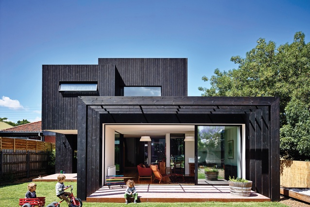
The rear addition to Garth House by Ola Studio comprises a series of dark boxes that are similar in form but contrasting in sequence and size to the building’s original 1800s facade.
When Jesse and Vanessa first bought their house in Melbourne’s Westgarth, it was in need of attention. Built in the late 1800s, the home was rich in history but showing its age. After living in the house in its original shape for three years, the couple decided to seek out an architect who was aligned with their vision, to design an extension at the rear of the existing dwelling. After some searching, the couple met Phil Snowdon of Ola Studio, who understood their aesthetic and style.
At the time of designing the Garth House extension, Jesse and Vanessa weren’t short of things to keep them busy – Jesse is a successful chef, and together they are business owners and operators as well as parents. They were eager to maintain as much of the original dwelling as possible, but over their first three years in the house, parts had fallen into irreversible disrepair, with progressively less of the original house being salvageable. At the rear of the home, existing external walls were rebuilt in their original locations, helping to distinguish the old from the new and establishing a framework to set the new against.
Phil describes the original house as one solid form, with all rooms contained within a single volume. He says it was a conscious decision to contrast this model in the new build, using the rectilinear forms of the old, but varying their sequence and size to create a series of spaces that felt a part of the garden and that could be looked through. It was important to the clients that the ambience of the existing house, with such a rich history, be maintained as much as possible.

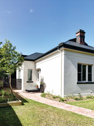
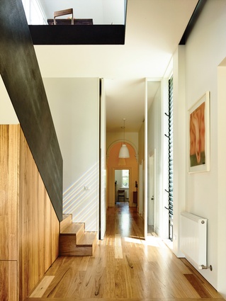
At the street, the original low stone wall and iron gate mark the boundary entrance. The existing facade, with its clean, white rendered walls and symmetrical front windows, remains in sync with the neighbouring houses. The front door is tucked into the side of the house and appears as it might have once been. Inside, the entry has been largely maintained, with internal walls merely receiving a fresh coat of paint. In a new, unexpected celebration of colour, Russian yellow glass is set around the front door, flooding the entry in a warm, hive-like glow.
Over the course of the house being designed and built (a process that took several years, with some pauses), two more children (and a couple more restaurants) come along, resulting in the replanning of spaces to accommodate the clients’ changing needs, a process which led Jesse and Vanessa to give thanks for Phil’s patience.
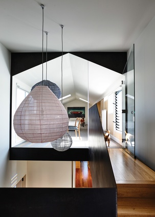
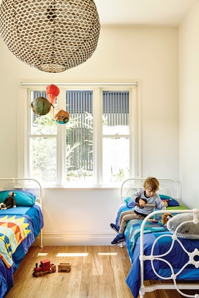
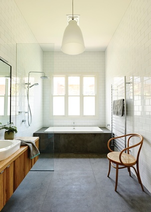
The three children’s bedrooms, a bathroom and lounge are located in the existing part of the house, while Jesse and Vanessa take their solitude in a lofty main bedroom off the mid landing of the winding stair. A balcony terrace is also accessed from this landing, while at the top of the last flight is the loft. Built in the space of the original roof, the loft acts as a spare bedroom, a place for the children to play and an office space for Jesse to work from, all hidden neatly away in fold-out or pull-down plywood cupboards and panels.
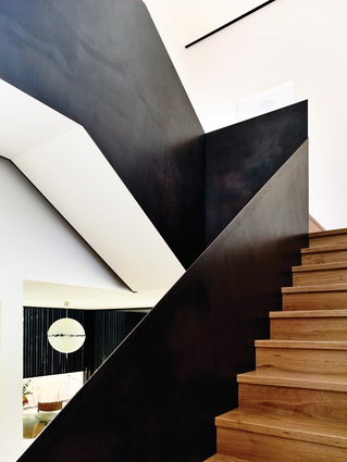
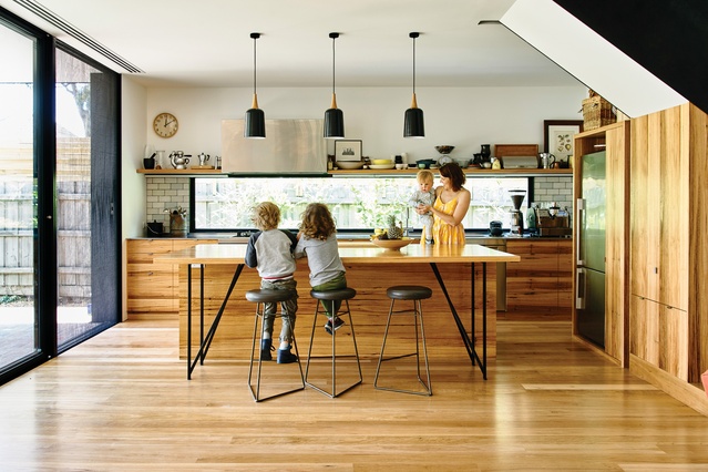
The stair itself appears as an arresting sculpture from the ground-floor kitchen, dining and living area. Lined by a black steel balustrade sealed in a layer of black boot polish, its alluring form draws you from the entry into the rear of the house, where the family spends time cooking, eating and entertaining.

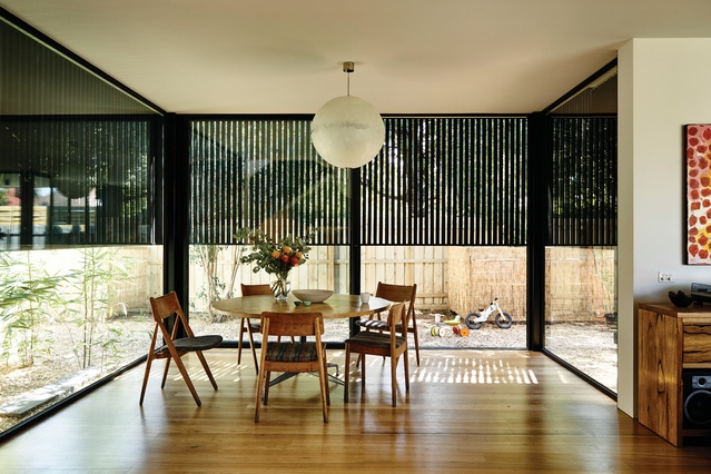
Within the volumes of the extension at ground level, zones are subtly created and given purpose while maintaining a broader connection to each other and the garden. The dining space is located opposite the kitchen. Its ceiling is a continuation of the kitchen and runs into the living area, but the perceived scale of the dining space is intimate and enclosed. Battens of the charred timber facade above run past the glass, creating privacy and giving the illusion that the space is much smaller than it really is.
Sitting at the dining table, Jesse and Vanessa share stories of their Christmas, the goose they cooked and the family that stayed, now that the house is finished. There are plans for more gardens and vegetable patches to be planted for the family to enjoy and be fed from. Ola Studio has captured the way its clients live and celebrated it.
Architecture has the ability to significantly affect people’s lives. But just as significant is the potential for people to have a profound influence on the architecture they commission, by the way they share their space and function within it. From the street, Garth House begins to tell stories of its past, while inside, a wonderful new tale unfolds. It is proof that the joy in architecture is emphasized by its users, that the building is made all the richer by its occupants.

