Titirangi bathroom
With a reputation spanning 40 years, architect Ian Burrow has become well known for his iconic designs characterised by strong geometric forms comprising elements such as circular windows and towers. Built in 1975, this house in the Auckland suburb of Titirangi is a prime example of Burrow’s work.
Paul Field, director of development firm Chapel Hill Investments, was very conscious of the legacy that came with the house when it was offered for sale for the first time since being built.
“One of Ian’s innate abilities lies in being able to render manifest the living requirements of his clients in a seemingly effortless manner. As a developer, you’re always looking to improve the functionality of a property and we did look at a number of layout configurations, but we always kept coming back to Ian’s original vision.”
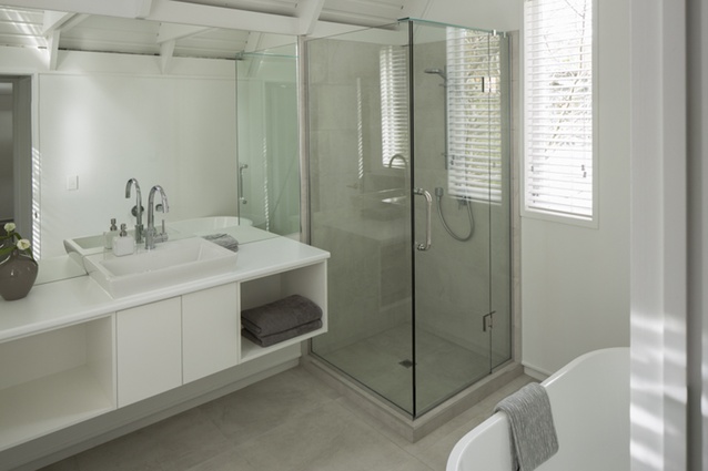
As was the style at the time, many of the fixtures in the bathroom were built in, making the 7m2 space feel even smaller.
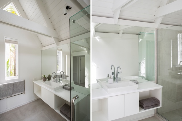
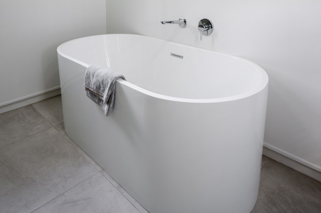
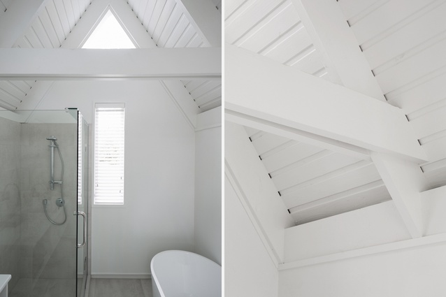
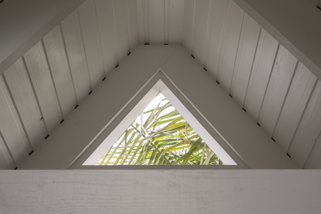
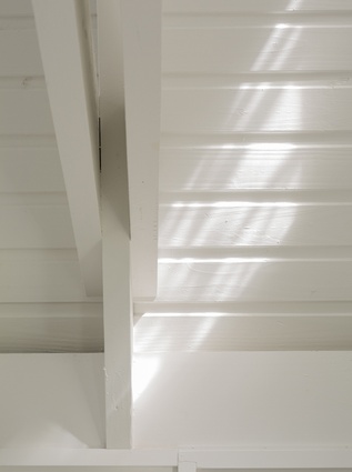
“The original vanity completely filled the space between the external wall and the shower, which was also walled in,” says Field. “The bath, too, was set into a surround, all of which really limited the amount of visible floor space. Coupled with the dark stain on the ceiling and trusses, the combination really minimised the effect of the room’s volume.”
The focus, then, became about highlighting the room’s unique elements – ceiling, trusses and windows – while updating the amenities.
“My advice to anyone looking to undertake a bathroom renovation is to pare back the space in your mind and identify what are the relevancies. In this instance, out went the built-in furniture, replaced by a wall-hung vanity and free-standing bath. The best feature, though, is that all these elements recede into the background and it is the architecture that takes pride of place.”

