To the island
What do you do with a steep, treed beachfront site only two rooms wide and exposed to the elements? That was the dilemma presented to Wellington architects Carolyn Walker and Geoff Fletcher in 2010.
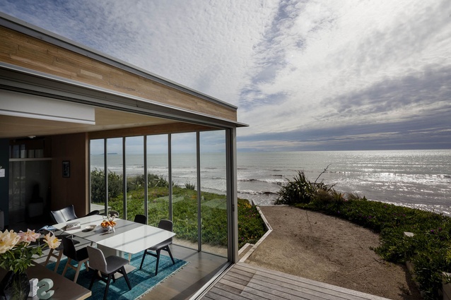
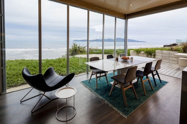
The 1500m² Kapiti Coast section their clients had purchased was too narrow for a flat, sprawling house in which each room had a view of the ocean. Neither the owners nor the architects were interested in constructing a multi-storeyed McMansion. And then there was the wind; if the outdoor living were perched at the top of the site to take advantage of the stupendous views of Kapiti Island, there’d be only a handful of calm, breezeless days a year in which the owners could sit outside.
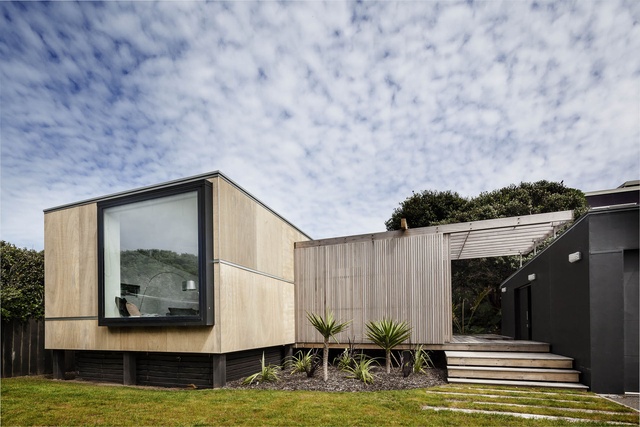
“It’s pretty exposed up there,” says Carolyn Walker. “But they wanted whatever land had the best aspect. And in the end, the long skinny site has worked in their favour.”
At first, the owners were keen on a small, one-bedroomed beach house with privacy. An existing cottage at the bottom of the section would be left intact to serve as guest quarters for their grown children and friends.
“It had to be low key: not something ostentatious or shout-y but something quiet,” says Walker.
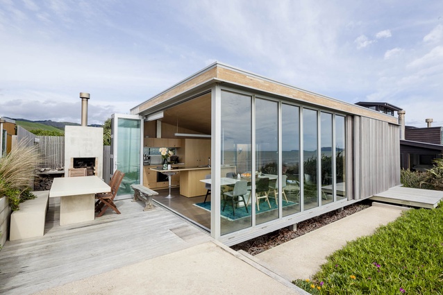
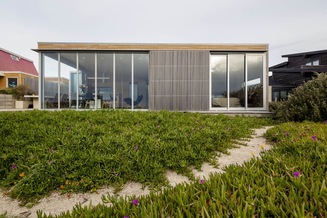
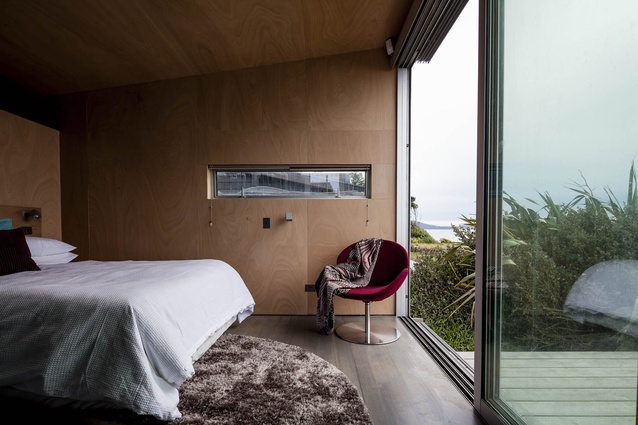
The architects met the brief by designing a 68m², two-roomed timber box at the top of the site. Inside, a living room with an open-plan kitchen takes up almost two-thirds of the space; a bedroom with a walk-in wardrobe and a small bathroom fills the rest. Floor-to-ceiling windows and sliding doors line the beachfront side; the rest of the interior walls and cabinetry are ply.
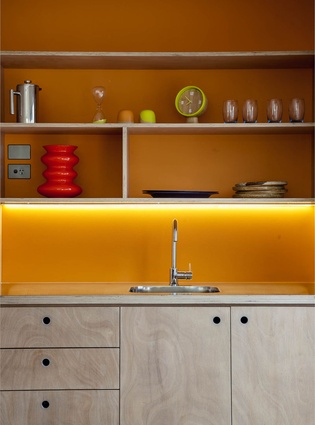
“It’s very cheap ply treated with applications of egg white to create a blonding effect,” explains Geoff Fletcher. “The kitchen is the same species but marine ply.”
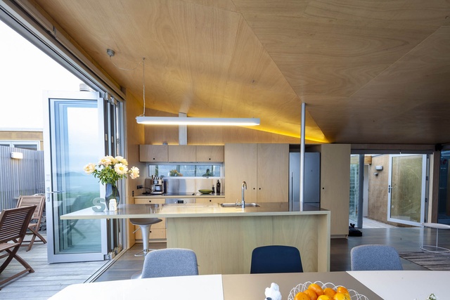
The fact that the kitchen cabinetry is made from the same material as is the rest of the house was a conscious effort to minimise its size. “They wanted a fairly full-on kitchen so the kitchen is a reasonable size for a one-bedroomed cottage,” says Walker. “For us, it became about how we could make it so it didn’t take over the house.”
There are other tricks to the design too. The entry deck to the home is small but floating. The bathroom has a glass roof that means it’s flooded with light but maintains some privacy. Glue-laminated timber is used on the exterior but it has huge flashings inside to protect it from moisture. And wooden shutters with a lantern pattern have been installed across the front façade so the house can be enclosed in extreme weather. “That western sun comes in low and really hard,” says Walker. “They give some protection from it and from the wind. They also do the job of the verandah we weren’t allowed because the local council had a no-build line at the front of the house.”

Construction, by Nick Robbers of Haarlem Build, took just 10 weeks so the owners could spend Christmas 2010 in the house. “It was a little bit tight,” says Walker. “That put constraints on the design too.” Not that you’d know it; the house won a NZIA award in the Small Project Architecture category in 2011.
Soon after stage one was completed, the owners decided to demolish the ramshackle cottage on the section and extend the house. Stage two was finished in December 2012.
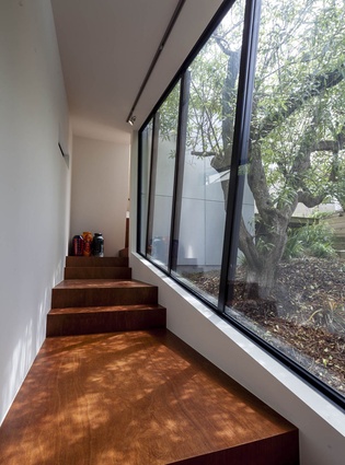
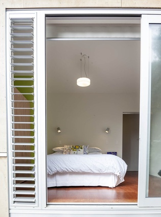
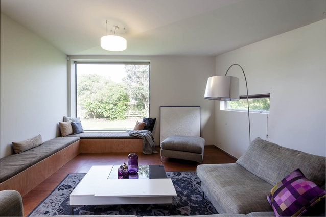
The two-bedroomed, 103m² addition, which won another NZIA Local Architecture award in November 2013, includes a series of boxes that includes a large living room, a kitchenette and a second bathroom. The rooms wend their way down the site and are connected with an internal stair box. The two wings connect, but not internally – to move from one to the other, you must pass through the impressive courtyard garden.
“To achieve internal access was going to compromise what had already been done here. They were keen on keeping this bit as their retreat. So you can get around without getting wet but we’ve retained a sense of a private retreat,” says Walker.
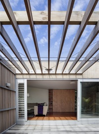
Each of the stage-two boxes faces onto the garden and cleaves to the land in such a way that it seems to have been there forever. That’s thanks in part to the sophisticated design – and also to the careful planting programme. The existing trees were moved, nurseried while the architecture was built around their space in the garden and then replanted into the same spot once construction was finished. Any planting that was damaged was replanted exactly the same.
“It was important to the owners and it’s always been important to us. So it became important for the whole job,” says Fletcher. “And I think it’s a much better house because of it. It’s a garden courtyard house now. It’s so site specific. It’s quietly bespoke. The number of days you can use the outside dining room [at the top of the site] is minimal but the courtyard is a delight in almost any weather.”
“It was never about making a statement,” adds Walker.
“If the section ended up looking similar to how it started then the owners had achieved what they wanted to. When you look up from the beach and all those shutters are closed, it’s really ççlow key. You just see the ice plants and the top of a timber box. The view is stunning but I think the private garden is, for me, the best part of the job. They’ve ended up with fantastic views and a private, sheltered courtyard garden as well.”

