Seamless design: Toi Art
If you haven't yet seen the new Toi Art gallery, designed by Warren and Mahoney, take a peek inside and hear more about the design process from project lead Katherine Skipper.
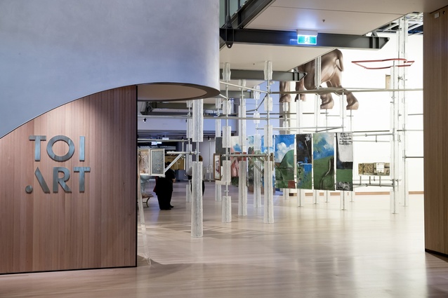
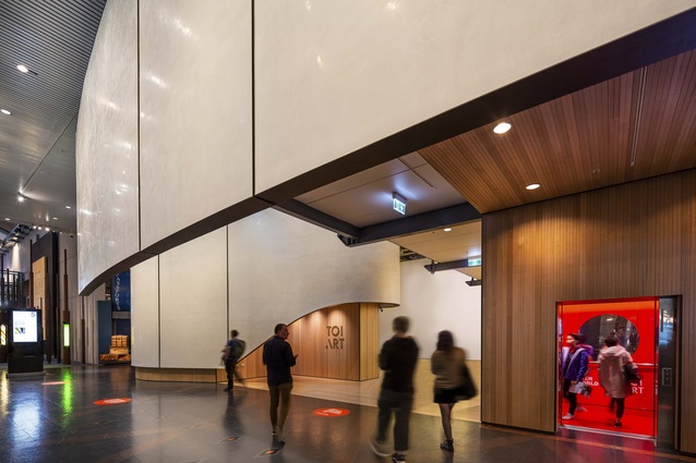
The Wellington studio of architecture firm Warren and Mahoney took on a five-year renewal project of the Museum of New Zealand Te Papa Tongarewa and the first new gallery in the expansion opened earlier this year. The new project is called Toi Art, and it has increased the museum’s space for art by 35 per cent – growing from 2430m2 to 3290m2. The firm is particularly proud of creating an experience that is “seamless”, moving from the existing museum to the new gallery with ease.
Project lead Katherine Skipper said, “Our brief for this project was clear. We needed to create a space of civic quality that would draw people in. In the first six weeks 100,000 people visited the gallery, which surpassed all expectations. The numbers prove to us that for visitors to Te Papa, the gallery provides a seamless experience that you come across and enter as you would any part of the museum.”
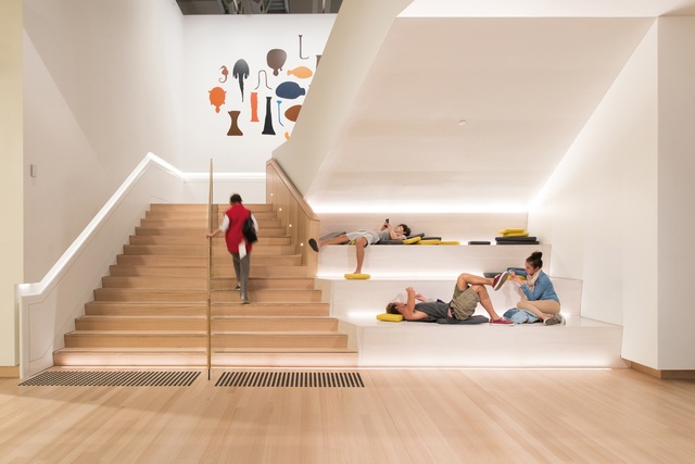
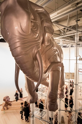
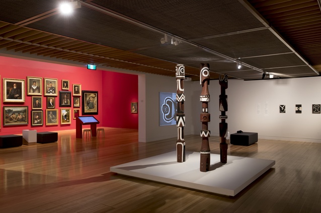
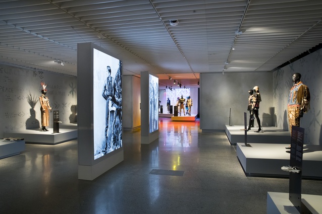
The brief for this latest $6 million interior refit included a key requirement of being able to commission and display large scale art forms not previously able to be displayed at Te Papa. “Our approach was to consider the threshold gallery as a volume for art, rather than just the walls for display. This enables the curatorial team to have new conversations with future artists about the scale and immersive experience of works that can now be supported in the space,” Skipper said.
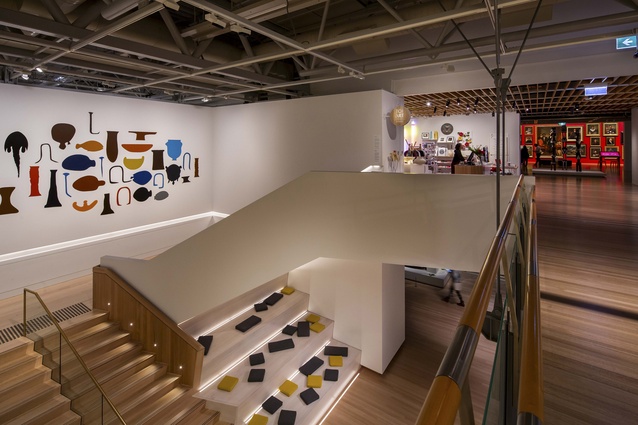
Skipper explained that the new staircase was an integral part in connecting the exiting space with the new Toi Art gallery. It provides viewers with the opportunity to view artwork from many angles and perspectives. “The staircase has been incredibly successful. Its wide, dynamic shape creates both a natural wayfinding tool and an additional exhibition space,” she says.
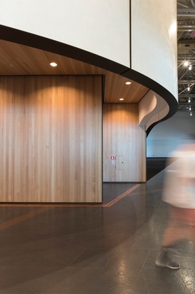
Several other elements were deliberately chosen to help carry out the mission of a seamless experience including the hand-applied polished plaster system used on the external gallery walls. Skipper noted, ““It was important that the finish was entirely of its place. The fact that it was hand-applied by a single person in situ adds to its effect, which has a luminous, beautiful quality to it.”
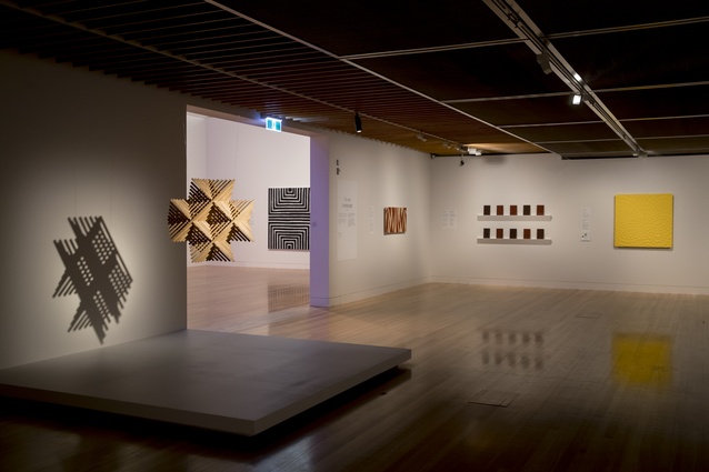
“Overall we’ve worked to a very limited palette, creating a cohesive space to enable the art within to be the focus, not the architecture,” Skipper concluded.

