TRA
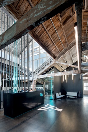
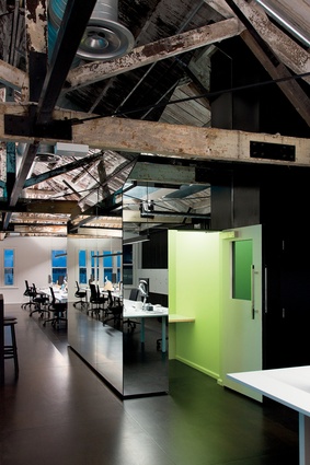
Located on the top floor of a heritage building on the waterfront side of Auckland’s revitalised Britomart precinct, the new offices of TRA (formerly ‘The Research Agency’) form a space that, in many ways, embodies the research and analytics company’s mission to create order and logic. The space features two hipped-roof forms with a central seven metre-high loft set between them.
Designer José Gutierrez explains: “from the outset of our concept design, we wanted to play on the capture and processing of information, and translate what TRA does into the architecture of this particular space.”
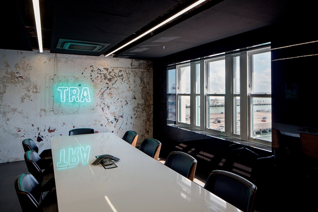
As part of the rebranding, artist Paul Hartigan was commissioned to create a neon artwork of the company’s new abbreviated name TRA. Playing off this concept, Gutierrez introduced neon accents into the heart of the office space to represent the continual flow of information/data running through the company.
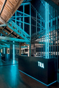
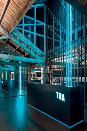
“Locating the reception beneath the seven metre-high sky-lighted loft gave us the potential to play off against the consistent themes of lightness and weight while emphasising the cathedral-like proportions. The reception desk was designed as a heavy monolithic sculpture, enhancing the tension between light and mass, the ethereal and the tangible,” Gutierrez says.
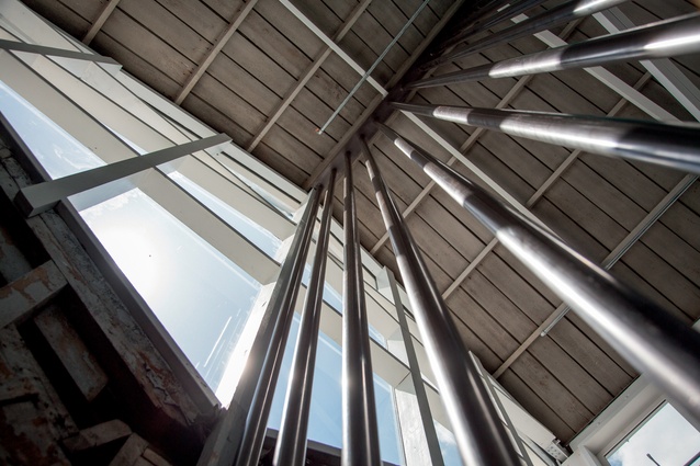
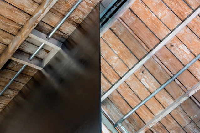
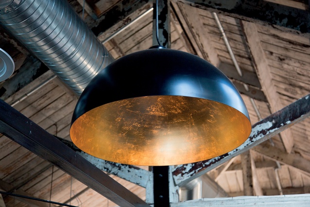
The steel screen behind it spans the full seven-metre height, creating a vertical axis that draws attention to the height and creates the impression that the screen runs right through the heart of the building. Two of the vertical poles are highlighted with blue neon tubes, compelling the eye to travel upward. All of the timber trusses and structural beams were exposed and uncared for and, in some areas, there were signs of fire damage. These were simply water-blasted and became an integral part of the overall aesthetic.
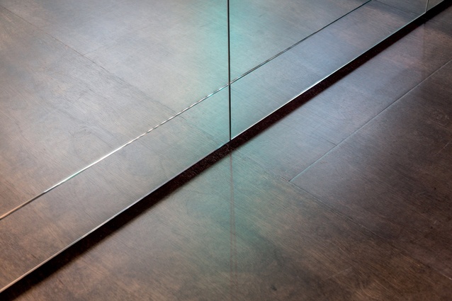
Existing timber floorboards were too damaged to be retained so Gutierrez used standard 1.2 metre x 2.4 metre marine-grade plywood panels, stained dark brown. The dimensions of these panels are repeated through the office – in panels of mirror, black lacquer and fabric.
“As much as [the design] is about the ceiling and the history of the space, it is very much anchored by the floor. The consistent grid of the floor panels, the repetition of those dimensions in all other materials – that is the anchor. It creates order and rationality,” Gutierrez explains.

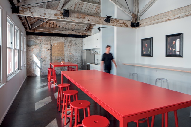
The spatial brief asked for an open-plan office for 40 staff. A boardroom was required, as was a series of smaller meeting rooms and a staff break-out area. In order to preserve the character and not dominate the existing space, the new areas were created by the insertion of pragmatic volumes within the existing framework. These volumes were then clad with mirrored panels, which dematerialise, reflect and accentuate the raw fabric, history and patina of the building.
The understated – almost invisible – horizontal light fixtures illuminate both the workstations below and the ceiling above, bringing into sharp relief the beams and weathered texture. The workstations are egalitarian – there is no corner office.
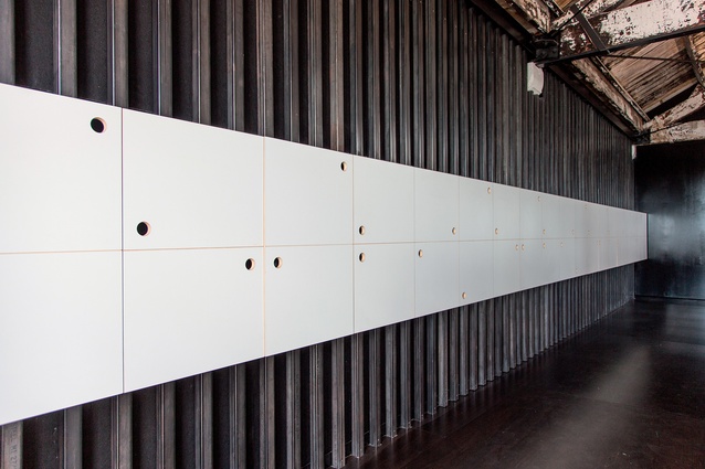
To improve acoustic performance in the large open space, Gutierrez used black sound-absorbing insulation, held in place by vertical sections of raw steel, on the back walls of the main workspace.

