Tranquil and textural: a pavilion between trees
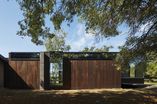
A modernist-inspired rural retreat, this semidetached pavilion by Branch Studio Architects responds meaningfully to its landscape and to the trees that determined its design.
Although close to the ground, Georgina Moore and Adrian Reis’s modernist-inspired retreat is a refined treehouse of sorts. Three lovely trees – a silver birch, desert ash and heirloom pear – determined its precise location on the couple’s four-hectare property and continue to infuse the semidetached pavilion with texture, tranquillity and shade.
“We decided a more meaningful connection with the landscape could be achieved if the building gave way to and interacted with the trees,” says Nicholas Russo, director of Branch Studio Architects, which the clients commissioned for an extension to their inherited 1990s house.
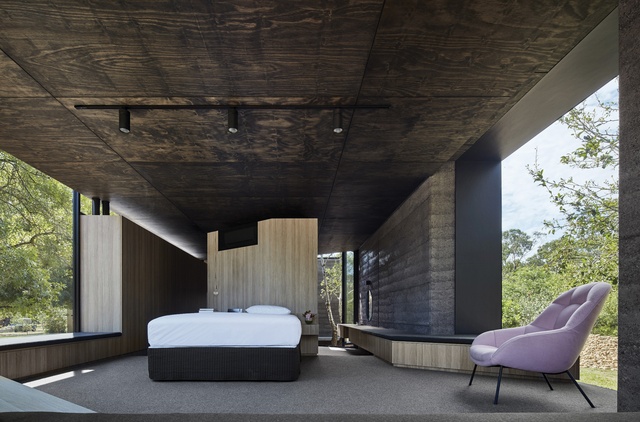
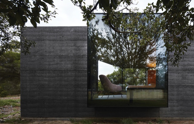
The architect conceived a rectangular form for the generous ensuite, dressing and bedroom spaces, and made a small indentation partway down its length for a miniature courtyard. This frames the silver birch and marks the junction of bathing and other program areas. Nicholas then pressed out windows to the north and south to frame the stretching ash and old-fashioned pear respectively.
A series of platforms was introduced to gradually raise the floor level by a metre and create a subtly different relationship to landscape in each section. Consequently, one takes in a grey mottled tree trunk from the courtyard, while the western glazing is heavily fringed with leaves.
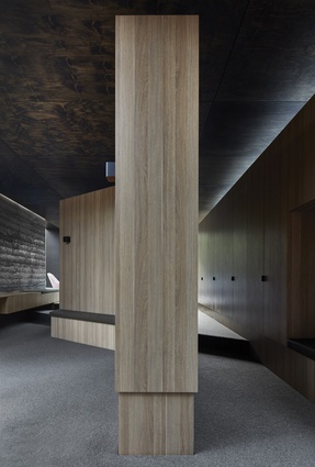
Inspiration was taken from Ludwig Mies van der Rohe’s Farnsworth House with respect to circulation and transparency. The house’s central corridor was narrowed, then parted into “his” and “her” paths that skirt dressing and bedroom perimeters and a bank of fine three-quarter-height joinery, while the latter path allows air and light to circulate freely above it.
“The plan has a very purposeful flow,” says Nicholas. “Pushing circulation to the edges of the space left the central joinery to divide the main sections.” This effectively obstructs views down the central corridor into the private spaces, enhances the pavilion’s connection to the exterior and creates a transparent corridor down to the courtyard.
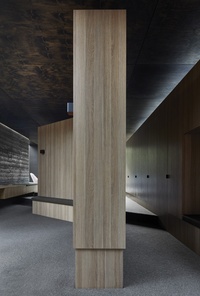
Each of the clients has their own “thinking window” and cluster of robes, which were informed by their individual characters and interests: Georgina’s faces the stable, garden and chooks, while Adrian’s window looks out to the sturdy ash and is surrounded by joinery that has the stripped-back feel of a locker room. “The only issue with my side is you have to learn to go to sleep by moonlight,” says Adrian ironically.
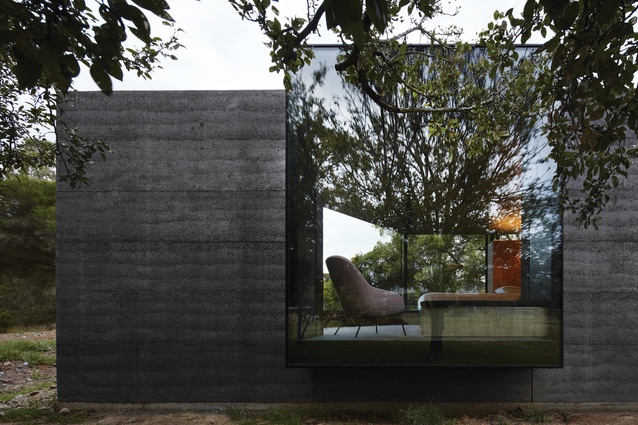
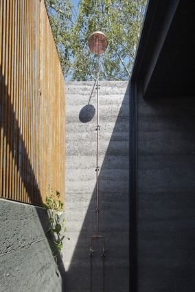
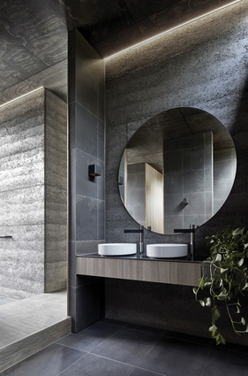
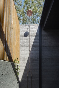
The architect dodged the architectural taboo of the bedroom being accessed through a bathroom by separating the ensuite into two parts, with basins and a toilet alcove on one side of the corridor and an indoor shower, outdoor shower and elegant bath on the other. The bath, which sits on the interior–exterior threshold, becomes open-air when the full folding glass doors are opened. Rammed-earth walls and a rusted steel grate threaded with star jasmine and white mandevilla flowers protect bathers from observation and the elements.
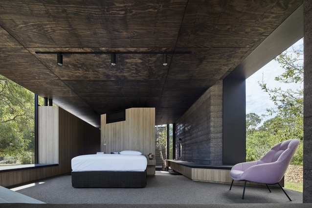
Along the southern side of the bedroom, informal seating shapeshifts from sideboard to dresser, then day bed to window seat, while the angled joinery that screens the bedroom from the house morphs into a low bedhead. “One-dimensional spaces can result in unimaginative houses,” says Nicholas of the importance of multifunction in design. “Why can’t a bedroom be your library, study and sitting room too?”
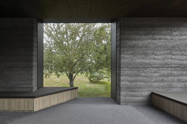
From the main bedroom, the view is through full westerly glazing, angled like a Stanley knife blade to the setting sun. The window also frames a stand of natives in the middle distance – eucalypts, wattles, she-oak and bottlebrush – behind a soon-to-be-filled creek bed. The full-height windows work well here, because this end of the pavilion is usually just occupied at the bookends of the day, when temperatures are milder, activities slower. That said, sheer dark curtains and blockout blinds are available when needed.
To further encourage a sense of refuge, volumes are lit naturally or indirectly and mainly organic and raw materials were chosen for their integrity and non-synthetic nature. Spare brass detailing has also been used throughout, like design punctuation accenting the sophistication at the heart of Branch Studio Architects’ design.
Deft circulation and glazing mean that textured surfaces – plywood, rammed earth, honed bluestone and a mock-oak veneer – change with the weather, light and trees. “In overcast weather the rammed earth feels darker and heavier and the timber reflects a monochromatic grey light,” says Nicholas. However, a fine day draws out the grain and warmer tones of earth and timber and scatters a dynamic filigree over ceiling, glass and walls.
This article was first published on ArchitectureAU.com.

