Tropical Zurich: modernist villa

Click to enlarge
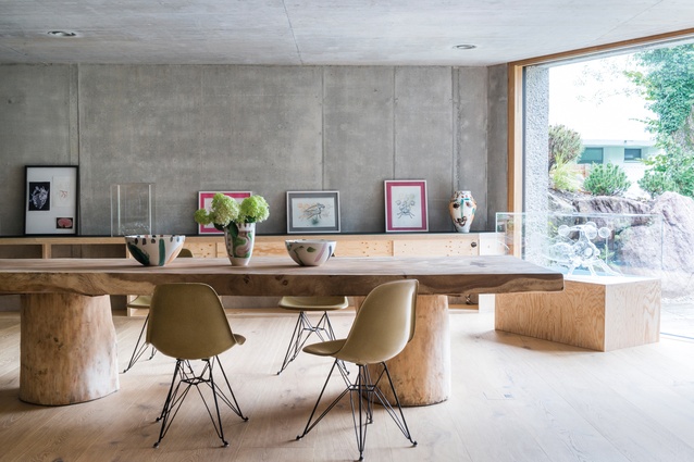
The studio of Melanie Grieder-Swarovski is furnished with a huge wooden table shipped from Ibiza and Eames chairs in pale green. All artworks are by Grieder-Swarovski (aka Melli Ink).

The studio of Melanie Grieder-Swarovski is furnished with a huge wooden table shipped from Ibiza and Eames chairs in pale green. All artworks are by Grieder-Swarovski (aka Melli Ink). Image: Christian Schaulin

1 of 11
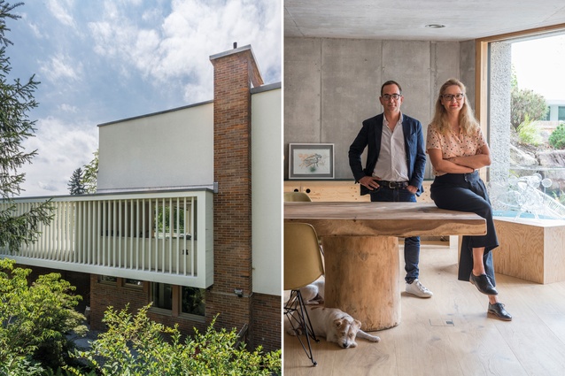
There are vertical lamellas in the back façade of the building; the home-owners, Damian Grieder and his wife, Melanie Grieder-Swarovski.

There are vertical lamellas in the back façade of the building; the home-owners, Damian Grieder and his wife, Melanie Grieder-Swarovski. Image: Christian Schaulin

2 of 11
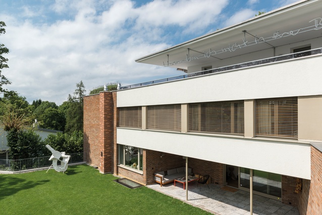
The original design of the 1956 international-style building by Theodor Laubi hasn’t been modified. The sculpture is by Thomas Kiesewetter.

The original design of the 1956 international-style building by Theodor Laubi hasn’t been modified. The sculpture is by Thomas Kiesewetter. Image: Christian Schaulin

3 of 11
The main entrance  is on the back side of the building and leads to the private rooms; cleverly positioned skylights plus dimmable LED bars recessed into the ceiling ensure the newly created lower level “does not feel like a basement” as Andreas Fuhrimann stresses.

The main entrance is on the back side of the building and leads to the private rooms; cleverly positioned skylights plus dimmable LED bars recessed into the ceiling ensure the newly created lower level “does not feel like a basement” as Andreas Fuhrimann stresses. Image: Christian Schaulin

4 of 11
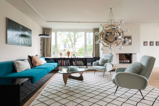
The main living room has a Noguchi table and vintage chairs. Artworks are by Gregor Hildebrandt (above sofa) and Ross Chisholm (above fireplace). Chandelier Mond (2015) is by artist Björn Dahlem. Pottery on the window bench is by Melli Ink.

The main living room has a Noguchi table and vintage chairs. Artworks are by Gregor Hildebrandt (above sofa) and Ross Chisholm (above fireplace). Chandelier Mond (2015) is by artist Björn Dahlem. Pottery on the window bench is by Melli Ink. Image: Christian Schaulin

5 of 11
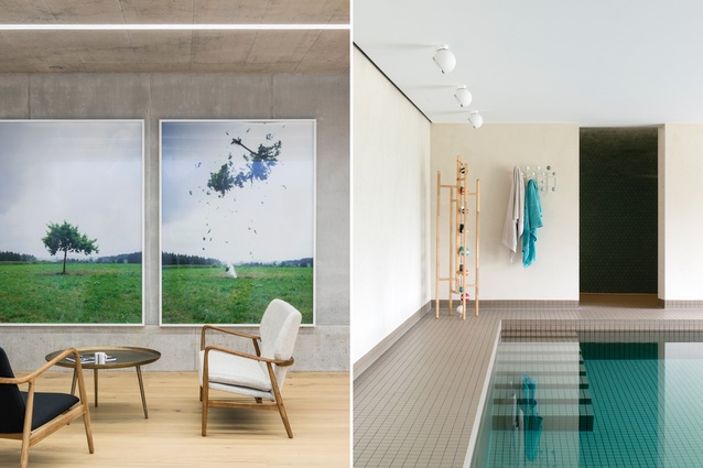
The entire extension was designed to be nearly invisible from the outside by building it underneath the garden. Artworks are by Michael Sailstorfer, and the chair and bench by Finn Juhl; the new pool area is part 
of the extension on the ground floor.

The entire extension was designed to be nearly invisible from the outside by building it underneath the garden. Artworks are by Michael Sailstorfer, and the chair and bench by Finn Juhl; the new pool area is part of the extension on the ground floor. Image: Christian Schaulin

6 of 11
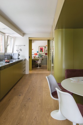
Organically shaped green kitchen fixtures allude to South American modernism of the 1950s. The juxtaposition of individual free forms with a floor plan was laid out with largely precise geometry.

Organically shaped green kitchen fixtures allude to South American modernism of the 1950s. The juxtaposition of individual free forms with a floor plan was laid out with largely precise geometry. Image: Christian Schaulin

7 of 11
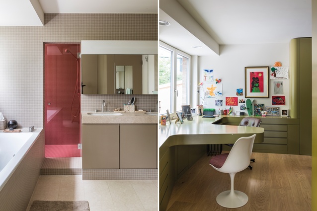
The master bathroom is on the first floor of the existing building; a small office is in the back of the kitchen.

The master bathroom is on the first floor of the existing building; a small office is in the back of the kitchen. Image: Christian Schaulin

8 of 11
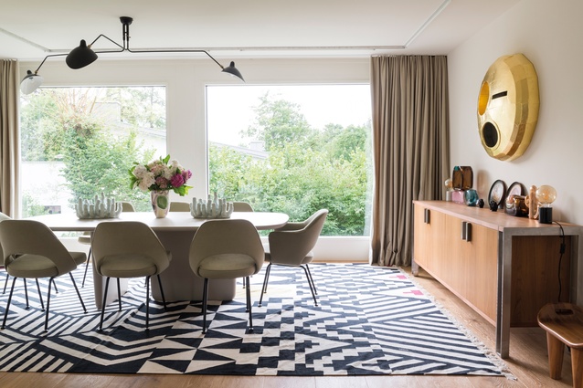
The dining area is located on the ground floor of the existing building, between the living room and the kitchen. The golden artwork, M24, 2015, is by Gregor Hildebrandt and hangs above  a vintage sideboard.

The dining area is located on the ground floor of the existing building, between the living room and the kitchen. The golden artwork, M24, 2015, is by Gregor Hildebrandt and hangs above a vintage sideboard. Image: Christian Schaulin

9 of 11
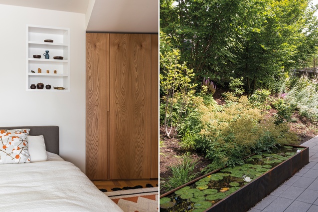
The master bedroom; the garden view (in front of the entrance area on the back side of the building).

The master bedroom; the garden view (in front of the entrance area on the back side of the building). Image: Christian Schaulin

10 of 11
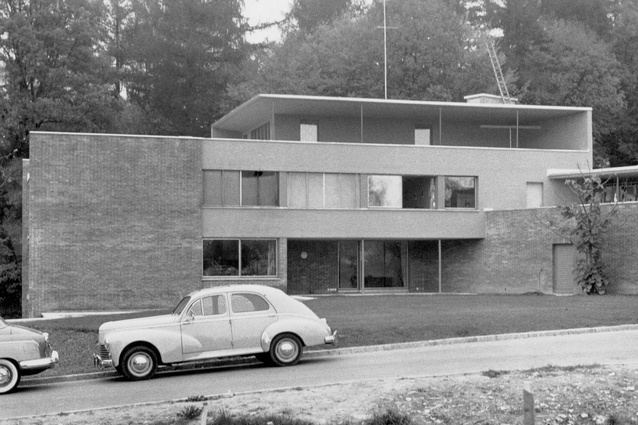
This black-and-white picture dates from 1956, when the main house was built.

This black-and-white picture dates from 1956, when the main house was built.

11 of 11

An art studio and underground gallery have been added to this stunning, Brazilian modernist-inspired, Zurich home for a highly creative couple.

Zurich-based art gallery owner Damian Grieder and his wife Melanie Grieder-Swarovski commissioned the services of Swiss architects Andreas Fuhrimann and Gabrielle Hächler on two occasions, a good 10 years apart. In 2006, the team converted the couple’s private residence in Zurich and, now, they have enlarged it considerably. The living space in the building has almost doubled during the course of an expansion to incorporate art studio and exhibition areas, and now amounts to around 700m2.

The building, which was erected in 1956, is a later work by Swiss architect Theodor Laubi and is clearly influenced by Brazilian modernism. “We liked the architectural qualities of Laubi’s design; they are revealed, for example, in the entrance façade, designed using concrete slats, or the curved staircase leading up to the first floor,” says Andreas Fuhrimann. “So, in our first conversion, a good 10 years ago, we wanted to highlight these clearly or even, if possible, enhance them.” 
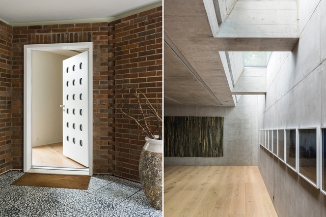
The main entrance is on the back side of the building and leads to the private rooms; cleverly positioned skylights plus dimmable LED bars recessed into the ceiling ensure the newly created lower level “does not feel like a basement” as Andreas Fuhrimann stresses. Image:  Christian Schaulin

Before the Grieder-Swarovskis acquired the villa, it had seen a number of different owners. “It was not in a good condition,” Grieder remembers; “nevertheless, the architectural quality was unmistakable. The clear geometry and clean lines sold it to us there and then. A gem of post-war modernism such as this is a rare find on Lake Zurich.” 

The architects agree: “Laubi positioned the L-shaped body of the building optimally on the plot, so the proportions and distribution of his design all add up,” says Hächler. 

In the first modernisation by the new owners, the architects stripped things back initially, removing inappropriate fixtures and additions (such as a garish double garage, which encroached on the garden area formed by the building) and, thus, made the quality of Laubi’s design visible once again. 
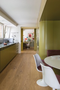
Organically shaped green kitchen fixtures allude to South American modernism of the 1950s. The juxtaposition of individual free forms with a floor plan was laid out with largely precise geometry. Image:  Christian Schaulin

On the other hand, they thought through the architectural elements and fixtures “in keeping with the house” as Hächler explains. “A typical feature of South American modernism in the 1950s was the juxtaposition of individual free forms with a floor plan that was laid out with largely precise geometry. With the design of the organically shaped green kitchen fixtures, for example, we deliberately followed this direction with the aim of enhancing this exciting contrast.” 

For 10 years, Grieder and Swarovski lived in the modernised villa with their very personal selection of furniture and art, until the decision was made to relocate exhibition spaces and the Grieder-Swarovskis’ art studio to Küsnacht. This prompted them to contact ‘their’ architects once again. 

“Our briefing was to create an extension for the art without losing the character of the house,” explains Grieder. “We wanted to gain sufficient work and studio space with a workshop, a storeroom and an archive, and to add exhibition spaces with a separate entrance.” 

This new wing had to be designed so that it could be made accessible to the public for special events without visitors having any contact with the private residential quarters. Fuhrimann and Hächler had the idea of making the entire extension invisible from the outside by building it underneath the garden – hiding it under the extensive lawn, so to speak. The steep topography means the new rooms enjoy a spacious glass frontage on the southern side and a separate entrance from the road. 

Cleverly positioned skylights plus dimmable LED bars recessed into the ceiling also ensure the newly created lower level “does not feel like a basement” as Fuhrimann stresses. On the contrary – thanks to the skylights that are set flush into the surface of the lawn – the daylight levels turn out to be ideal for the art. The selection of materials – plywood and painted blockboard for the fixtures, and floorboards made of solid Tyrolean oak – creates a homely counterpoint to the raw concrete that represents a nod to the underground nature of the project. 

The entire extension was designed to be nearly invisible from the outside by building it underneath the garden. Artworks are by Michael Sailstorfer, and the chair and bench by Finn Juhl; the new pool area is part of the extension on the ground floor. Image:  Christian Schaulin

This contrast between ‘rough’ materials left in their natural states and high-gloss surfaces is typical of the work of Fuhrimann and Hächler, and is reflected not only in their design of private homes but also in projects like exhibition stands and public buildings.

“In the beginning, Damian and Melanie were pretty sceptical, because the aesthetic of the extension is so different from that of the house,” explains Fuhrimann. “It’s more Mendes da Rocha than Niemeyer, if you like, but, ultimately, the ambivalence fits very well into the various functions – and into the couple’s lives.” 

Grieder, who is envisioning a salon function for the new section of the building, appears thoroughly satisfied: “We wanted to create a perfect work environment for Melli and a platform for cultural exchange – and the architects have achieved this masterfully with this extension.”

This article first appeared in Urbis magazine.

Subscribe here


More projects