Twinkling terrace: PerfPad
Through a series of simple but effective alterations Northbourne Architecture and Design has transformed an existing terrace house into a more functional, light-filled home with a luminous street presence.
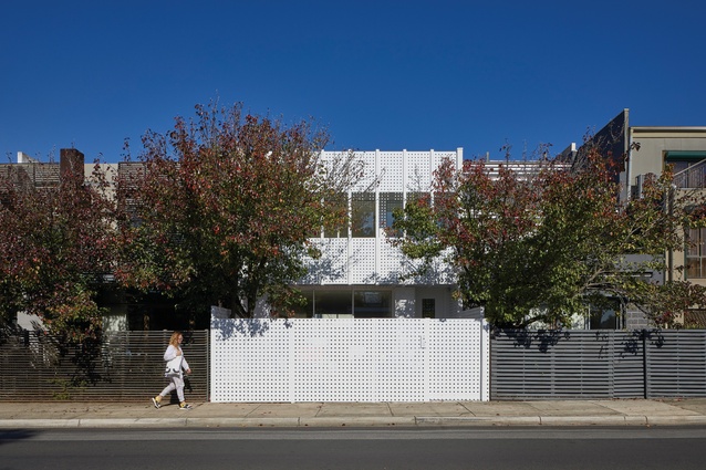
Northbourne Architecture and Design’s first completed architectural project sits comfortably nestled in a row of terrace houses down one of South Yarra’s narrow streets. While its white facade glows brightly among more subdued houses, its scale and form ground it comfortably within the existing streetscape. The building volume is very much in keeping with the character of the street, with expressed horizontal lines that tie it in with the datum lines of its neighbours.
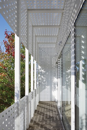
Although the scale and form are contextual, materially the house departs from the sombre and muted streetscape palette. Clad in bright white powdercoated aluminium sheets perforated with regularly spaced round holes, the facade presents as a crisp, minimal, all-white box. Compared to its neighbours, it’s quite abstracted as a form, with little to reference the human scale.
The only aberration to the rational, geometric all-white design is the existing tree in the front garden. This organic, snaking green form acts as a counter to the rectilinear, pure white facade and is almost as essential to the facade composition as the architecture itself. Both the tree and the architecture seek to highlight the features of the other through contrast, and together they give one another balance.

One would be forgiven for assuming that the project is a new build, given its contemporary, minimalist facade, but in fact it’s a renovation of an existing dwelling. The aluminium screens clad a pre-existing house. With the exception of increasing the first-floor building envelope by one metre, the building footprint is more or less as it was. The “before” and “after” plans make it obvious that the degree of intervention was fairly minimal and that much of the original structure remains intact.
The ground floor was essentially massaged through the addition of a row of joinery that separates the main living area from the entry, plus a new laundry and powder room. Other than that, little has changed in the plan.
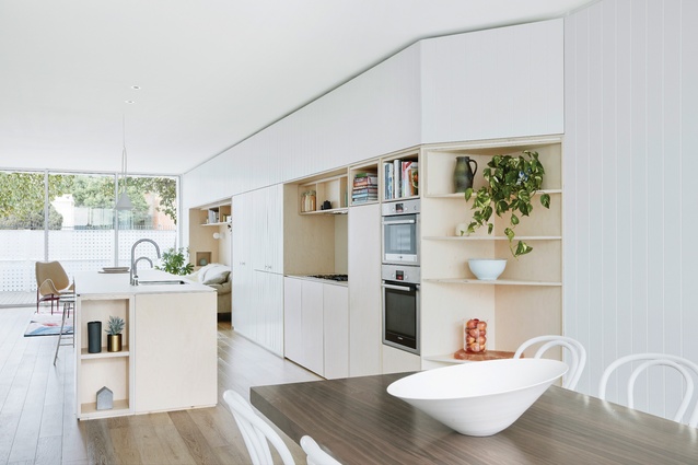
The kitchen, which has always been the hub of the house, remains centrally located on the ground floor with open space either side. The first floor, which has been extended with the additional metre toward the front, has had some slightly more extensive internal changes to accommodate an additional bedroom upstairs. However, the two rear bedrooms have changed little.
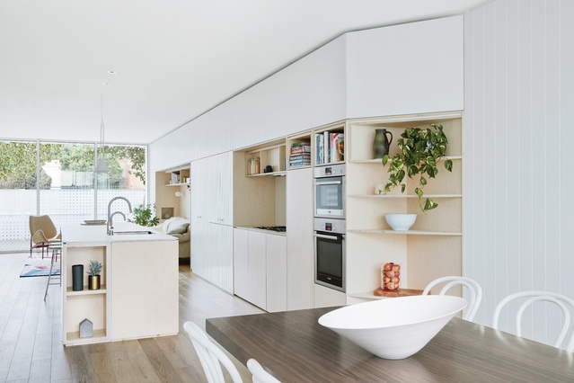
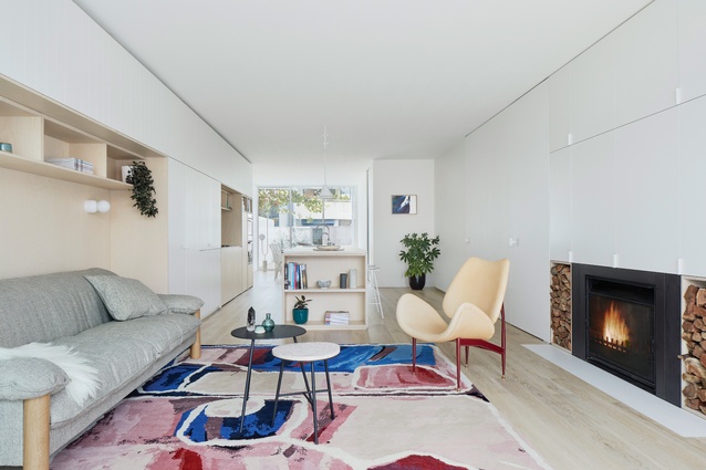
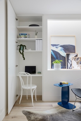
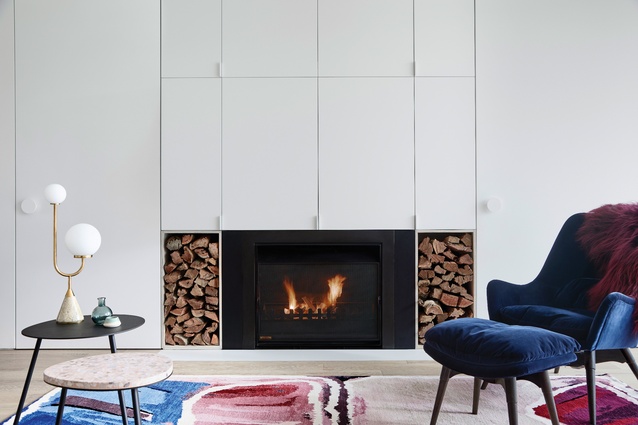
Although the plans reveal fairly limited intervention, the quality and feel of the internal spaces have been completely transformed. This is partly due to the updated joinery and finishes, which change the look of the house and add more functional storage.
However, it’s the simple spatial massaging that fundamentally changes the bones of the dwelling and gives it new life. New full-height glazing has been introduced to both ends of the open living area on the ground floor, providing vastly more light than the former heavy timber-framed French doors. A timber deck has been added to the front of the house, which has been significantly raised above the natural ground level to finish flush with the internal floor.
Given the fence height, this courtyard is protected from the street and makes for a highly useable private outdoor space. This new outdoor room extends the perceived length of the living space and offers a much more successful indoor–outdoor experience, transforming the daily use of the living area. The continuous line of kitchen joinery extending to an external barbecue unit also helps drive that visual flow and connection.
The new joinery unit opposite this houses the television unit and additional storage. More importantly, it acts as a dividing element to create the separated entry, which is now hidden behind a concealed pivot door in the joinery. This new entry made it possible for the owners to use one of the bedrooms upstairs as a consultancy room. With an enclosed entry, the owner’s patients can now access the consultancy room without any visual connection to the private family living zone.

Upstairs, other than the additional bedroom, it’s the main bedroom that has undergone the most radical transformation. The original bedroom turned its back on the street and suffered from a lack of daylight. In contrast, the new main bedroom reorients the bed toward the windows.
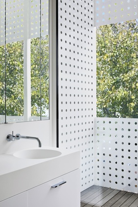
Facing onto the only new external wall in the project, full-height glazing opens up to an outdoor terrace, inviting fresh daylight to stream in, filtered and reflected off the perforated screens. The bedroom and ensuite hang in the canopy of the existing tree and this greenery both enriches the outlook and provides privacy screening and shading to the main bedroom.
The alterations to this existing terrace are highly efficient. Maximum impact has been achieved through small but clever and strategic interventions.
This article was first published on architectureau.com

