Understated style: Sheppard Wilson House
Sam Crawford Architects has restored and extended a weatherboard cottage towards views of a heritage-listed Moreton Bay fig tree in the backyard.
There’s an understated quality in Sam Crawford’s residential projects that makes them appear all the more stylish and elegant. The Sydney-based principal of Sam Crawford Architects doesn’t believe in bells and whistles and his signature thoughtful approach primarily focuses on the client’s comfort. Homes need not make flashy architectural statements; rather they can be intelligently designed places for everyday living, as his recently completed addition in Sydney’s Bronte attests.
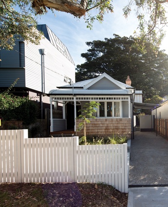
The project’s modest existing weatherboard cottage is one of the beachside suburb’s original houses. When clients Neil Sheppard and Emma Wilson first approached Sam it was with a relatively ambitious brief calling for an extension that would accommodate two kids’ bedrooms, at least one guestroom, a study, an open-plan living space and a kids’ area.
Because they didn’t have any preconceptions, Sam was free to explore different ideas; however, it was clear that there was only one solution. “With most clients we’ll suggest a soft transition to the rear that’s in sympathy with the existing house, but in this case the brief called for something larger than could ever be accommodated in a form that would sit easily with the cottage,” he says. “So we did something completely different and set it a long way back from the street.”
The cottage is in one of a number of Waverley Council’s Heritage Urban Conservation Areas and while the new two-storey addition complies with the presiding height restrictions, it’s still generous in scale. This generosity of proportion is balanced by the massive Moreton Bay fig tree at the western rear of the property and the hulking three-storey neighbour on the south. It ensures that the addition is not out of place and is resolutely mindful of its richly eclectic suburban context.

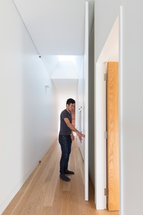
A sense of cohesion between new and old was also of visual importance to the overall scheme, so first Sam renovated the existing cottage to near-original condition. The refurbishment not only restored the structure, but also helped meet the brief’s programmatic requirements. He divided the large front room into the study and guestroom and inserted a new bathroom in between. A discreet bifold door in the corridor can be used to zone this area from the rest of the house, providing guests with privacy.

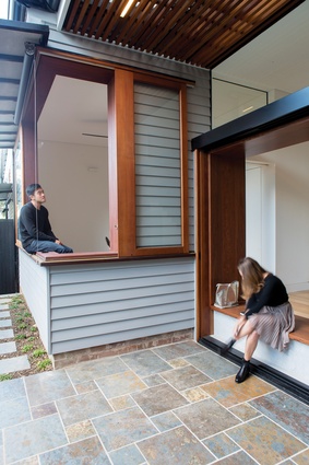
It’s a logical plan that aligns rooms on the northern side with the corridor running east on the south. The corridor’s side wall is original, retained closer to the boundary than Sam was permitted to build. Tucked neatly behind the guestroom is the kids’ area/TV room that sits within the cottage’s original footprint and abuts the courtyard. “We always try to incorporate a courtyard space that’s facing north and can be opened up. We thought it would be nice to have a table here and use the large window as a bench to sit on. And the windows [of the TV room] also open up the whole corner of the cottage,” Sam explains.
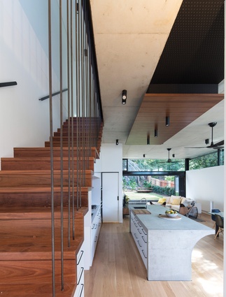
This transitional zone gives rise to the threshold between the existing structure and the new addition, in which the corridor cleanly “extends” into the stair. Sam introduces ironbark to the material palette and uses it dynamically yet judiciously to contrast with the oak timber flooring. Applying the darker timber to the stair, three-step threshold and large window reveal creates definition and visual intrigue in a zone that would have appeared washed out without such material accents.
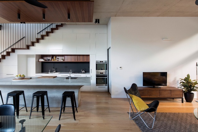
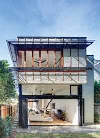
An expansive, light-drenched open plan characterizes the addition’s living areas. The space is minimal and clean, heightened by a three-metre-high ceiling and a deliberate lack of embellishment. A custom concrete kitchen island installed below a spotted gum panel feature, plus blackened aluminium window and door frames, anchors the space without detracting from the view.

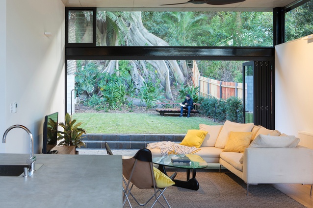
The rear wall’s full-height glass doors welcome the outside in and frame the heritage-listed Moreton Bay fig tree. “That tree is the biggest, most impressive part of the site,” says Sam. “And because of the hill behind it, it gives [the plan] a beautiful sense of spaciousness.” The large glass doors also capture as much sunlight as possible during the winter months (along with the high row of north-facing windows), while the tree serves to shade the house during summer.
Sam uses passive design to great effect in order to avoid airconditioning. The ceiling’s concrete slab keeps the upstairs bedrooms cool, as do the reverse brick veneer and discreet sunshading. A central circular skylight offers the bedrooms and bathroom another source of light, which reduces glare on the brightest of days. The overall scheme is quietly hardworking – it’s a home that is both relaxed and comfortable. Sam’s attention to detail is strong, but nothing in the renovation or addition is laboured, making for an interior that is as well crafted as it is inviting.

