An agile workplace
If we believe the adage that doctors make the worst patients, what must it be like to undertake the fit-out for your firm’s own office space? Sarah Langford of Unispace Auckland knows first-hand, and the result has been an unqualified success.
“It was a little bit daunting, but incredibly exciting at the same time. This was the opportunity to use ourselves as a case study; so we were very focused on not just creating a great workspace but also on getting a comprehensive understanding of the entire process first-hand, and from the client’s point of view.”
Langford says the concept design began in November 2014. “I began the process with a workshop for our executive team. What did they want to achieve, in terms of the business and the brand? And that’s how the idea of ‘agility’ came about – we wanted Unispace to genuinely be a leader. I’m not sure any other design firm has been brave enough to do to themselves what they’ve done to other people, and actually explore what that means properly.”

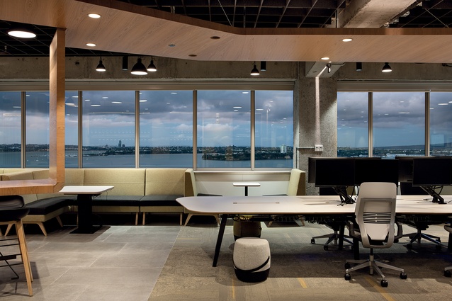
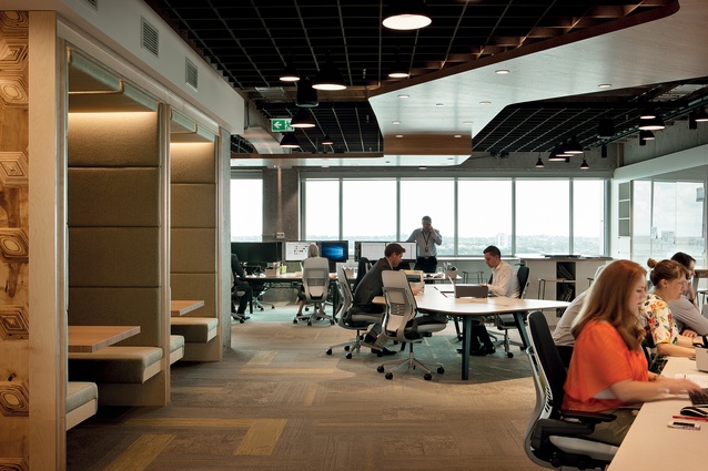
In terms of physical practicalities, there were two mitigating factors: the constraints imposed by the (HSBC House at 1 Queen Street) building’s traditional floor plate and services and the desire to make the most of the harbour views. The rectangular office floors have part-height glazing of about one metre from the floor on all faces. Unispace is on the 16th level, with impressive views out over the Waitemata Harbour.
Langford says, “It’s not the most up-to-date building in some terms. We’re on 450m2 with quite a traditional floor plate. There were low, suspended ceilings. The windows are not floor-to-ceiling – but actually we love that. I wanted to turn those factors into positives.”
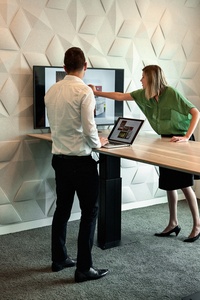
Internal partitions were removed and the suspended ceiling was stripped out and replaced with a waffle-like Autex acoustic grid. It looks quite light and permeable, but it actually has more surface area – and therefore more acoustic dampening capability – than a standard ceiling. The lattice-look design allows flexible configuration of overhead lighting, and easy access to services and wiring.
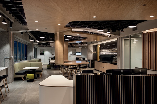
Upon entering, the overall impression is how very ‘un-office-ish’ the space is. “The idea of hospitality is one of the key philosophies at Unispace, so we put the gathering and social spaces right up front,” says Langford.
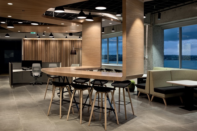
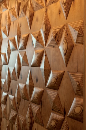
Harbour views notwithstanding, the visual focal point is a sculptural timber feature suspended over, and winding through, the entire space. Langford designed the component, which was manufactured by Hansen’s joinery from sustainable New Zealand hard oak and American white oak, with a white transparent wax. Part of the sculpture appears to droop down to form a table surface just behind the reception desk and in the centre of the social area.
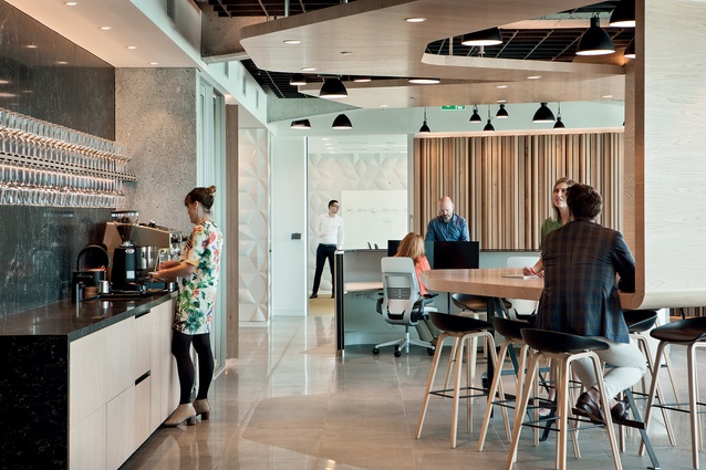
Anchored by a wet-bar and barista-style coffee machine, this social space is used for lunch, after-work drinks and informal meetings. On the exterior walls of the reception area a continuous desk-level work surface sits just under the windows. This transitions to banquette booths – suitable for eating or working – in the hospitality area just behind.
Moving through the office, there’s a seamless but inferred transition from the public/social zone through to the private/work zone, and then on to ‘invited spaces’. Langford explains, “In terms of workspace design, we felt like the pendulum had swung a bit too far in favour of the individual.
At Unispace, we believe the power is in the team – in bringing individuals together and what they can achieve collectively. The whole is greater than the sum of the parts. And, let’s face it – most people come to work to be with other people, not to spend eight-plus hours a day all alone.”
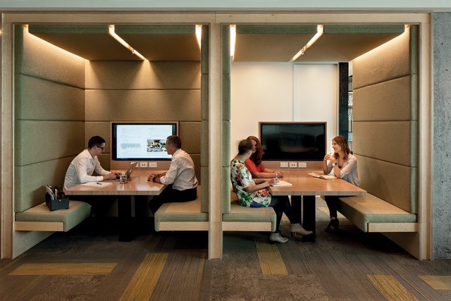
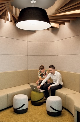
Based on internal workshops, the concepts of agility and collaboration emerged as essential drivers, and set the tone for all other decisions. The variety of seating configurations reflects this: ancillary spaces cater to small or large teams, presentations or collaborative discussions; and quiet zones provide retreat space for focused work.
“We came up with our own take on things, which we call the ‘liberated team environment’, Langford explains. “We created a variety of spaces where teams can form and work together. You can dock next to one person for half the day and work on a project together, and then easily pick up and join a different, larger group in another part of the office.”
Tucked into the core of the office, near the supply and service area, a bank of lockers with white-board doors provide every staff member with storage space. Each is fitted with B-code locking (swipe tag), and a charging station for devices. A slot allows post to be dropped through.

“Everyone has a tote,” Langford explains. “It’s a place for your office supplies and files. In the morning, you take it to where you sit with your laptop; and at the end of the day you put it all back in your locker. Clean desks, every night! “I believe that we might be the first design company to go clear-desk and fully agile – totally non-assigned.”

A number of satellite rooms are positioned around the central space. Just inside the front entrance, a large conference room – ideal for presentations and brainstorming sessions – takes in the harbour views. ‘The Sanctuary’ is the smallest, nearly-soundproof quiet pod. “It was essential to provide the opportunity to escape, focus and create, with no distractions,” Langford explains. Like the larger presentation room – and any of the other spaces – the Sanctuary can link directly with any other of Unispace’s 35 global offices, if needed.
Further into the office, more ‘quiet pods’, and smaller meeting areas cater to all types of group work. All these areas are equipped with touch screens that push content from computer to the screen wirelessly, just by entering a code. The booth-style seating areas are the most popular, Langford says.
“Our executive team used to work out of offices. Now they work fully agile, but of course there are times when they need privacy, so they can retreat to the ‘premium lounge’ – it’s the farthest space from the front entrance, and includes a wet-bar and an en suite.
Beyond furniture and fittings, “We tried to mitigate every complaint that people might have with an agile, paperless-as-possible, clear-desk work environment; and kept flexibility and future-proofing as a priority.”

