University of Auckland: Arts 1 redevelopment
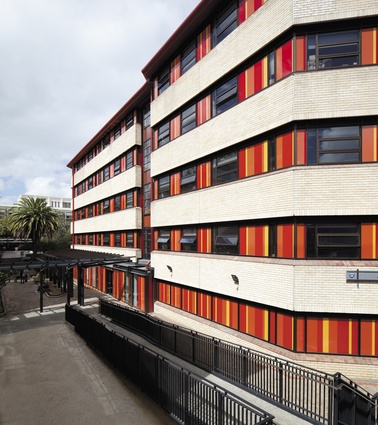
Building 206 or Arts 1 was designed by Ivan Mercep of JASMaD in the early ’80s and it reflected the idea, current at the time, that education occurred in a village not a city. The building is decidedly domestic with a brick façade and hip roofs of concrete tiles. The various arts departments (English, European Languages and Literature, Drama) each had their own floors, their own receptions and their own teaching rooms.
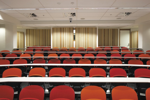
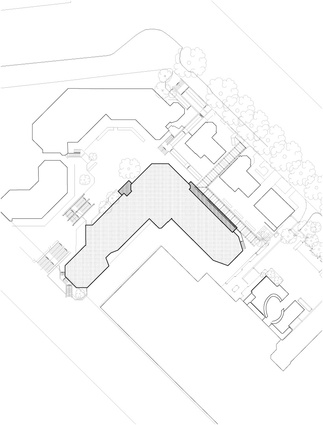
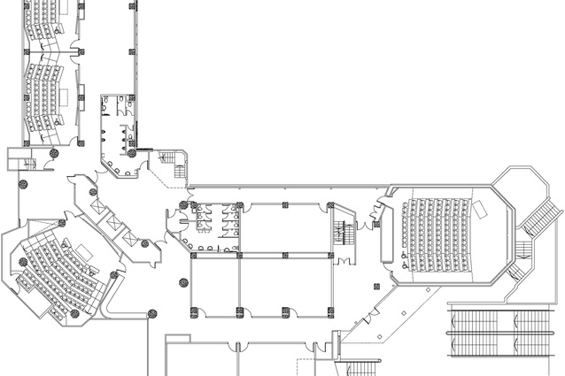
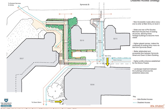
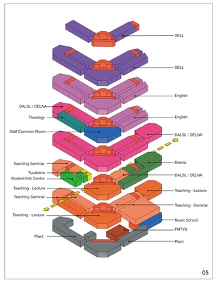
RTA Studio was commissioned to refurbish the building and it is testament to the team’s skills that they have done it so seamlessly, making it hard to identify what is existing and what is new. They have cleaned up the address, establishing one main entrance (there were four on different floors) and clarifying the circulation. All the teaching spaces have been brought down to levels 2 and 3, freeing up the upper floors for departmental offices. The building has two narrow wings off a central fulcrum, which houses the lifts and, awkwardly, some offices. These offices have gone from the lower floors, replaced by a cunning 80-seat lecture room at one level and the staff lunch room on another.
Seminar rooms have been updated and, where they were once faced across a narrow corridor by offices, the space has been opened up to provide break-out spaces for students. On the office floors, one side of the corridor has been left largely untouched while new standardised offices have been built on the west side, with glass interior walls to bring borrowed light to what was once a dark corridor.
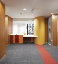
There was a mix of square and hexagonal columns that have been turned into circular columns and tiled to match the existing sensibility of the building and provide consistent signals, floor-to-floor, for wayfinding. Timber panelling of American White Oak and Silver Beech warm the interior.
This is a carefully considered refurbishment that honours the intent of the original but effectively updates it to suit modern ways of teaching.

