University of Auckland: University Hall
Student hostels were once a first-year rite of passage and the place to go until you were ready for flatting. With the increase in numbers of international students, spaces are very much in demand and the expectations of students have increased, particularly with regard to the quality of the spaces they are paying for.
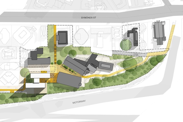
Warren and Mahoney (WAM) worked on the masterplan for 400 South, which extends from Elam along the ridge to Grafton Bridge. Over the last ten years, a series of mean and ugly tower blocks designed to conform to the town-planning controls have broken out like acne pustules on Symonds Street. They have stolen the march on the University which has lately come to the party and now understands its commitment to providing quality accommodation for students.
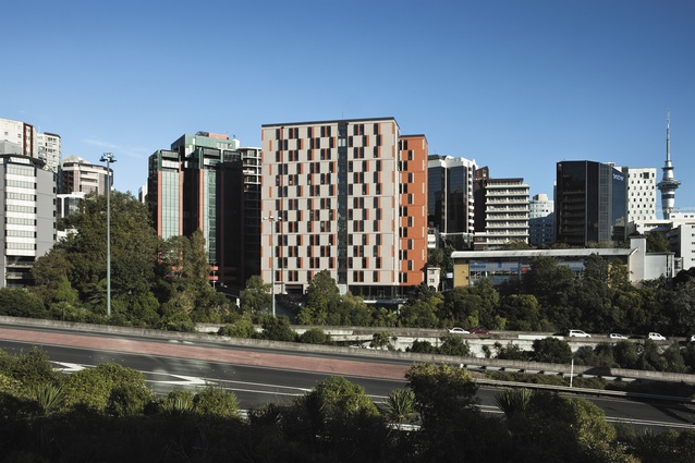
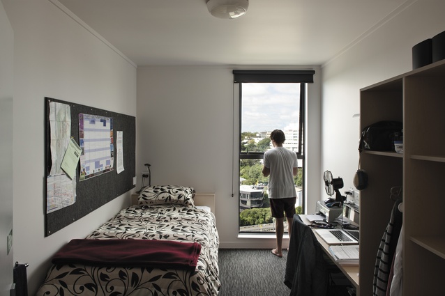
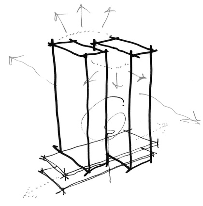
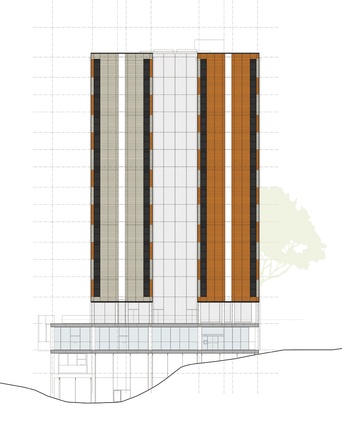
The first major project is University Hall to the south of Elam and protected from the edge of the motorway by a wall of trees. WAM has designed two tower blocks housing 422 students, separated by common areas and lifts. The blocks are not directly aligned, allowing views from all the rooms. The rooms themselves were designed as pods that were prefabricated offsite in Matamata and craned into position. Three floors of pods were stacked on top of each other between concrete slab floors and they came completely finished, including electrics, built-in furniture, doors and windows.
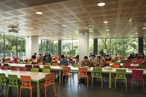
Each floor of accommodation has its own shared space with floor-to-ceiling windows, couches and a kitchenette. The lowest floors are almost completely transparent and house the building’s entrance, the kitchen and dining hall.
The building is clad in German terracotta tiles in mixes of grey and orange and, with the alternating window placement of the rooms, becomes a graphic tessellation, a two-dimensional exercise, where some exploration of a third dimension might have provided some relief. In this, it shares with its cousin Te Puni at Victoria University in Wellington (designed by Architectus) a flatness that risks being deadening, in spite of the graphic treatment. This is alleviated by the pleasant shared spaces, bounded at the lower levels by greenery and the stunning views from most of the rooms.

