Urban opportunism: Albert Park House
Behind a rebuilt heritage facade, this home by Ha offers ample daylight and a rewarding journey of spaces, from a clever sunken living area to a rooftop terrace with city views.
A blue-chip site with a heritage overlay, unforgiving dimensions, an ambitious brief from an owner-builder client and a set of onerous council restrictions – on paper it’s the kind of project that’s ripe for reality television exploitation. But in the hands of Nick Harding of architecture practice Ha, these potential pitfalls have been navigated with aplomb to create an inventive addition.
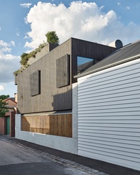
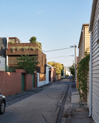
Located in Albert Park, in Melbourne’s inner south, the site is at the junction of two lanes devoid of both trees and footpaths. Tightly packed terraces open directly to the street, a curiously gritty remnant of British planning that intensified the usual challenges of introducing light and views while maintaining privacy.
The first major obstacle to overcome, however, was satisfying the client’s desire to have a rooftop garden terrace within strict heritage regulations. As it happens, reality television came to the rescue when the council established a precedent by approving a rooftop terrace just down the street for a well-known renovation program project.
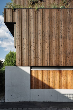
On its tight laneway corner, the dwelling takes on what Nick calls a “wedding cake approach,” its form stepping in and out where required to accommodate the building program and onerous setbacks. Careful incisions admit light wherever possible. The new form’s beautifully realized concrete walls are playfully balanced with the lightweight weatherboard of the original dwelling, creating a dialogue between old and new in the laneway.
Above, timber cladding and battens have been rendered black and laid in a series of “embossed” patterns that change subtly between floor levels and across fenestration. The stepping of the form also accommodates a series of hidden planter ledges that, even in the middle of winter, provide an important softening of the facade. This is a difficult dance and one that the building pulls off without a misstep.

The design had initially placed the sleeping quarters on the ground floor and the living areas on the upper level to capture any potential views across the rooftops. But when a third level became a possibility, this thinking was flipped. The project still needed to satisfy the council’s height limitations, however.
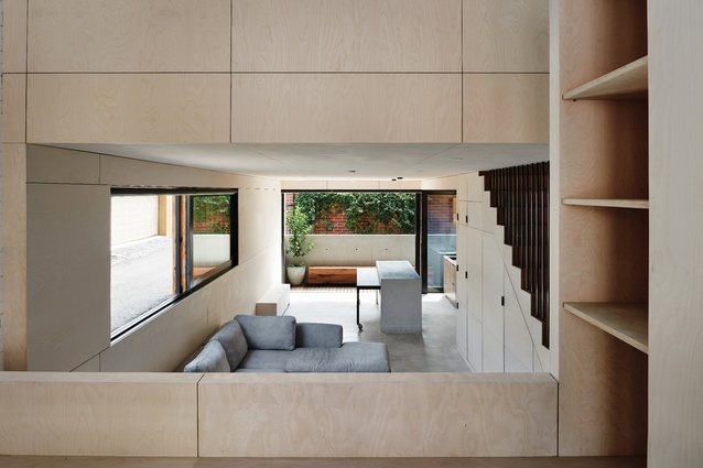
Not to be deterred, the architect and client decided, boldly, to sink the living zone below ground by nearly a metre (bold given the proximity to Port Phillip Bay and the known high water table) and effectively construct a swimming pool shell to house the main living area.
Behind the rebuilt heritage facade, the traditional front room has been cleared out for a flexible study space, and the old plasterboard walls and ceilings have been done away with in favour of painted lining boards and a cathedral ceiling, which notionally mark the extent of the original dwelling. The spaces flow easily around a curious bank of cabinetry that cleverly hides a compact toilet complete with glass roof and concealed exhaust system.
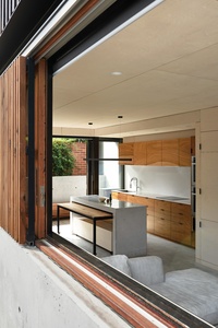
Down a small flight of concrete steps is the living zone, where the concrete shell is celebrated rather than built over. It forms a concrete dado that rings the walls, complemented by a lovingly crafted concrete kitchen bench designed down to the millimetre, housing a moveable table that can be slid in to become a breakfast bar or out to host a dinner party. Despite being sunk into the ground, the space does not feel subterranean.
Sliding glass doors beyond the kitchen open to a narrow courtyard that backs onto a metre-deep easement, borrowing space and introducing ample light. Only a long window in the lounge gives away the difference between the site and laneway levels. This sliding window, with its sliding screen in pale timber, has you looking at the shins of passers-by in an unexpected gesture of openness that enriches the laneway experience, but has also formed a short circuit in getting to know the neighbours, who regularly stop at the window for a chat.

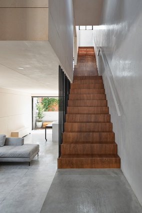
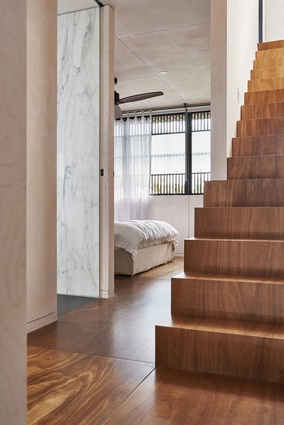
Sitting above the dado of concrete are pale, poplar-faced plywood panels. These are used throughout the interior, precisely cut and fitted in lieu of plasterboard – the client requested a durable palette of finishes that eliminates plasterboard wherever possible. A beautiful example of the use of polished hard plaster is the wall that lines the stairs, which uses marble dust taken from the installation of the bathrooms. This shimmering wall, and its similarly highly crafted plywood stair, lead to the mid-level bedrooms and bathrooms.
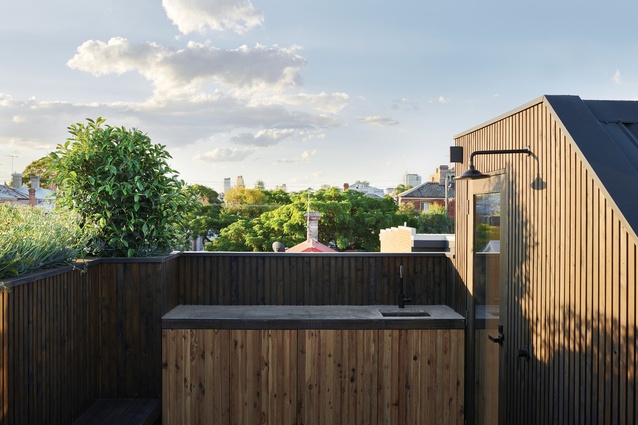
These rooms are pragmatically planned and finished in the ply panelling, with a suite of clever niches to maximize storage developed on site. On the third level is the roof terrace, a simple and robust timber-clad space with a built-in barbecue and all the other essentials for a long summer’s day, not to mention the stunning views that the project fought so hard to obtain.
As good as the views may be, the great reward in this project is found in experiencing the series of carefully composed spaces and opportunistic “moments” of borrowed light that have made the most of this incredibly tight and complex site. To trot out a well-worn cliché, the reward is in the journey and not the destination.

