Venice 2014: Vernissage day three
A daily account of the movers and shakers at the opening of the 2014 Venice Architecture Biennale by Grace Mortlock, ArchitectureAU reporter at large.
By day three of the Vernissage, you are sleep deprived, weary worn, hungover and hoarse. So of course the only thought in your mind is to dive once more into the Biennale, in search of the pavilions that have evaded your attention. Day three also brings the jury’s selections for the prestigious Gold and Silver Lions. As everyone rushes to catch their last glimpse of this Venetian mega-show (damn, I must have missed Korea!) there is a frenzied feeling in the air. On Saturday the Biennale opens to the public hordes – no place for fragile writers. Here is my final power rankings for Fundamentals. Thanks for reading.
Power Rankings: Day three – The wrap up
1. Phyllis Lambert (founding director of the Canadian Centre for Architecture)
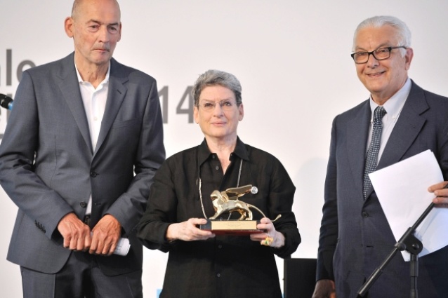
If Lambert’s Gold Lion for lifetime achievement was a no-brainer, it was also something of a surprise. After all, we’ve become accustomed to seeing prominent female architectural personalities overlooked (Denise-Scott Brown, anyone?). As founding director of the Canadian Centre for Architecture, Lambert has built one of the world’s most comprehensive architectural collections over the past thirty five years. Switzerland’s exhibition borrowed heavily from her archives, unearthing obscure material from Lucius Burkhardt and Cedric Price, and presenting it for public view. Lambert is awesome. She has always had my vote.
2. French Pavilion (Modernity: Promise or Menace?)
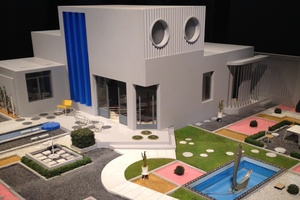
If architecture and cinema are the parralel strands of the Biennale, France’s pavilion brings them perfectly together. The centrepiece of curator Jean Louis-Cohen’s exhibition is a large scale model of the house from Jacques Tati’s film “Mon Oncle”. The unpredictable behaviour of Tati’s house is used as a parable for Modernity, as is the Cité de la Muette housing complex, converted into a concentration camp during World War II. Many pavilions address the complications of Modernism, or its unsung benefits. Few portray its dualities as effectively as the French. A well deserved commendation from the Biennale jury.
3. Korean Pavilion (Crow’s eye view: The Korean Peninsula)
When I belatedly visited the pavilion, an angry German man (irony?) was storming around, accusing the poor attendants of glorifying a dictatorship and brazenly displaying propaganda. Incredibly, this convincing performance was not part of the exhibition. Winner of the Gold Lion for best national participant, Korea took the opportunity of “looking back” encouraged by Rem to explore the pavilion’s origins as a display space intended for both North and South Koreas. While North Korea’s architects were unable to contribute to the exhibition, their Southern compatriots provide a magnanimous (if dense) exploration of architectural developments on both sides of the border, hopefully anticipating future reunification.
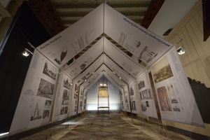
4. New Zealand Pavilion (Last, Loneliest, Loveliest)
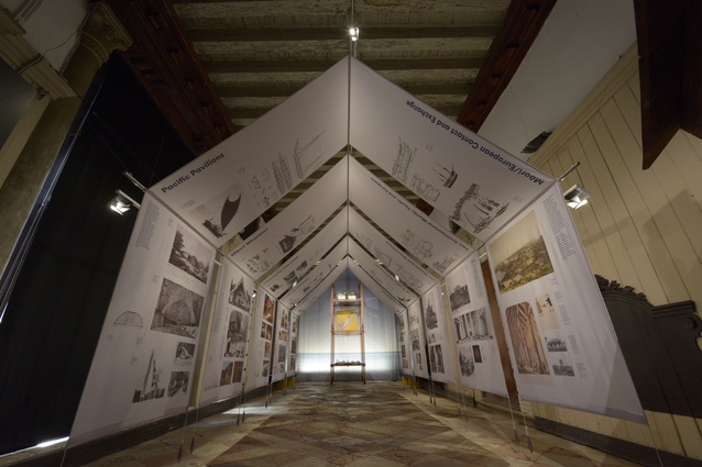
Entitled “Last, Loneliest, Loveliest”, the New Zealand exhibition is at least two of those three things. Awaiting the intrepid architect, this difficult to find, off-site pavilion is tucked away in the back streets of Rialto. New Zealand’s inaugural Biennale show explores the links between Maori and Pacific architecture, colonialism and Modernity, while simultaneously setting up an aspirational view for the country post Christchurch earthquake. At the exhibition’s entrance, the Auckland War Memorial is lodged within the maw of a traditional Maori storehouse, like an Imperialist English ship in an exquisitely carved bottle.
5. Andres Jacque (director of Andres Jacque Architects/Office for Political Innovation)
The Spanish pocket rocket conquered yet another architectural exhibition with his installation, “Sales Oddity”. Splicing TV footage and animated graphics together, “Sales Oddity” pushed the boundaries of architectural representation to the Pop event horizon. Jaque’s subtle critque of consumer culture contrasted with the excesses of the Spanish Pavilion, dedicated to grandiose interiors, grossly inappropriate in a time of national crisis.
Not ranked
-
The first six-month-long Architecture Biennale – double the running time, double the costs for most exhibitors. Unclear yet whether an innovation or anomaly.
-
The Venetian Regatta – for closing the entire Grand Canal to vaparettos on the day of Superscript’s events at the Arsenale.
-
Bjarke Ingels Group rooftop party – amount of advertised rooftop space: 100%. Amount of actual rooftop space: 15%. Remaining hot, crowded apartment space: 85%. Number of guests: 150% of capacity.
-
Politics – from the Korean DMZ to Pinochet’s Chile to Berlusconi’s media empire, the selections by this year’s jury took on a distinctly political bent.
-
Books – making a comeback this year, if my added 8.6 kilograms of luggage is any indication.
-
Pierre de Meuron – he told me that he plans to visit Australia next year. “Risk” conference, anyone?
-
Antartic Pavilion – “Icy impenetrability and absolute silence of the game. Antartica as an ideal place to play chess.” Well said, Alexander Brodsky.
-
Peter Eisenman – when you stated that this Biennale signifies the end of Koolhaas’s career, were you aware that your own ended at least ten years ago?
-
The Venetian Mayor – did the Mayor get arrested last night?

