Vernon Townhouses remembered
The ’80s was a time of bold, colourful expressions in architecture and across all facets of our lives. Pip Cheshire of Cheshire Architects recalls one of his additions to the built environment from those halcyon days.

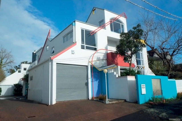
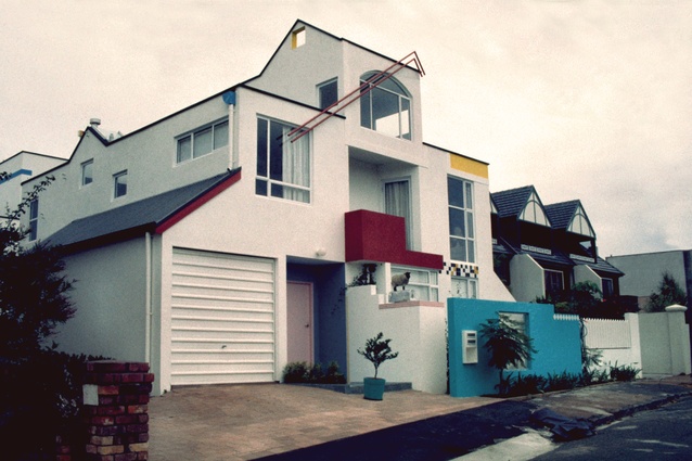
It was supposed to be a villa alteration, carefully designed and drawn by Mal Bartleet, but on day one so much bora was uncovered that [owner] Robin Vernon obtained a permit and torched it. ‘Gone by lunchtime’, in those days before the dead hand of Residential 1 zoning. Mal was at the airport, off on the grand tour, and I am not sure how I got an empty and smouldering tabula rasa in Freemans Bay. I would like to think Robin and his wife Penny had a say, but it might have been Bossley and I tossing a coin1.
The design was born of a furiously angst-ridden reaching out, in all directions without favour – photos of the inside of Corbusier’s Maison Ozenfant, Penny and Robin’s turangawaewae on the Waikato coast, Eisenmann’s early houses, the Pacific presence in pre-gentrified Ponsonby, Megson’s Wood Street houses – and a rising sense of response to context and the neighbours, though many still dispute that.

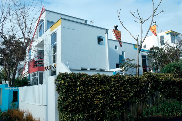
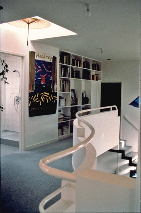
There are two units on the site, the streetside one designed for Penny and Robin and the back one, intended for resale but claimed by Robin’s mother late in the piece. Despite eleventh-hour replanning to include a lower-level bedroom, I found her on moving day dragging her mattress up to the third-storey eyrie and its view over the city. I added a bathroom inside a corrugated rooftop water tank, later, to complete the facilities up there.

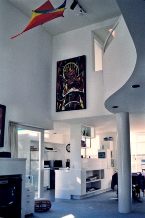
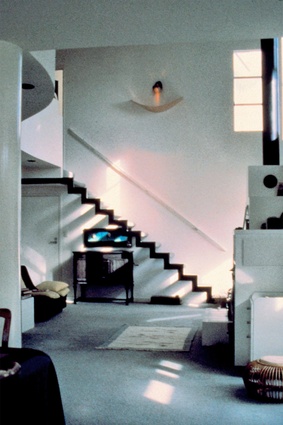
The double-height volume just off the street, that homage to Ozenfant’s studio, was the centre of the project, the focus of a lively extended family, and filled with the art and artefacts of a rich life. There are probably too many architectural moves: the piano-curve mezzanine, cantilevered stairs, free-standing column, the ‘look, no hands’ corner, and a recurring motif of boxed and cubed storage and dividing walls.
If this eclectic melange had any quiet moments, they were revved up by an Allen Maddox piece, full of Penny’s beloved saturated colours and Robin’s wryly whimsical constructs. On completion, I was continuing a long and fiercely contested discussion regarding window placement with Penny’s mother. At a critical point, she leant against a door – carefully detailed by Greg Boyden to be invisible. It swung open as one of Robin’s concealed mechanisms clicked into action, and she disappeared into a bathroom concealed within, amid lingering snatches of Sinatra’s ‘My Way’.
I love the project still, and cherish its making; it marks a time when all involved – architect, clients, and even the city – were experimenting. We were reaching out to a wider world from a nascent, urban identity, free from the previously accepted canon of deference to landscape being the defining determinant of our architecture.
1. At the time, Mal Bartleet, Pete Bossley and I, along with Amanda Reynolds, were working under an umbrella group called Artifice Studio.

