Viewfinder: Emma Smales’ top five
Auckland-based photographer Emma Smales delights in light, form, material and the experience of a space, both public and private. She shares some of her favourite images with us.
Tell us about the images you selected. What makes these projects your favourite?
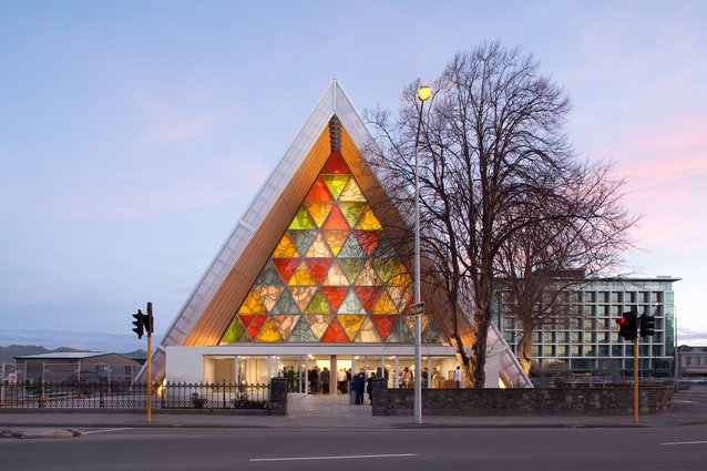
Emma Smales (ES): 1. Firstly, the Cardboard Cathedral by Shigeru Ban. Shigeru Ban is an innovator and humanitarian, a world-famous architect, so I was naturally excited for the shoot. My mentors in the UK asked me to photograph it for VIEW Pictures, an architectural image library, which meant a lot and was certainly a good motivational push. The images have since been published worldwide, including in The New York Times.
The Cardboard Cathedral was a symbol of hope after the Christchurch earthquake – the first civic building to be completed. There is a feeling of peace in and around the building, and I think this is attributed to the lightness of the architecture.
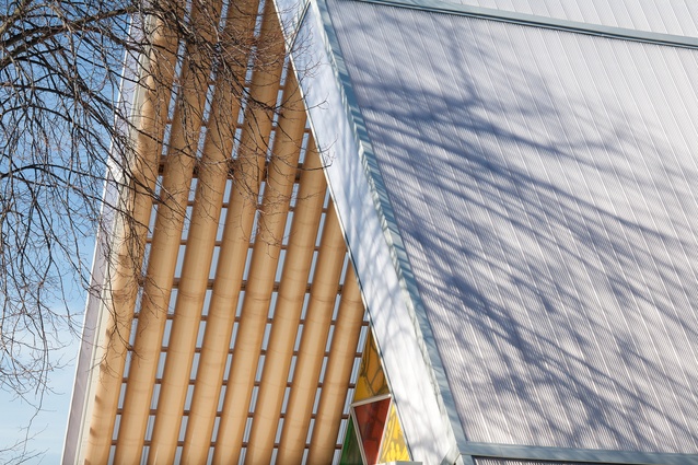
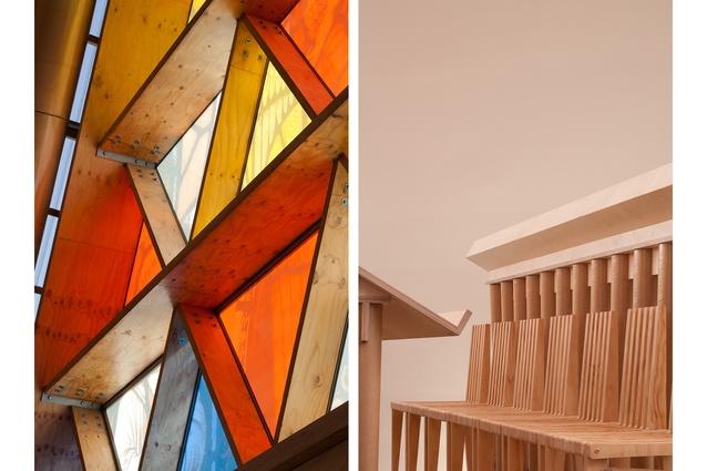
The coloured glass has a direct link to the original cathedral through the motif and is pretty and vibrant. I like the way the glass contrasts with the wood while also absorbing the coloured light. I love the simplicity of the pews and how you can see every detail of the plywood and cardboard tubes. The early afternoon shot of a tree and its shadow on the roof, to me, shows the healing touch of nature, and the dusk shot is a bold representation of faith and community.
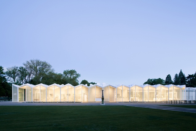
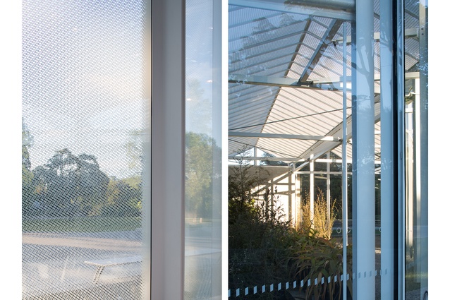
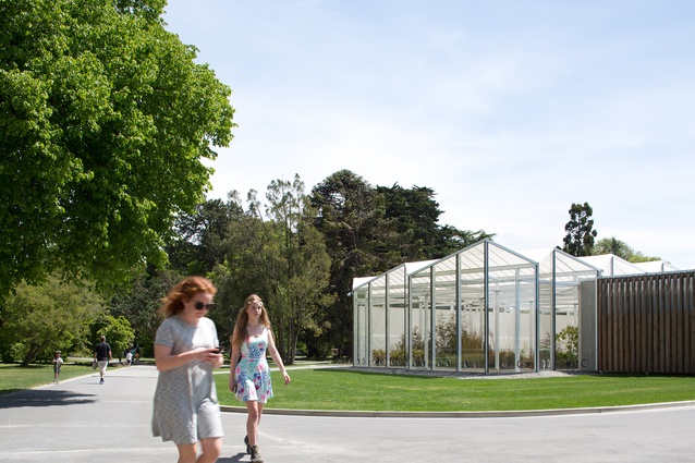
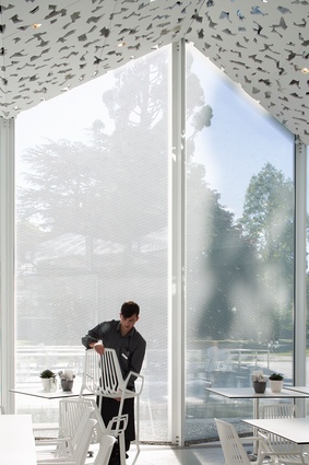
2. I chose the Christchurch Botanic Gardens Visitor Centre by Pattersons Associates Architects because I’m a fan of Pattersons, so having the opportunity to photograph a public building by a renowned architectural firm was meaningful to begin with. It’s such a delightful space. When you’re there, you keep thinking how lucky people are to work here and how fortunate the public is to be able to come and enjoy this architecture; the whole shoot felt incredibly positive.
It’s in an extraordinary setting where you walk to the building through the botanical gardens, so nature and architecture are equally on show. The images I’ve chosen reflect my personal experience of the shoot over a few days. A bright summery image with people, building and trees taking equal space. Looking out and in through the impressive glass – with its gorgeous fine pattern. Documenting the changes in light and time as a cafe worker packs up. There’s an overall feeling of transparency and belonging.

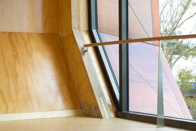
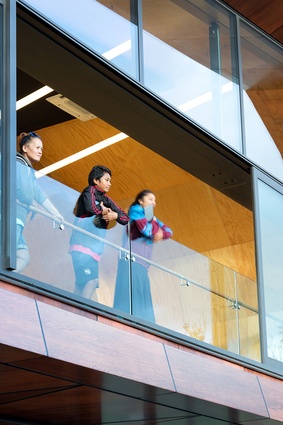
3. Then there is Te Oro by Archimedia. Te Oro was an absolute pleasure to shoot, mainly because it’s a living and breathing community space. It is situated on the high street, so to speak, and I love when bold architecture pops like this in its surroundings.
All day and night people come and go: kindergarten kids are shown around by their teacher, students sing in the studio, children run barefoot and dance. There’s a constant flow of energy and spirit.
I photographed Te Oro in the first week of opening and I could see an immediate sense of belonging – maybe because the community was empowered to contribute to the process through a completely open consultation. Or, maybe it was because the arts facility was finally ready for use, supporting young people in their creativity. Being a dancer myself I was quite jealous of the studio space. How often are dance studios architecturally designed? In one of my images you can see there is this wonderful mix of materials and lines; the ballet bar is held up by a slice of steel; it’s exquisite.
Quality materials are one of my favourite things to photograph, and I love seeing how an architect can successfully combine them. With the shot of people in the open frame, I like how structure and detail carry similar weight with the overall feeling, which is a sense of ease. The wider shot shows how light can play a part in one’s day – the setting sun hits the studio wall, it’s a pretty sight as colours are enhanced inside and out.
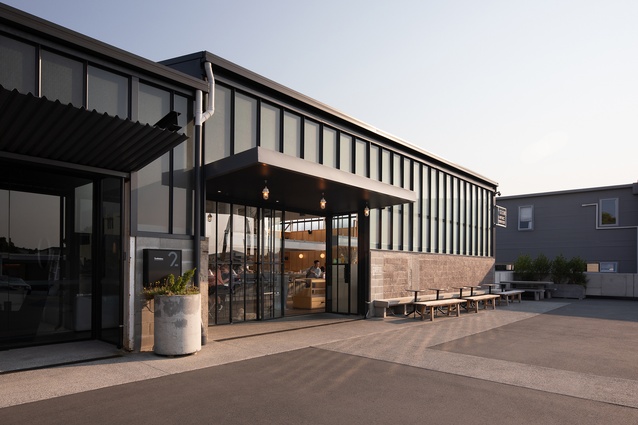
4. The Scrap Yard by Cheshire Architects and Box 9 Design. I lived more or less over the fence from The Scrap Yard – where I once found concrete slabs for a makeshift shelf. Since then it has been turned into a cool hub of businesses, with Ozone cafe at its heart. Locals love to flock here – it’s such a welcoming space with friendly staff and I felt it needed to be documented.
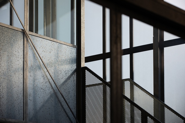
The success of this project is seeing what has been retained and what is added. One of my favourite images is a detail of the original upstairs office area, taken with a long lens. The verticals are strong and light shines on the textured steel. It’s kind of moody and I like to depict that feeling through photography.
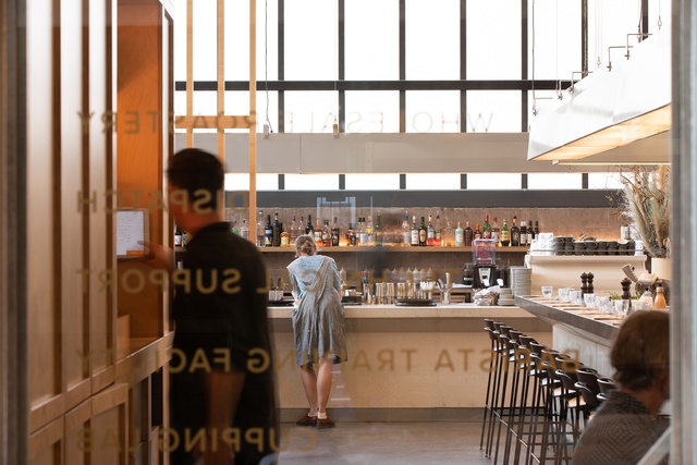
Another image – shot through glass – is rather casual, where staff are working and lettering reads backward, but it’s held together by the framework of interior architecture and repeating objects. Also, it reminds me of a still from a film, so I like this one. The exterior image is to show you what it looks like, and sometimes that’s essential, but I think you can get a hint at the vibe of the place, as the people (and animals) look pretty relaxed. The tones and materials are really complimentary.

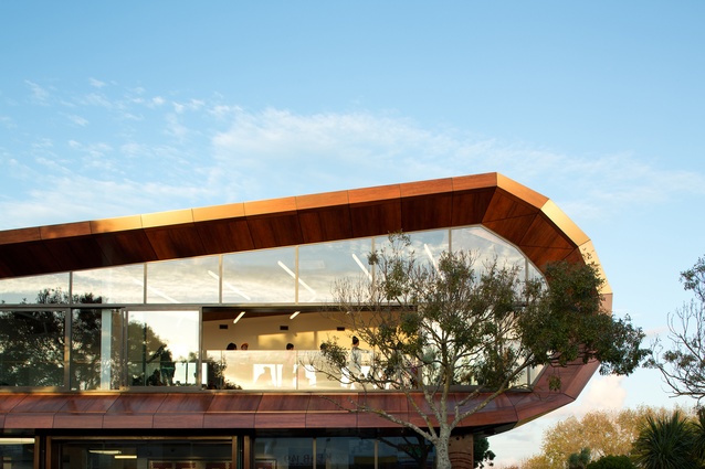
5. Finally, the University of Auckland Faculty of Engineering/Te Herenga Mātai Pūkaha B405 by Jasmax. I like to photograph around the University because it reminds me of my student days at Elam, and new buildings sit beside classics that have been there for 40 years or so and still look great. It’s an interesting mix of nostalgia and change.
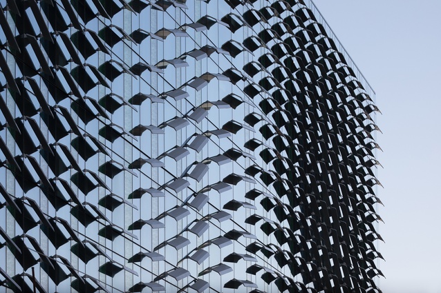
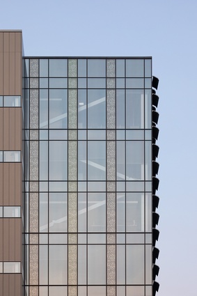
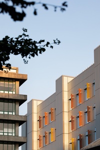
Sitting on the ridgeline, B405 has always looked impressive, even in its construction days; it’s the epic scale that demands attention. However, I’ve mostly honed in on the details: warm coloured shutters in golden light, subtle pink and blue tones of dusk framed by black vertical and horizontal lines and the east-facing façade with its undulating fins – which is truly spectacular, by the way. When I turned the corner to see this – the scale and repetition – it was one of those thrilling moments where art meets architecture, and it reminded me of a sculptural installation, permanently on display.
How did you get started with photography? What sparked a particular interest in buildings?
ES: I took painting and sculpture at school, but I would often peek into the photography department and darkrooms to see what was going on and what my friends were doing. We were lucky enough to have a brand new arts building and I really appreciated the facilities. I had my own space to work in on a mezzanine; it was very cool. I think we all felt respected as young artists.
In my first year at art school, I initially did a photography weekend workshop put on by a couple of fellow students and then an elective. After that, I majored in photography.
I’ve always understood how space and design can impact one’s mood: from the houses I grew up in, buildings at school, to the public spaces and institutions in London. However, I took that understanding for granted and only really fine-tuned this when I decided to assist some of the top architectural photographers in London. I was picture editing at the time on a magazine called Inside Out, and it was then that the spark hit me: I wanted to get back into photography and this was how I could do it. It was a real privilege, as an assistant, to spend time in these new incredible buildings and see first hand the different approaches to image-making.
I enjoy the autonomy in photographing architecture; often you’re left to your own devices – your own thoughts and flow state. It suits my personality.
You’ve photographed quite a few projects in your local neighbourhood – what does your personal connection to the area bring to the shoot?
ES: I think the connection comes from really caring about a project from the time it is born. Seeing beauty in the construction, knowing the foundational forms. Seeing the way light falls across the site. It’s about forming an attachment early on by walking and taking time to observe. Often this can cross seasons and there’s something beautiful in that.
One local project I particularly like is St Paul’s College by Architectus. It’s quite a strong simple building, but it has this fantastic façade that faces west and catches the setting sun. I love it because everyone can enjoy this design aspect directly from the street. I also like that the students and teachers occupy an architecturally designed building. Having a personal connection to local architecture creates a desire to shoot it along with a sense of community pride.
The way a project is shot can say a lot about how the space appears to feel – how do you go about capturing the spirit of a building in a still image? Is this different when shooting a public space, since so many will encounter and experience the space?
ES: Yes, you can definitely create a mood through the style and lens in which you shoot. I would rely mostly on light and people to capture spirit in a still image. And, when I say people, it would be a decisive moment that encapsulates some feeling. Narrative can start to play here; stories can be told through action, movement and scale. With public spaces, people are there for a reason, and it’s interesting to see how they choose to spend their time. Observation is key, as well as working quickly, combined with a lot of patience.
It is different when photographing a public space because I’d like to get a series of shots that depict a level of experience, whether that’s one person’s or many. However, there is also beauty in architecture alone, and it could be the setting in which it sits that tells of a certain spirit or the scale of form and quality of light.
How does the design of a building affect how you approach photographing it?
ES: There are so many things to consider, and it’s good to know what the architect’s favourite aspects are, but generally it’s quite easy to get a feel for a place and what will work photographically. Different lenses may be required, but overall the approach is the same, and the objective that you want to get good coverage.
The size of a building can have an effect; however, with all projects, large and small, I like to take my time, because the possibilities are endless really. My ideal approach, regardless of the design, is that I have enough time to truly explore all aspects of the building and site. Finding different angles and perspectives that work well is rewarding. If there is a completed project that is fully ready, it can be a dream to photograph.
How do you compose a perfect shot? What interests you the most about creating this composition?
ES: Photography is intuitive for me. When I see something that I feel needs to be photographed and I can compose that with balance, without distracting elements, and the light is just right, it’s a wonderful feeling. And, hopefully, other people can appreciate the image and get a similar level of excitement; it’s all subjective. It may be that the image starts to shine when placed next to another one or within a group – the story being just as good as the single shot.
I’d say my fine art background influences me greatly in that I want my images to convey a certain mood – in addition to documentation. That could be evoking a feeling, emotion or certain atmosphere. A level of intrigue is desirable too.
What do you think are the top three elements to consider when photographing a project (lighting, form, etc)? Or, perhaps these things change from project to project?
ES: Light is definitely number one. Light is inspiration to a photographer. I want to ensure the materials and design are showcased, so how light is falling in the space is first and foremost on my mind. Something may work with strong sunlight, flat or reflected light – directional light and patterns can be interesting too. You need to work with and around it and know what’s best for each shot.
Form as it mostly dictates composition – how will the architecture translate photographically? I want to capture this volume, shape, line. Is it harmonious and balanced or is there tension?
Interesting texture and pattern can make a design come alive. Quality materials and craftsmanship are important. By highlighting that, a link is created to the architect’s design on a personal level – there is beauty in the detail.
These are my top considerations but, yes, it could be that other elements like colour, tone and space rise to the top. They’re all significant and that’s what makes photography so interesting.
Is there are a project, or type of project, that you’re dying to shoot?
ES: A project that enhances and enriches people’s lives. One that is sustainable and easy on our planet. Bold, yet simple and considered. High quality and enduring. Has a relationship with nature and is in a beautiful setting. Aesthetically pleasing and photogenic. Award-winning and iconic. All the good things.
See more at emmasmales.com.

