Viewfinder: Top five with Michelle Weir
With a background in spatial design, this photographer took up a position behind the lens in 2015, creating Studio Weir. Since then she's been photographing people and places, as well as working on the Our Spaces book, which chronicles contemporary New Zealand interiors. Here, she chronicles her favourite projects to shoot, using her eye for design and more.
What are the top five projects you’ve photographed so far? How did these five make it to the top of your list?
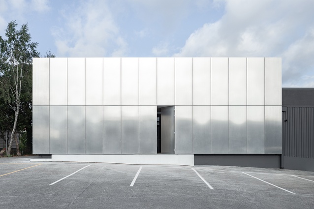
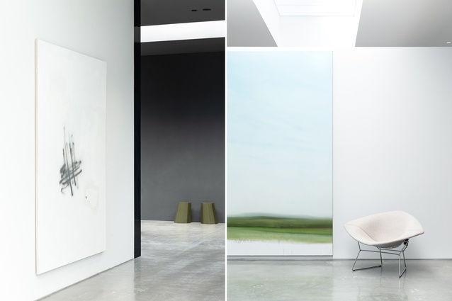
Michelle Weir (MW): In no particular order, one is Wall Fabrics by Fearon Hay Architects. This is a project that reveals more and more of itself as you move through the space. With, what I would call, an incredibly mysterious facade, the building hides its inner workings away from the street, and I relished unmasking the layers as I worked my way through it. With practically no windows, shafts of light were cut through the ceilings of the gallery-like spaces, creating a dramatic backdrop for the owner’s extensive artwork collection, team working spots and breakout spaces alike.
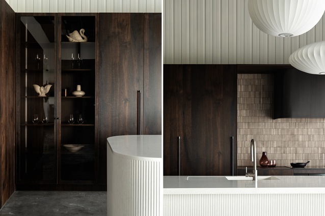
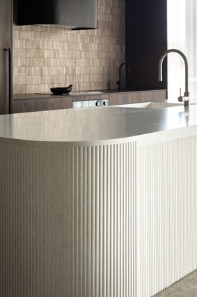
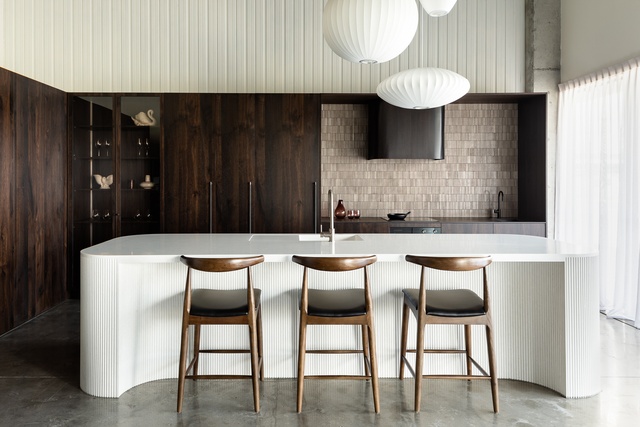
Next, I’ve chosen the Rowson Kitchens Showroom. Prior to going on maternity leave and the COVID lockdowns, I was working frequently with Annika Rowson shooting her projects in New Plymouth. On one of these days, we photographed her new showroom kitchen very quickly at the tail end (I almost missed my flight home!). At first glimpse, I was struck by the texture and the way the light sculpted the curved island bench and rangehood and accentuated the texture of the fluted Corian, mosaic tiles and timber joinery. It was an experimental design for Annika, so in the images, we played with the layers of texture, geometric forms and areas of lightness and darkness. I love the tension between the strong lines and dark tones and the soft dreaminess.
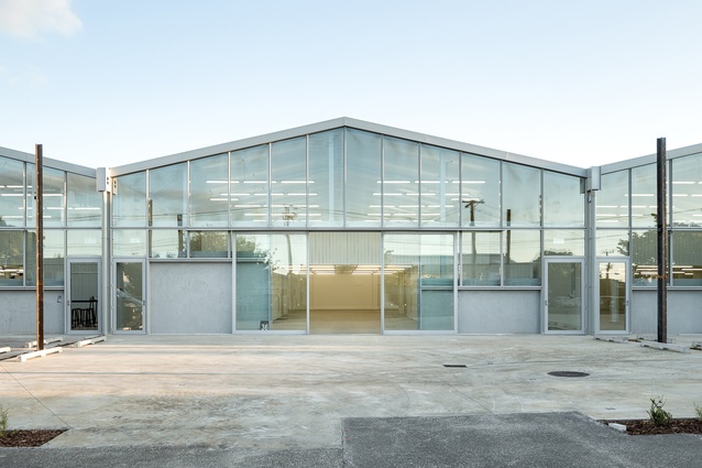
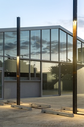
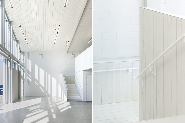
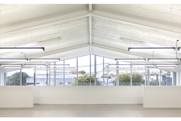
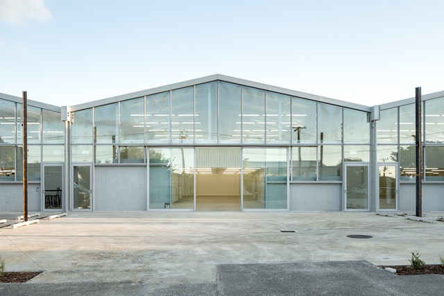
I had the unique experience of shooting my next pick: the Ethel Street Warehouses by Fearon Hay Architects. I photographed it before and after, with the building literally being torn down around me (safely). I enjoyed this process, firstly, because it encouraged me to stop and view a space that was rundown, dated and destined for destruction with fresh eyes, finding moments of beauty and intrigue… all with time being of the essence! Secondly, I enjoyed capturing the transformational aspect of the project and the opportunities that brought.
The Ethel Street interiors were completely whitewashed and empty of any fittings or furnishing. It was a case of capturing the essence of the space: the volume, how light and shadow play across the day, the layers of texture.
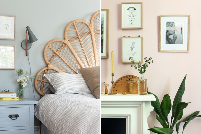
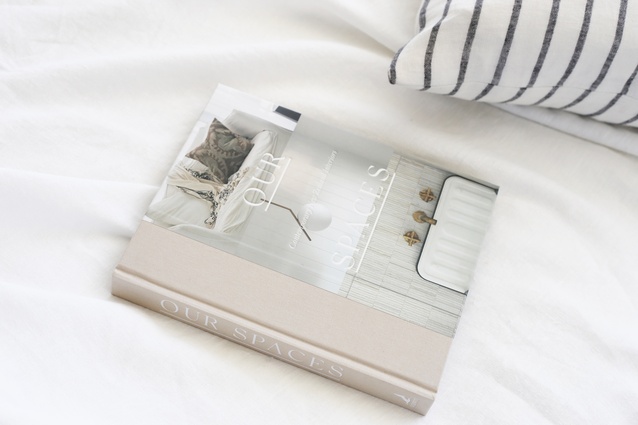
I’ve chosen the Our Spaces book next because I couldn’t choose just one space within it! In the autumn of 2019, I captured 39 homes across the country for this book, curated by TheNew’s editor Alana Broadhead and published by Penguin Random House. It was a collection of homes portrayed room by room that are aspirational while attainable, with a focus on meaningful design.
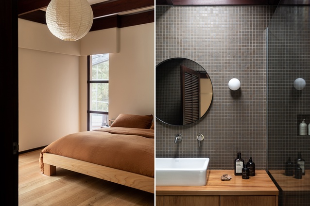
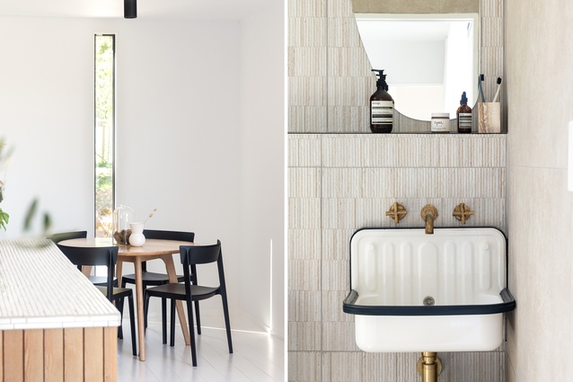
It was a challenging undertaking due to the intensity, while that same intensity made it incredibly personally rewarding. I find that it’s when I’m being challenged that I grow the most. For Our Spaces, I was either travelling or shooting a home almost every day and was working directly with the homeowner to style and shoot their spaces. Each homeowner offered a fresh perspective on design to capture and some standouts include Annique Heeson’s (Gezellig Interiors) light and airy container home in Rotorua, the serene Titirangi home of Lucy Vincent and the colourful Christchurch Villa of StudioHome’s Julia Aitkinson-Dunn.
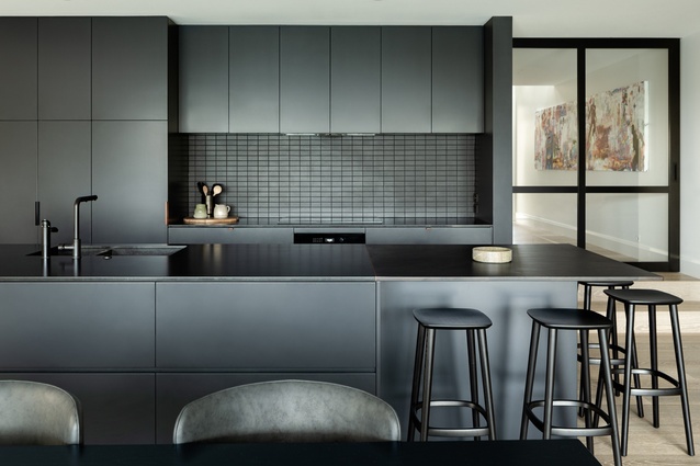
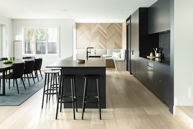
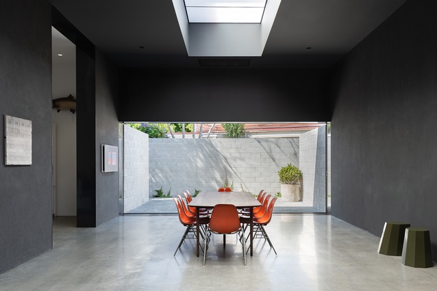
Lastly, the Milford Residence by At.Space: What girl doesn’t love a little drama? Arriving at At.Space’s Milford Residence, I was standing in a generous entranceway leading to a spacious open dining and living area with a dramatic black kitchen in the heart. A villa extension, this project is a favourite as the designers, Alex McLeod and Tomi Williams, have a way of producing the ‘big moments’ through the use of scale, materiality or colour, while then drawing you in through detail and comfort to experience intimate, relatable moments. Their projects are modern and streamlined, but a busy family can feel at home and relaxed in them – I consider that a big feat.
You started off studying spatial design – how did you make the move into photography?
MW: This was very organic. From early on I had an interest in photography, although it wasn’t until I got my first camera (a Canon 350D) for my 21st birthday that I used it as a tool for communicating in my final year of my Bachelor of Design at Massey.
I honestly can’t say it was an instant, intense passion, but instead, a slow burn that intensified years later the more I did it. It was while shooting for my dear friend, Anya Brighouse’s fashion and interiors website that I would positively fizz after our shoots together (all after hours). One day, I realised that if I was brave enough, I could actually do it for my day job. I never looked back and am so grateful for the designers who took a chance on me. I’m still working with lots of them today.
Do you ever see yourself taking up design or spatial work again in the future?
MW: While photography is my focus now, spatial design is such a part of me that I can’t imagine not doing it in some form. I understood early on that I couldn’t’ really give both disciplines my all, so I needed to make a choice and am very happy with that decision now, looking back. Photography has opened up a new world to me. In regards to design, we are working on our own house plans, so I will get my interiors fix through that in the meantime. Then, who knows? One thing I’ve learnt is that you can never tell what’s around the next corner!
Do you take a specific approach to shooting interiors or spaces? As opposed to other kinds of work that you do?
MW: I think when approaching shooting a space, one of the first things I’m registering on arrival is how it makes me feel. (Cheesy, much?) From that comes my exploration of the space: Is it small and intimate, expansive and engulfing, busy or quiet? Plus, the effect of light and shadow, finishes and furnishings in the space. And, the big question of how best to convey this in a frame. Whereas if shooting people or objects, I would consider more about that specific piece and how best to convey its message.
Are there any kinds of spaces that appeal to you more than others? Any design styles that you are drawn to?
MW: So many! I’m drawn to minimalist buildings (although I am not a minimalist myself), which offer clean lines and simple geometry, interesting framing drawing focus and lots of white space; and monochromatic spaces with a focus on layering and texture, slices of light through skylights or windows, framed smaller moments.
Specifically, I do also enjoy a warehouse conversion, with the juxtaposition of original architecture and materials against modern elements or details, and often with voluminous spaces with modern interventions.
Is it ever challenging to put aside your “design eye” in a space you’ve been commissioned to shoot?
MW: I think it is hard to separate my ‘design eye’ from me as, intrinsically, it’s how I see a project. But, I wouldn’t necessarily want to do that either; it assists me to understand the designer’s intent, concept and detailing. There’s also an aspect of styling from my past life that I find myself naturally drawn to and helps get the shot ‘just right’.

Does your approach to the images change based on the feel of the space or the designer’s brief?
MW: Definitely. Some projects may call for the big hero image or for some drama, whereas others may be quieter or sing more when they’re revealed through a series of tighter images. It’s always important to listen to a client’s brief to help convey their perspective through the images but it’s also taken through my eyes and interpretation of that. I thrive on a good collaboration, as everyone brings something to the table and opens a world of possibilities.
2020/21 has been a challenging time with lockdowns and travel restrictions. How have you been staying inspired?
MW: 2020 was certainly a challenging time to be self-employed and I had our baby during the last August Level 3 lockdown. The previous years were really busy, including shooting Our Spaces, so sometimes inspiration comes from a rest, a break or a change and letting ideas simmer in the background. We don’t necessarily need to go far to find inspiration, but more to look with fresh eyes. I’ve come back to work this winter energized again and with a new perspective that often comes with a big life change! I’m also very fortunate in that I’m inspired every time I arrive at a shoot by what my clients have produced.
See more of Michelle’s work at studioweir.com and see more from the Viewfinder series here.

