Villa gone rogue
Strict heritage protections did not stop this villa from becoming somewhat of a rebel among its neighbours.
When your villa is on one of four streets in Auckland with an extra-high level of heritage classification, and row upon row of villas sit side by side – like school children with their arms folded and legs crossed – facing the street, it feels just a tad naughty to create something with a bit of theatre: something that makes your jaw drop when you open the front door.
Of course, tampering with the villa frontage and format was never an option. Despite the fact that all possible ‘villafications’ had been committed to this abode in the past – filled-in verandah, aluminium joinery, central hallway wall removed and ceilings lowered – it was crucial to reinstate that history.
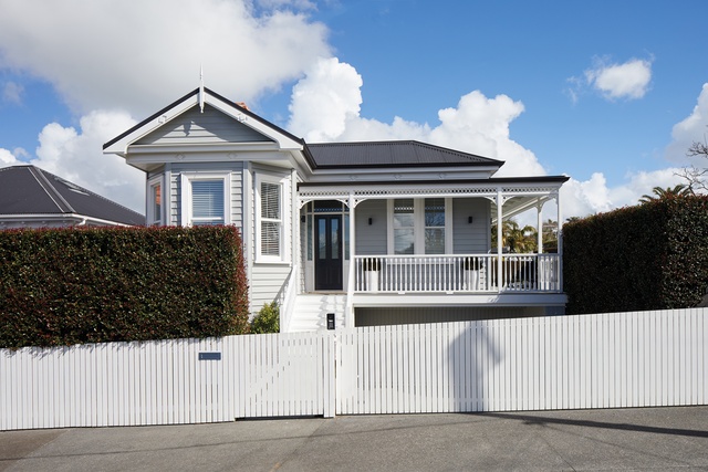
Yet, from early on, it became apparent that bringing the traditional look back to this butchered house was harder than expected and, at times, the remaking of history felt like a farce. In fact, after stripping away all the nasty additions and atrophied limbs of this building, all that was left was the front bay of the villa. To the neighbourhood, it looked like a massacre and it didn’t go unnoticed in the media.
“We ended up having a crisis meeting at council because we were in the newspaper as ‘destroyers of heritage’,” says project architect John Irving. “Obviously, we needed to play the villa game and sort all that out. But we actually raised the house as well and created a ‘mythical’ villa that was much longer than the original.”
What’s great and, shockingly, different about the site is that it’s much wider than all the other sections on the street. The section initially accommodated a double garage to the right of the house and, in the re-imagining of the villa, the width of the section allowed so much more creative scope than a typical section would have permitted.

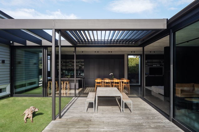
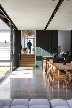
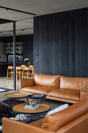
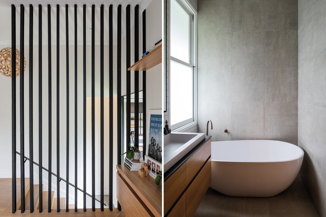
The bedrooms and the double garage now sit in an area of the house that has retained the ‘traditional villa’ feel. But, once you go down the classic, wide hallway, it drops down a small set of stairs and into a modernist pavilion of black steel and glass.
“We’ve called it ‘villa gone rogue’ because, basically, we wanted to do the least sympathetic addition you could do,” says Irving with a smile.
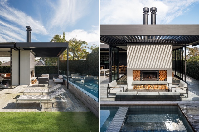
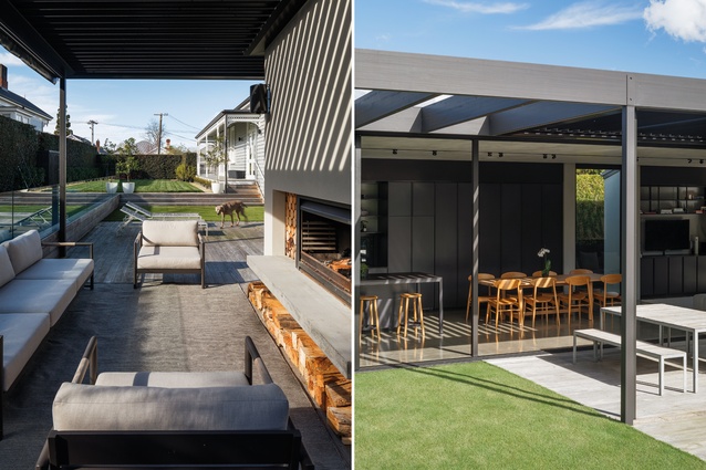
Thankfully, the council played along with this design, which called for a graphic juxtaposition of old and new. But perhaps that’s not surprising as the pavilion beds so neatly into the site, wrapping itself around a private oasis with pool and lawn, hiding itself so completely from neighbours that all you can see are the comforting angles of various villa roof lines from the rear of the site.
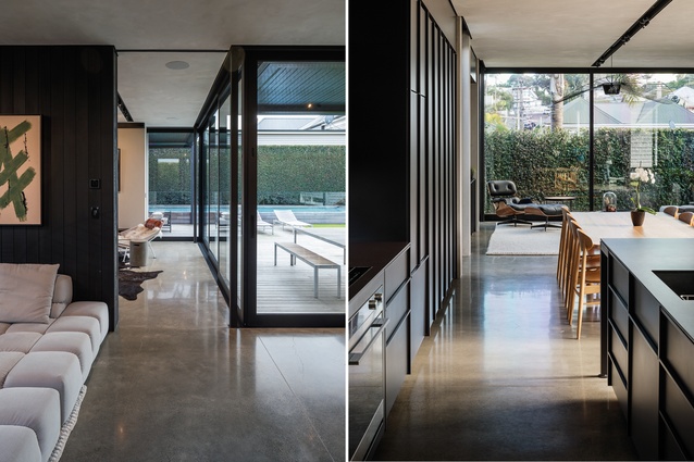
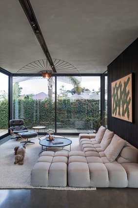
The pavilion itself has a sense of the rebel child – the only materials used are steel, concrete and glass, in a complete rejection of the villa’s vernacular of timber and frippery.
“That’s why we went with black – when you have a lot of glass, you need to temper it with a dark palette; otherwise, it’s just too bright. It’s all either concrete, metal or glass and that’s it – any softness was introduced with the furniture and art,” says Irving.
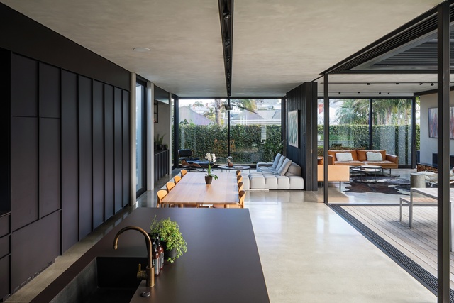
Openable louvres and huge glass sliders mean that many of the walls in the pavilion retract and slide completely out of sight. The temperature in the various living spaces can be moderated entirely by opening a combination of glass walls so that living areas can breathe in a cross-breeze or insulate against it.

The degree of openness of rooms to each other and the interior to the exterior is also modulated in the same way, with glass sliders slotting neatly into internal walls or between the two fireplaces. This allows the pleasure of simply cutting across a corner of the home, blurring the lines completely between interior and exterior environments.
But the success of this space is in its surprising warmth: counter-intuitive to the modernist, gallery-like materiality. Irving says spaces like these can often feel stark, as though you have to whisper, but the warm villa half of the home with its soft surfaces and oak flooring, marries nicely with the sunlit pavilion.
“They seem to get along quite well. It’s a house of two halves but they don’t seem to be fighting each other.”
Coming back out to the street after visiting the space, it’s hard to spot any clues about the rogue modernist oasis hidden out the back like a smug little secret – and the owner has an amused smile when he says that those who were scandalised in the initial build stages, now wander past singing the praises of the immaculately restored villa.
This article first appeared in Urbis magazine.


