Virtue of restraint: South Melbourne House
Showing restraint and simplicity, this new home by Powell and Glenn is animated by the changing light and shade throughout the day and into the evening.
Every once in a while I visit a house that sits so comfortably with its occupants and setting that the architecture, such as it is, appears almost invisible. This impression is an illusion, of course – much rigorous effort goes into the crafting of simple and casual-looking things, as any designer will tell you.
Nevertheless, such houses are almost always calibrated to the achievement of modest but clearly defined aims. They are almost always conspicuously lacking in design “dogma” – the aspirational baggage that can accrue when designers work on their own houses. The husband and wife team, architect Ed Glenn of Powell and Glenn and interior designer Edwina Glenn, who designed this South Melbourne home called it “stripping back the design-isms .” Put another way, this is a design that doesn’t have the architect’s handprints all over it.
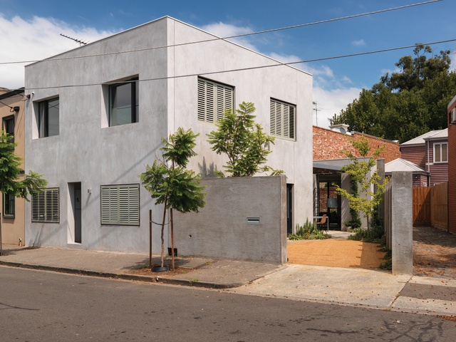
The designers’ first aim seems to have been that of geometric and material simplicity. This is partly a response to the small site, and partly a response to the eclectic South Melbourne neighbourhood.
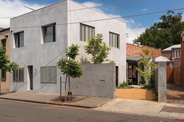
Into this setting, the house presents a flattened facade that is austere to the point of near-blankness, resolving deeper on the block into a primary volume – a cube – as one glimpses its northern flank over the fence. In time-honoured fashion, apart from some window shutters, the facade is unmarred by any feature at all. The omission of even a house number leaves the first-time visitor to wander the winding, small backstreet knocking on possible doors in a process of elimination.

The bare render coating of the facade, installed with a special technique that results in a particularly hard finish, lends a Mediterranean feel to the house’s street front. The whole hovers between this visual impression and that of a pocket-sized Viennese proto-modernism, stripped back to the 1920s.
Upon entering the house, it becomes immediately apparent that the main cubic volume is divided into eight volumetric parts with a room in each octant, downstairs and up. It’s very rational and quite straightforward, making the house very legible to the observing architect. The two-level cube contains all of the house’s bedrooms, a tiny but adorable studio facing the street and a comfortable sitting room opposite a stair connecting the two levels.
Both the sitting room and the downstairs child’s bedroom have French doors that open into a small, but welcome, north-facing, triangular side yard containing a steel fire pit, which was cheerfully lit on the early winter evening I visited. The yard is finished in gravel, with a slowly maturing coastal/Mediterranean planting scheme. High walls prohibit views into this private outdoor space, while looking outwards over the walls allows distant views of the upper levels of nearby houses and other buildings and a picturesque neighbouring palm tree.
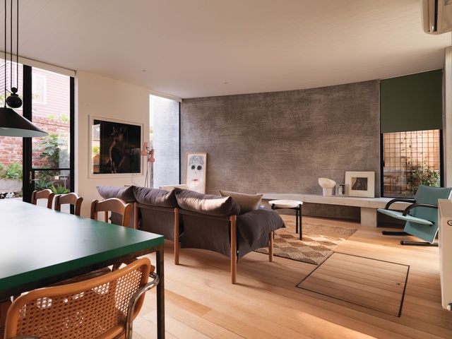
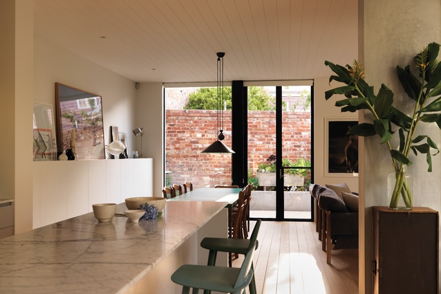
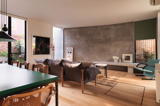
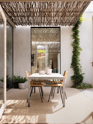
The trapezoid shape of the block introduces an angular dynamic into the plan, and the single-level living, kitchen and dining space at the rear of the cube is cranked to align with the site boundaries, creating a western terrace. The ground floor living space, a harmonious if oddly shaped room, nestles happily between the small northern yard and the western terrace. The space faces due north-northeast and as a whole becomes a suntrap. A pergola of reclaimed tea-tree sticks in the adjacent terrace adds texture to the otherwise bare exterior, filtering the sunlight to create a further play of shadows.

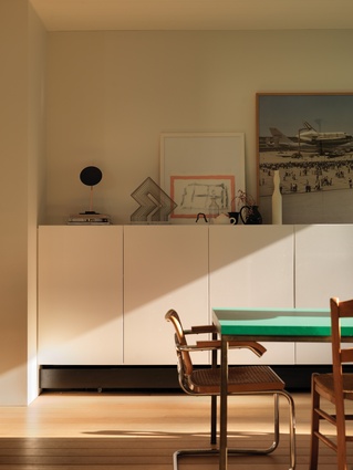
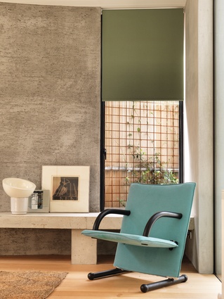
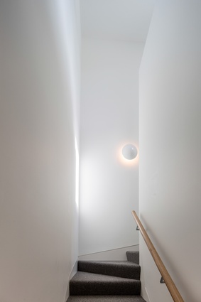
Within the interior, light and shade play a pivotal role in making the simple spaces feel vibrant. At dusk, the spare interior is animated by the beams of lamps, combined with a restrained lighting scheme, throwing engaging diagonal shadows throughout. Again, simplicity of means satisfying a modest intention has been the key to creating quite theatrical results.
When I asked the designers if they had laboured over the design in the effort to achieve the evident level of simplicity, I was surprised to learn that the plan had emerged quickly, early on in the process, and remained virtually unchanged from day one. I confess I am more accustomed to deceptively simple design work being the result of obsessive and laborious, even compulsive, attention and effort; but perhaps that is just a cliché.
The authors of this creative work have manifested something unusual – an architecture that renders neat encapsulation re- dundant, and refutes attempts to summarize it as one thing more than another. It is simple, and yet multivalent. From a stripped-back kit of parts, in an eclectic setting, they have achieved more than mere simplicity; they have created a particular and entirely coherent architectural answer to the question of “home.”
This is no mean feat, and they are to be commended for being so focused, so immune to the seductions of the “blank page,” and so committed to applying a restraint so thorough that it becomes a virtue.

