Wondrous curves: Wahroonga House
An earthy colour palette brings the surrounding bushland inside this laidback yet sophisticated refuge that playfully acknowledges its mid-century modernist roots.
While embracing its mid-century roots, Wahroonga House leans away from the trappings of domesticity: even in functionally demanding spaces like the kitchen and bathrooms, the home’s task-focused areas have playful, animated designs. Sydney interior design studio Tom Mark Henry explores high-contrast colour palettes, richly textured finishes and formal expressiveness to create spaces more akin to a boutique hotel than a domestic retreat.
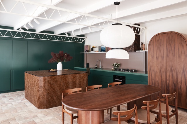
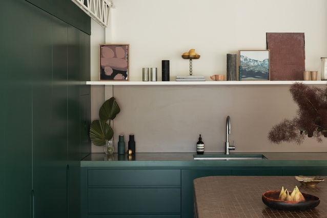
The native bushland surrounding Wahroonga House informed a colour palette of greens, golds and browns with finishes hewn from nature. Clay and timber extensively feature, with tumbled terracotta tiles creating a floor that is soft and cool underfoot. Deep ochres emerge in walnut timber veneer joinery and burgundy trims. Such references to the colours of the Australian landscape give the interior a tonal richness that is familiar and uplifting.
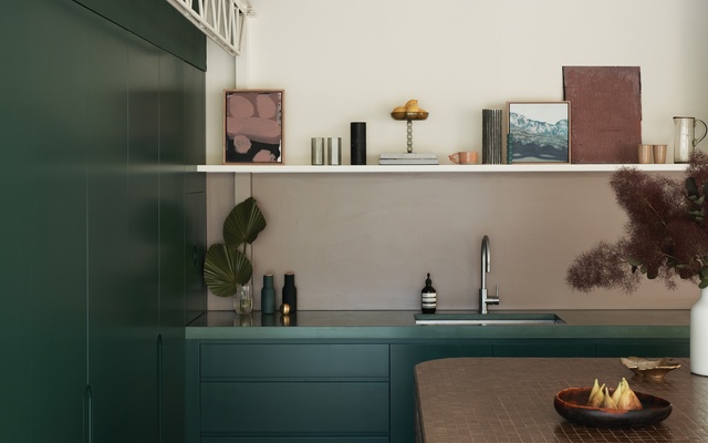
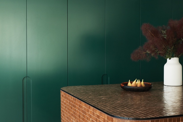
The kitchen and the bathrooms entertain the idea of curating a suite of “objects” that take the form of functional elements. In the kitchen, for instance, a walnut timber storage unit sits beside emerald kitchen cabinetry. The joinery unit is used as a storage cupboard, but its playful form and contrasting finish give it the appearance of a found object. The bedroom door echoes this gesture with arched golden glass, adding to the contrasting palette of jewelled tones. Further, the monolithic, earthen form of the kitchen island bench creates an anchor for gatherings, and its tiled surface proves an irresistibly tactile centrepiece.

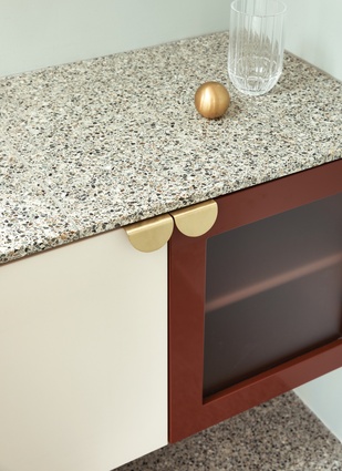
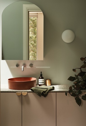
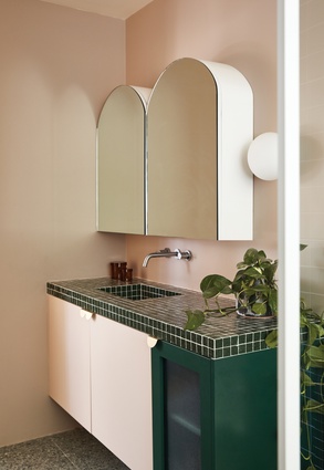
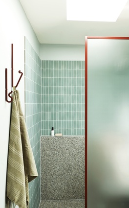
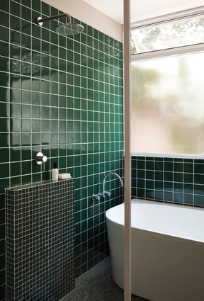
Tile-topped surfaces extend into the bathroom, where deep greens bring the colour of the forest inside. Soft blush pinks add warmth, as does the gilded finish of brass pull handles. In the ensuite, a concrete basin in colour ‘Terracotta’ invites touch and gives the space a focal point. Tiled walls in eucalyptus green reflect the colour of gum trees, while terrazzo recalls a material that has strong roots in twentieth-century architecture.
The repetition of arches and curves sets up a wonderful sense of contrast between the rigid lines of modernism and the softer, more relaxed forms of this contemporary refurbishment. Colour also helps to impart a sense of contradiction: original trusses and ceilings are painted white to maintain visual contrast with the bold finishes of the new elements. The result is that at Wahroonga House, the minimalist tendencies of mid-century design are respected while contemporary embellishments showcase the dexterity of the designer.
This article first appeared in the June 2021 issue of Houses: Kitchens + Bathrooms (Australia) and was first published online at architectureau.com.
Project credits
Designer: Tom Mark Henry, Sydney, NSW, Australia
Project team: Cushla McFadden, Kelly Doyle, Emma Say
Consultants
Architect and builder (house): Quantum Built
Builder (interior): owner builder
Joinery: All Smart Kitchens

