Wai-atarau Plaza
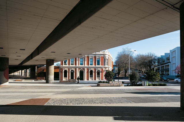
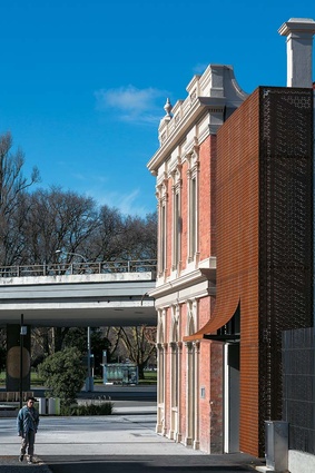
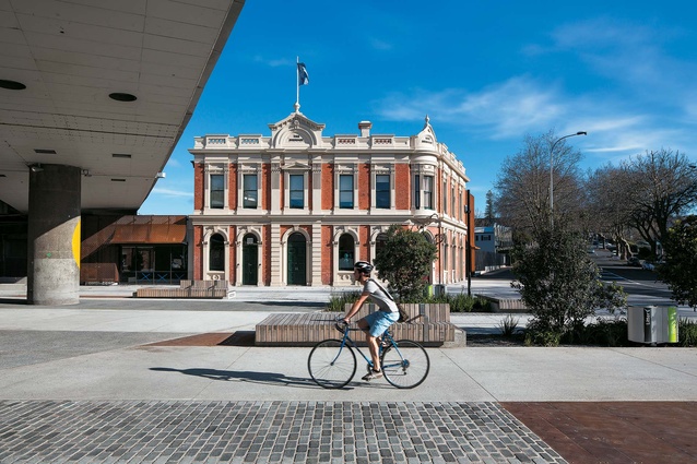
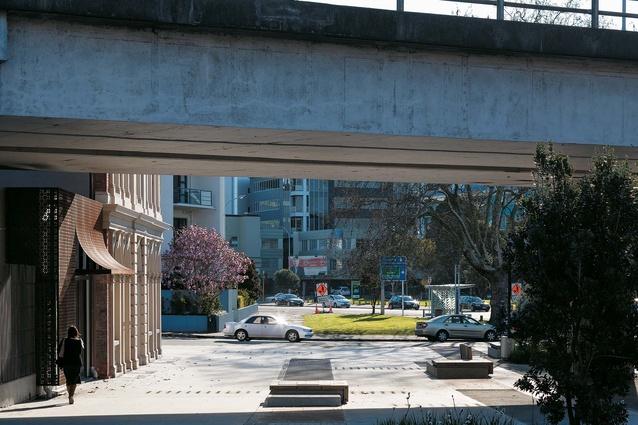
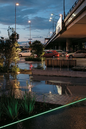
Ah well then, criticisms first. This is one of those rare instances when, with respect to a landscape project, a number of people voice opinions about works done. That’s a good thing, I think. With respect to Wai-atarau Plaza, the newly coined name for the public space in front of the historic Birdcage Hotel, the voices of the populous in camp negative run a little like this: too much concrete on the ground plane that ties the public space to the overpass rather than the handsome heritage building; trees too big for space, eventually, meaning, as one wag put it, that “the council is going to have to lead an expedition at some stage in the future to find out where the Birdcage went”; wrong furniture – a suite of moveable furniture would have been more appropriate, in that it would have freed up the plaza for flexible use, markets and the like, and also that the type of furniture most suited to this space would be that of the café table and chair variety (although, no hospitality tenant has been announced for the for the Birdcage, at the time of writing, anyway). Another respondent was critical of the road that runs between the plaza and Victoria Park Market, and also of the parking spaces that line the lane. And, finally, our esteemed photographer also chipped in. Shooting at night, on a damp, almost-spring evening, “felt like a Tarkovsky film,” he says. “Water dripping everywhere.” Others cited Bladerunner, given the nocturnal neon colour scheme.
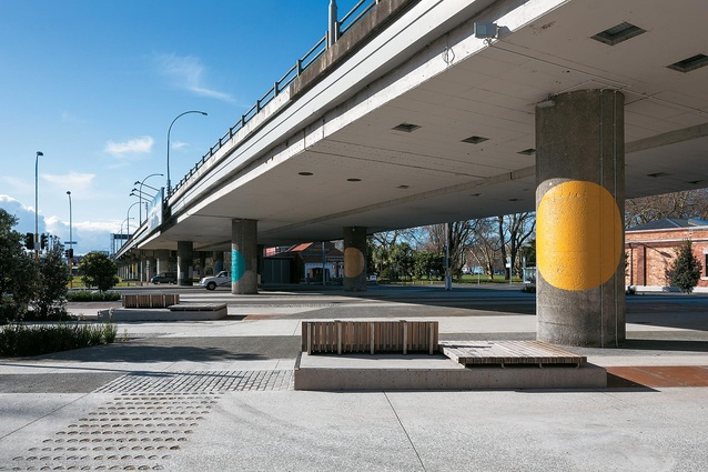
So, are there any bright spots? Well, yes, literally, as it turns out. Miriam van Wezel has done a thoughtful series of painted discs on the columns that support the carcass of the viaduct. Entitled Colours of Our History, the work highlights the changing uses of colour through the periods of settlement of New Zealand. However, despite the art, that flyover is hard work; ponderous and grey, it is depressing of space. It seems unbelievable that one would go to so much effort to put in a tunnel, yet, lo, no great urban design payoff. That the flyover will be dismantled at some stage seems to be something most people agree upon, although the timeline for its removal seems rather open ended. In the meantime, this massive concrete structure from yesteryear has a massive impact on the urban fabric in the here and now, and makes the plaza, despite the skill of the designers, seem like an interim proposition.
Perhaps the divergences in opinion about this project results from a reading of its type. Michael Hawes, landscape architects from Boffa Miskell, says he identified Wai-atarau Plaza not as a place to spend any great length of time but, rather, as a place to pass through on your way to the Victoria quarter, or to Victoria Park Market, the park, or the CBD beyond. It’s also a place to gather or regroup. Chatting at the plaza with Hawes on a Friday morning, I can see his point. It’s loud, there’s traffic at points left and right, as well as above and below. As if the vehicular message wasn’t overt enough, a massive billboard hangs over the space advertising a late-model Mercedes.
“Because of the ‘lid’, it’s not going to be a destination,” says Hawes. “This isn’t St Patrick’s Square, but it is potentially a meeting place. If you’re going to eat your sandwiches, you’ll go to the park. This place is about coming together, but not really staying. It’s not a day out, and not every space has to be everything to everyone.”
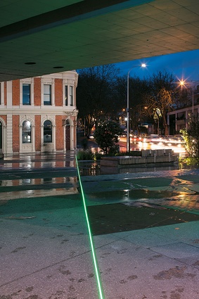
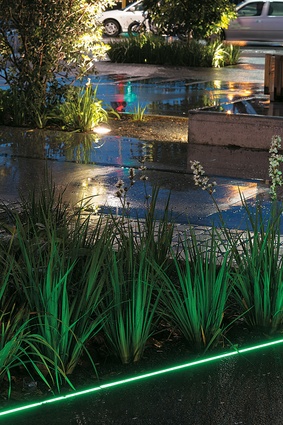
Despite the fact that the plaza is an island in a sea of roads, the landscape work here has its finer moments. Original plans for the standard suite of CBD furniture and paving were thankfully dispensed with and, in its place, is a varied ground plane that shows a variety of texture and materials: steel, concrete and paving; the mix of materials is an effective way to break up the ground plane’s expanse. One of the most interesting interventions is the nighttime lighting; a singular strip of green light bisects the plaza with an accompaniment of small clusters of green dots, a subtle reference to the kuta reeds which grew on this site when it was part of Auckland’s foreshore.

