Waitomo Visitor Centre
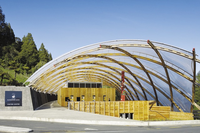
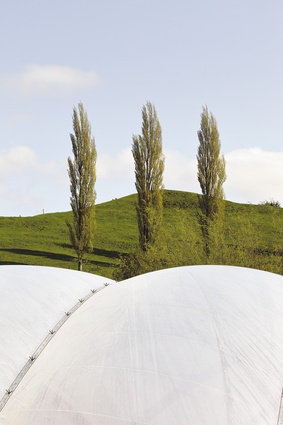
Waitomo Glowworm Caves Visitor Centre is designed with uniqueness surrounded by the beautiful landscape.
Kiwi architects are obsessed with the landscape. Even in our big cities architects often focus on the landscape rather than the built or social aspects of the environment as the primary context of their work. I was amazed last year to hear Simon Twose describe his very urban and urbane Leek Street building, a largely interior renovation that rates among Auckland’s most interesting recent projects, as a reading of the Auckland topography. A similarly groundbreaking design, the new Wellington Airport International Terminal (see pages 68-75), was explained by its architects as rocks inspired by the rugged coastline nearby, despite the building being pressed up against the most abstract context imaginable – a two-kilometre-long flat slab of runway concrete.
Why our fixation with landscape? One explanation is that the notion of close connection to the land is deeply embedded in our culture, a foundational element of both Maori and pioneer understandings of life. Alternatively, we might look to the part landscape played in the construction of our high culture – when painters and poets sought to escape colonial bonds and create nationalist art, they turned to the landscape as a potential source of New Zealand-ness. In describing his work, Colin McCahon went so far as to say, “I saw something logical, orderly and beautiful belonging to the land”, an attitude that is curiously mirrored by the way in which our architects often look to their sites to provide a structure for the design they will place on it.
Paying attention to orientation, geomorphology, and the local flora is fundamental to any design, but the landscape, even a beautiful, orderly one, is not always helpful to the architect. Natural beauty, as with physical beauty in human relationships, can throw off our judgement. Just as the abstract white walls of an art gallery can invest seemingly any object placed within them – a porcelain urinal or a pile of screenprinted boxes or an unmade bed – with the aura of art, the stunning backdrops against which many Kiwi architects are able to build – the mountains of central Otago, the coastlines of Northland – can have a similarly defamiliarising effect, making even a wooden shack or a corrugated dunny seem an architectural splendour.
If the risk of seduction is one hazard posed by the landscape, getting too close is a greater one; we much prefer the great outdoors not to invade our personal space. We’re not keen on landscapes that refuse to keep a respectful distance, and in particular, building in the bush presents a challenge that is rarely attempted. Architecture Workshop’s new Waitomo Glowworm Caves Visitors Centre joins the very short list of important New Zealand buildings to have been built in the bush.
The thick undergrowth of New Zealand’s subtropical rainforest is not always a pleasant place to linger; most buildings in the bush seem bent on escaping it. Buildings like Ron Sang’s Brake House or, more recently, Pete Bossley’s McCahon House Artists Residence depart the ground in favour of the treetops. Others push the foliage back, creating a decorous clearing in which to build. Beyond being a reluctant host, the bush can even prove actively hostile – the press of greenery and the relentless damp (assisted by a lack of maintenance) have brought John Scott’s Uruwera Visitors Centre to the brink of demolition.
The previous visitors centre at Waitomo met its end by different means – the hamlet of characteristically extroverted Roger Walker buildings in brick and shingle was destroyed by fire in 2005. Architecture Workshop were brought in soon afterwards by the cave operators, a joint venture involving Tourism Holdings Ltd, the Department of Conservation and the local Ruapuha-Uekaha hapu.
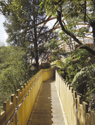
A journey into the caves follows a looping path that departs from and returns to the Visitors Centre, with the departure pathway traversing higher up the steeply sloping site. The Waitomo area receives more than 500,000 visitors a year, and the various levels and pathways of Architecture Workshop’s scheme are designed to gently organise these flows of people. Stepping down contours of hillside, most of the building’s walls are clad in raw timber boards with oversized battens, reading as both crate-like volumes and palisaded terraces. Visitors to the building are presented with sheltered gathering areas, loos (neatly tucked into the hillside behind concrete retaining walls), and ticket booths. The path to the cave entry glides up past a theatre, small café and deck where groups gather before being guided into the caves.
The return path from the caves delivers visitors to a lower level of the building. Here they can linger at another café counter, exhibition areas, and generous dining decks before being funnelled out through the shop, an arrangement that adds a wry commercial nuance to the metaphor for the project that was provided by the local hapu – the woven hinaki or narrow-necked eel trap.
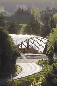
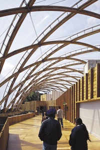
Floating over the whole arrangement of paths, enclosed volumes and decks is a woven timber roof that shelters visitors from the road edge up to the point where the paths to and from the caves disappear into the bush. The space created under the roof is an intriguing blur of interior and exterior, the character of the space shifting depending on one’s position and direction of view.
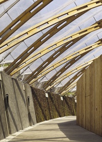
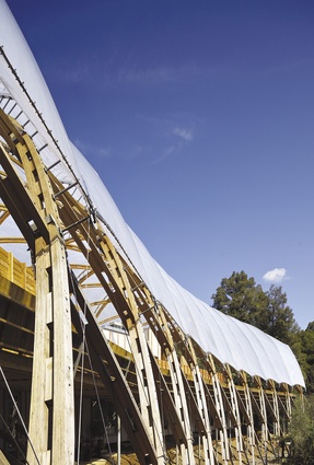
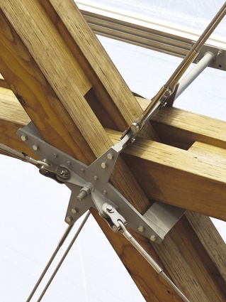
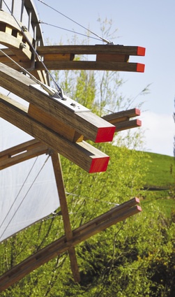
The geometry of the roof bends to follow the shape of the hillside and the curve of the Waitomo Stream below, the tube thus forming a part of a toroid or doughnut shape. On paper, this rotationally derived shape is highly regular and the ribs all follow the same circular arc, a cunning repetition which helps keep the extravagant architectural gesture of the roof affordable. However, moving from abstract geometry to physical construction involved all kinds of complications. In order to stay perpendicular to the roof surface, the prefabricated LVL (laminated veneer lumber) ribs had to twist like a propeller. Stretched over the woven wooden structure is a skin of translucent inflated ETFE (Ethylene Tetrafluoroethylene) pillows composed in strips that follow the geometry of the structure.
Constructing this building required great geometrical and structural sophistication – the timber gridshell included global innovations – but in the experience of this building, this wizardry recedes in favour of its raw material palette and flowing, open spaces. Like Architecture Workshop’s Peregrine Winery in Central Otago, with which it shares a similar parti (a dramatic landscape setting, a building volume that extends from the ground, and a sculptural roof), the Waitomo Glowworm Caves Visitor Centre allows us to occupy dramatic surroundings without being overwhelmed by them.
The building exudes an air of confident casualness that seems perfectly attuned to our ‘100% Pure’ tourist branding. Intriguingly, there was a touch of Bilbao-ism about the commission for the project, as the clients’ intention was to create a flagship building for New Zealand tourism. It seems the clients feel their hopes have been fulfilled – a billboard at Auckland Airport advertising Waitomo sports a photo of the Visitor Centre as big as the picture of the caves themselves.
Returning to the difficulties of building in the New Zealand bush: it is a landscape that can not only be tough to occupy, but is slow to forgive the construction process. It can take years for the vegetation removed during construction to return around a building. This is certainly the case at Waitomo, with the area immediately around the building fated to remain mud and seedlings for some time. The freshness of the wound is clear against the lushness of the surrounding virgin bush, and the gap created leaves some of the building’s undercarriage exposed.
The upside is that the Waitomo Glowworm Caves Visitor Centre is a great building that will improve with age. As the timber and concrete walls weather, they’ll mellow into the landform, and as the foliage moves in closer the edges of the building will blur and the back-of-house areas will disappear into the leaves. This highlights an aspect of the landscape that rarely draws attention here in New Zealand (perhaps because we have so few deciduous trees): if we must be fixated with landscape, let us not just celebrate its timelessness but exploit its ability to change.

