Walking backwards
While he misses some of the grunge and graffiti patina, Mark Southcombe finds the essential character of Wellington’s Cuba Street in Athfield Architects’ remaking of the Farmers Building and adjoining buildings to be a sensitive bridging of time and a weaving of new architectural layers with the old.
Wellington’s Cuba Street is a diverse place, with its own cookbook and street festival, CubaDupa. Hip and fine dining restaurants mix with noodle houses and grungy cafés, second-hand clothing and records, night music venues and a range of boutique shops and services, including several architects’ offices. It has a low-rise character and scale, graduated from tall buildings at the north end transitioning to a residential scale at the south. The small site and building sizes and the advanced age of many of Cuba Street’s buildings have created a natural enterprise incubator of cheap tenancies in poor condition near the ends of their economic lives.
Almost every period of our history is represented in an eclectic mix that includes many Edwardian mixed-use commercial buildings with heritage designations. The street is relatively narrow in urban terms and this distinctive characteristic is a part of its charm, creating a contained, human-scale urban space.
Cuba Street has survived the ravages of time relatively intact because of the Cuba Street Heritage Area: a Wellington City Council (WCC) special character area that recognises and protects its collective historic, architectural and social significance. Good luck plays a role, too. Post the Canterbury and Kaikōura earthquakes, many of us were unsettled in Cuba Street because we knew that a similar earthquake in Wellington would be likely to cause significant damage there, as occurred in High Street in Christchurch.

At Te Herenga Waka Victoria University of Wellington, we worked with WCC, Heritage New Zealand, building owners and students to re-imagine the architectural potentials of seismic retrofitting, and to educate about the synergies of adaptive reuse redeveloping clusters of heritage buildings. Many of these buildings have since undergone seismic retrofitting. The Cuba Precinct redevelopment by Athfield Architects is part of this ongoing upgrading process.
Traces of the periodic remaking of architecture come to light when we study an existing building prior to redesign. Generations of work characteristic of particular eras are layered as palimpsests over one another.
With heritage regeneration, some key questions emerge: How do we decide what is saved and what is edited? How are cultural and heritage values balanced with financial and amenity values? Which heritage values and layers of the historic palimpsest do we recover and renew? And which layers of history are erased in the process? These questions are often the realm of authorities and tensions. They have been negotiated adroitly here in the second of four stages of a major redevelopment of half a Cuba Street block by developers Willis Bond, with the base and fit-out designs by Athfield Architects and construction by LT McGuinness.
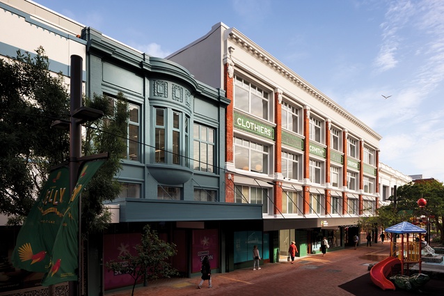
The major building of the ensemble faces Cuba Street and is a Category 2 Historic Place: a three-storey, stripped classical building, designed in 1913 by Joshua Charlesworth for draper Christopher Smith and now known as the Farmers Building. In a remarkable heritage gain, the whole original building, once doomed to façadism, has been substantially retained, including its hybrid structure of solid, closely spaced steel circular columns and tōtara timber floor beams and joists. This was able to occur through integration with two heritage buildings to the south, known and loved in recent years as the Matterhorn and Mighty Mighty buildings.
Both had significant cultural heritage value through their different uses over time. They were the venues for first public performances by Fat Freddy’s Drop and Lorde. Strengthening occurred by linking the cluster of buildings to create a new, larger, hybrid building. The smaller buildings were substantially demolished with the Mighty Mighty façade saved and the Matterhorn façade mural (itself a remodel) restored and reinstated.
The Farmers Building strengthening was achieved primarily by connecting to the new concrete floors and steel structure in the adjacent buildings. The Cuba Street heritage façades were reinforced with new concrete column and beam structures behind, and all exposed 1990s’ steel cross-bracing was removed. New 28m-deep piles were retrofitted for braced steel frames. Large 810 UB steel portal frames along the edge of the new-build section and a single row of smaller steel K braces through the length of the existing Farmers Building brace it and enable the original uncluttered, open character to emerge.
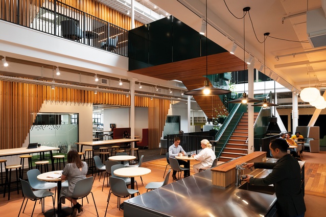
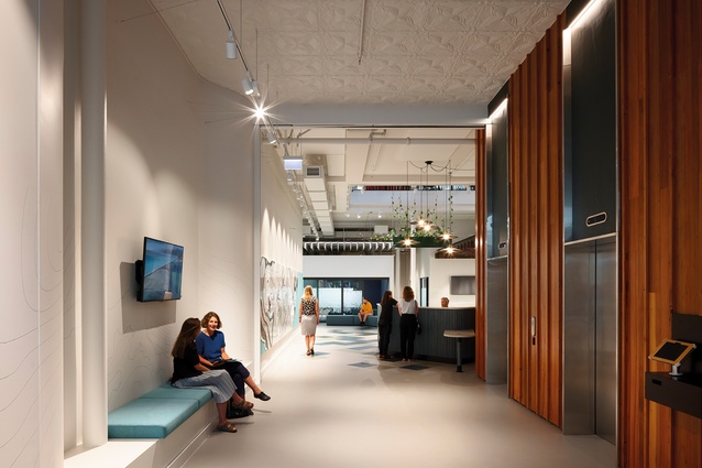
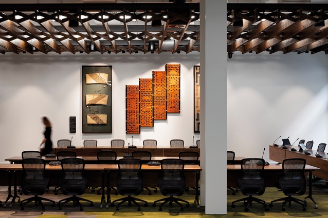
The Farmers Building was never really a grand old department store but it has had its simple dignity restored in what has become a contemporary office building with an expansive 50m x 50m floor plate, high stud, large stairs, light-wells and pressed tin ceilings. Floorboards removed during the fire rating and light-well addition process were salvaged and reused. In the foyer and Council Chambers of the new tenant, the Greater Wellington Regional Council (GWRC), joists and their herringbone bracing are suspended as exposed ceiling panel traces of the original floors.
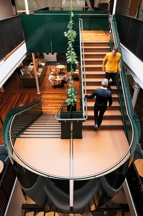
GWRC is a great client match for the project, enabling a contemporary shared office fit-out for the upper levels and ground-floor rear of the building where there is ready access to Cuba Street and services behind for field staff. The fit-out redesigned the cores, extended the existing light-well and reinstated portions of the original light-well to the ground level; a central mixer stair was accommodated within. While heritage purists may rankle at such changes, the building’s big floor plates needed some brave moves, and the final spatial qualities and access to natural light are more consistent with the original than has been the case at almost any time in the building’s history.

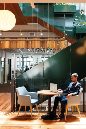
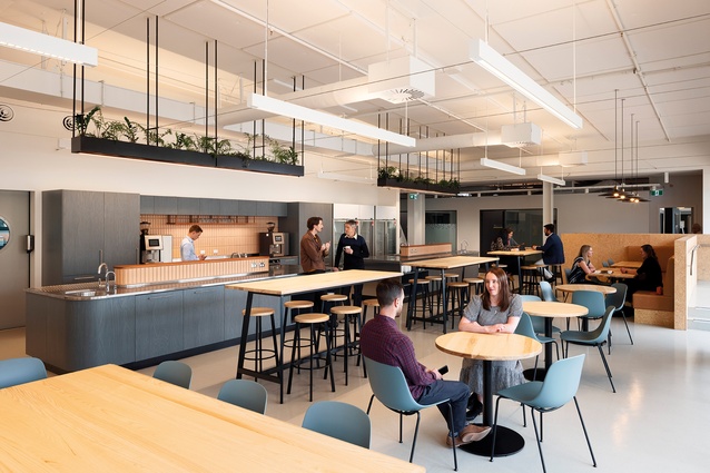
The new design has facilitated a new, compatible use for the building into the foreseeable future. GWRC has 390 desks for 450 people and a clean-desk policy, with each staff member having card-activated lockers for storage of their work and personal material. The office space is configured in a diverse series of spatial zones following a brand-driven internal landscape idea interpreted and expressed through colour, texture and material selection. There are centralised retreat pods and meeting rooms and interconnected upper floors as we now expect in contemporary office workplace design. The ground floor is imagined as an urban forest floor, with dappled light filtering through the central atrium incorporating a vertical hanging garden and a space that is easily accessible to council and committee rooms. It has built-in seating niches in areas where people may be waiting.
Minimal purpose-designed services bracing completes the careful attention to detail. Sustainability here is more than heritage resourcefulness, with immediate access to electric vehicle charging and a limited number of shared office car parks behind for field staff. There are extensive bike parks and associated changing facilities for the one-third of GWRC staff now biking to work because it’s easy and they can. Upper levels of the building are intended to convey a sense of a forest canopy through the detailing of integrated timber screens and include a fantastic staff café opening onto a roof terrace set back from the Cuba Street edge with glass screens. This strange move is to prevent people from being seen from the street but it also prevents staff from engaging with the wonderful life of the street below in a sad, anti-urban moment of heritage protection madness.
The pristine newness of the regenerated Cuba Precinct buildings that is evident from the street is slightly uncanny as if they have travelled from the past just after they were built. The range of medium and small retail tenancies and their low-key, glazed-tile fronts fit well with the scale of the street yet there is a sense of a time warp because, like any translation, the work is not quite the same. We miss the diversity of the previous tenants and their signs; the quirky multicoloured Mighty Mighty façade is now a nondescript muted dark shade. I even miss the grunge, as the graffiti and patina were part of the essential character of the street, although the newness will, no doubt, soften over time.

I looked for traces of the beautifully designed Matterhorn restaurant interior and found few. Subsequent discussion highlighted compromises inherent in redesign, with multiple players and needs even with the best of clients. The famed Matterhorn narrow rear courtyards have re-emerged as a vertical slot garden and this move highlights the role of the architect and interior architect weaving a dense series of new architectural layers with the old to create a new, hybrid aesthetic and workplace with character and historical integrity that is also contemporary.
Heritage regenerations are worthy, sustainable, memory-building projects that may lack the expressive opportunities of a new build and require significant innovation and compromise. Not all base buildings offer a lot, as was the case with the Farmers Building’s large volume but otherwise degraded and nondescript heritage spaces. Heritage regeneration requires sensitivity, judgement and an understanding of the fleeting fragility of a building and its histories over time while, at the same time, drawing out architectural possibilities for a new future.
The irony with a completed heritage regeneration is that, even though we can usually still read new and old distinctly, the building is immeasurably changed: a new/old hybrid. And the new architects of the work, this [re]architecture with mixed authorship and bridging time may hardly be noticed. We owe a great debt to Katherine Dean, John Hardwick-Smith, Michelle Cooper, Athfield Architects’ team, and Paul Cummack, who, with their eyes on the future, painstakingly reformed and redesigned these traces of our past.

