Wall to Wall
Architect Dr Anupama Kundoo’s acclaimed ‘Wall House One to One’ installation, held at last year’s Architecture Biennale in Venice, was the principal topic of discussion during her keynote lecture for Auckland Architecture Week 2012, held from 23–30 October. Justine Harvey interviewed Kundoo at The University of Auckland.
Firstly, I want to ask you about the Venice Biennale; it must have been very exciting to be involved and to show your exhibit in the historic Corderie of the Arsenale. Were you pleased with the end result? There were certainly some very good reviews in The Wall Street Journal and other media.
Yes, The New York Times and others, like The Wall Street Journal – who have taken a critical look at the whole Biennale – have flattered us very generously so, for me, it builds on a lot of my work (you will realise how old I am!) since 1990 when I started my practice.
1990 doesn’t seem that long ago to me.
I know exactly what you mean, it’s like yesterday. Since the very first project, there’s always been a lot of risk and adventure, which I often took without knowing what I was getting into. I’m used to some amount of that but this one was the most complex; it was like a huge choreography over three continents. I had just relocated to Australia – I had not even unpacked properly – when I was asked to participate in the Biennale.

So how long have you been living in Brisbane?
I started teaching at The University of Queensland in March 2012 and before that I was teaching in New York. I thought that the Biennale is an occasion to include other people; it’s such a huge learning opportunity for students, in particular. And, because of the concept of the Biennale, ‘Common Ground’, I thought it would be good to show these different building cultures and the people behind them to explain ‘common ground’. This was not only in terms of what we are showing as an end product but to try to discover what it is, in the process of making it, through people from these three places: the people of the Venice site – I wanted to involve students and people there – and I wanted a dialogue to happen, even without a common language. The common language is architecture. I also invited a craftsman from India, so a lot more hands were involved because all of these building products were manufactured especially for the Biennale by lots of people from villages in India. There was this huge choreography that I had to do: three containers of materials had to enter Italy, customs had to be cleared, money had to be raised, people who didn’t even have passports or visas had to have them applied for – it was incredible.
How would you describe the end result?
First of all, my response to the term ‘common ground’ was a one-to-one architectural object that was rebuilt. The reason was to show the common ground in the making, through making it in the real scale. I feel that the ‘ground’ is very important in Common Ground! For architects, the ground is important; things are grounded in reality and when you show architectural representation (and maybe, working in architecture magazines, you won’t like my views), I feel that the trend of architectural photography and the way things are represented in the Eurocentric world is that it has become so glamorous, attractive and visual – devoid of people. I don’t agree with that representation for all kinds of work and especially in the context of whatever I have done. I have discovered those contexts; from Bombay, I ventured into areas and I found out that they’re automatically excluded if you have a certain type of language which, first of all, doesn’t represent architecture correctly, in my opinion.
It doesn’t represent the place does it? It’s image-based architecture.
Architecture is such a total experience that, if everything becomes a visualonly experience, it already reduces everything to a small amount; I’m more worried about the distortion that takes place. I was really concerned and said, “let me address it at the Biennale” because of all the ‘isms’ that are coming out of places that people haven’t visited or experienced; how do you express architecture if you’ve not inhabited a space yourself? It’s more important for me than the posters. If I go to Venice and visit Carlo Scarpa’s work, I have to see his buildings and then I can read, but I don’t need to have the posters explaining it in the building – I didn’t want to exhibit like that. So, it was a huge risk for me because the idea is quite subtle if you don’t explain anything. There’s no poster in my exhibition. My medium of communication is architecture itself, so I felt that, if it would succeed, it would exclude nobody – no language or profession; the craftsman can appreciate the craft, the architects can appreciate the whole and the engineers can appreciate the engineering. Everyone can receive it at their own level and understand the common ground through all those levels. They don’t have to understand everything because architecture is so complex; you don’t have to make it a big burden on them.
I gave a leaflet out discreetly on the side at the exhibition, so you don’t even have to take it. You can find information elsewhere; it’s not an attempt to say everything at all but it is the beginning of the thinking. “How was it received?” I think many people thought it would miss the point. I felt, “I will see whether people have picked up what is a common ground. How am I trying to respond by having built this? Why am I addressing Chipperfield’s term? Let everyone feel it on their own.” I was waiting for the newspapers’ (response), because they’re not in our incestuous architectural circle; they are viewing it from a general society persective and they got it. I wasn’t expecting this amount of success; I thought I’d be lucky if I managed to get the exhibition completed in six weeks.
It’s a very intense process isn’t it? I worked at the Biennale in 2010 and I absolutely loved it but it was very intense and exciting, with every sort of emotion involved.
For me, the excitement is about the fact that all those people, who are so passionate about architecture, are all there at the same moment, so it’s a celebration.
Everyone is in such a good mood. It’s interesting that the standout exhibitions are often those which show real authenticity. Or it’s the innovation that stands out.
For me, the other reason to choose this project was because I thought: Venice is a brick city and everybody takes brick for granted; they think ‘a brick is a brick’ and it’s not. They feel that there are all of these new materials to be invented but brick is the first manufactured material; it has never been thrown out of use, it has survived every societal changing scenario and it has continued to evolve. In the developing countries, old ancient methods of brick-making go on being used as they were for like the very first brick that was ever made and yet, in other areas, they are so sophisticated, the robots are doing the brick work. So I thought that brick is a very good unit of common ground to analyse how people build and how they design because I wanted to stress that we don’t exist in isolation; we don’t have to feel that we have to be so unique as designers, as if we are the main creator of something. We are always building upon things that other societies have developed.
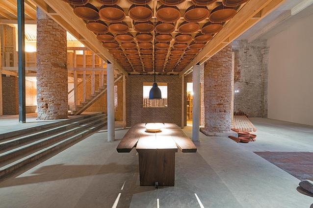
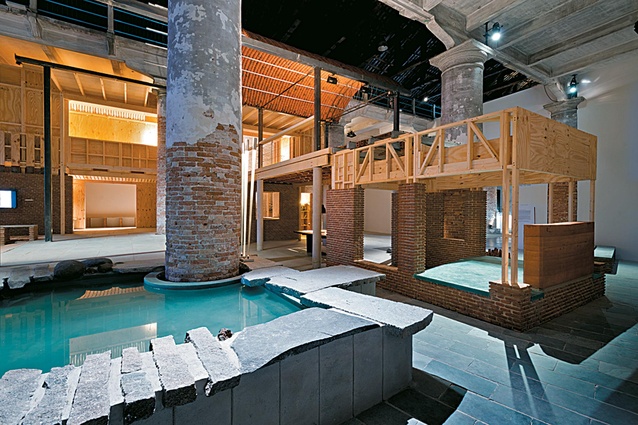
I decided to take an ancient brick, which I revived in the Indian context, and produced some high-tech engineered systems out of fired clay. Then I put it against a brick city context, where there’s a terracotta ceiling with a lot of wood – an ancient way of making roofs – and my modern way is to use terracotta. It’s insulating with no substructure and no wood but necessary in our times. It is more engineered but, when you look up, you can compare the two. You look down and you can see that brick. I collected local brick rubble and inserted the pieces as joins, interspersed with our bricks so that, wherever you look, if you see the walls, you see the columns. Then it becomes like a dialogue: a flirtation is happening between our brick and that brick but it’s indivisible integration. You don’t know where one structure is, so there’s no competition with the existing context. It’s a mutually flattering response to each other so, as an architect, my intention was to exhibit with the same respect I give to any site. My entry is not a stand-alone thing; it exists inside the space and for the Common Ground, rather than talking about the differences. I wanted to show (the 2012 Biennale director) David Chipperfield, particularly, that there is more ‘common’ in the world than you think. The strength is in what is common. We can celebrate the differences but, if you go directly to the differences, without establishing that, then I think you create conflict or confrontation.
New Zealand is an earthquake-prone country so building with brick becomes a difficult issue. How do you create inexpensive, earthquake and environmentally friendly brick buildings?
I think that the real reason why brick has been thrown out now, in these times, is more for commercial reasons. I mean, one doesn’t have to adopt a material everywhere but at least in areas where it makes sense. It’s not been used structurally, it’s been used as façade elements or…
It’s a beautiful material visually so, in that respect, I think it works well here in New Zealand – probably in most countries, to be fair.
In the earthquake areas of India, people are reinforcing brickwork with concrete, so it’s not as if the whole load is transferred onto these columns, it’s only to take out the stresses that would occur. I suspect that brick structures are more complex to analyse and people want everything standardised, so a lot of things are not being done because we want to standardise everything – to order things from catalogues and use software to analyse our reinforced concrete – it’s easier. I believe that’s the reason why we are doing less brick masonry. For me, bricks were important to promote because in India I’m focusing on reducing embodied energy in building materials and, in the Western world, the developed countries’ processes have considered brick a very high-energy material because it has to be fired, so they go for very sophisticated methods of firing and achieve strengths which are also over-designed, maybe. There are bricks being made in India that are not ideal clay but they are enough for that purpose. I think it should go on because they are not using fuels like coal, they’re using leaves and thinnings from forests that they grow for that purpose. Brick isn’t a material to be rejected and, in the context of India’s rapid urbanisation, there’s a huge class of society – the bulk of the country – that has to be absorbed into urbanisation through labour, so I try to spend money through the choices I make; I try to ensure that I don’t just see what is ‘cheaper’ when I say low cost; I check what percentage of the money went into labour, then I know it benefits people and not only industries.
There’s an ethical element in there.
Yes but, for me, it’s not even that I’m much of a social worker, to be frank; I’ve received credit for that sort of approach but it was more out of being a designer and designing for efficiency. I think that, if people in that area continue to be able to do what they’re good at, then we’ll achieve better products and stop bringing in alien systems and saying that we have to do capacity building, as if they have no capacity. They have a capacity for something and you’re not using it. So, it’s your incapacity to use what they can do. I think that a couple of generations do need to be protected in the transition from rural to urban, that this must be considered. The process is as important for me as is the product in building because I am part of it and I enjoy the process.
We sense the process in the end result too. The process is something that keeps coming up in interviews recently. There seems to be this thought that somewhere along the way we’ve lost the process. There’s a yearning, almost, to see the hand of the maker. For the November/December 2012 issue of this magazine, I invited architectural students to produce hand drawings and some of them were a bit surprised to be asked to draw by hand, rather than by computer.
That’s very interesting because I try to focus on the hand aspect because I think that, instead of seeing the poor people and the labour, I think ‘that’s how the building looks’, it’s not a high luxury. It’s like a home-made cake is different from a factory one.
It usually tastes better.
Yes, that’s what I mean. And the touch too because, when you do something with the hand, the person’s engagement is there. He can do his quality check, it’s not cold-bloodedly produced and, on top of it, we need to sustain all those people’s lives.
What’s interesting me now is that we seem to be at a point where we’re mixing up the high-tech and the low-tech.
I’m also very intrigued by that. For me, it all started in a very naïve way. I graduated from Bombay out of a more high-density situation and I was looking for something else before practising for the usual run-of-the-mill. So, when I travelled, I wanted to know a little more about the country because, like New York is different from the rest of America, Bombay is like that too. I was moved by a lot of things that I met and, since then, I’ve been continuously working on these hybrid systems because I think that what we need is to have highly engineered but low-tech systems. That way we save materials and we very judiciously use what we need and we find a layering of skills, so that everybody can be included in whatever capacity they have. That’s why I included students in the Biennale project. Early on (in my career) I developed various building systems to use what they call unskilled labour, so I always try to plan for larger components of work which don’t require some knowledge and skill, like even masonry requires. When I designed this exhibition, I wanted to revisit this equation and invited six heritage craftsmen, who were learning to be craftsmen when I first worked with them years ago but who are are now the fathers; they’ve become the contractors with well-established set-ups. So I thought, the same people can come and the students can become the unskilled labour symbolically; a lot of them had never built with their hands; we had 20 students from Australia and 10 or more from Venice.
What was it like to have the architectural students working for the contractors?
There was such a lot of cultural exchange and learning for everybody. It was very rich in all of that and to realise that you need each of these people and that they’ve all worked without a common language on one common thing at their own levels, even though we knew that the masons would be probably be doing most of the masonry. But then, the students were also helping in carpentry and they were learning how to use different tools. There was a lot of creativity because, when we had to solve something, there were these three perspectives. In terms of realisation, Michael Dixon from the School of Architecture (The University of Queensland, Brisbane) had a big enabling role, so the whole project could essentially be built by the students.
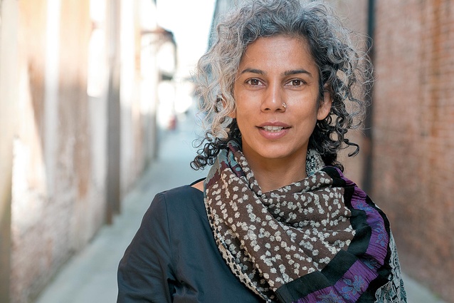
I noticed this lovely portrait of you in your Biennale leaflet. Was it taken in Venice?
It is in Venice and you can see the suggestion of this alley – it has this long space, this plan feeling. It has something…
It reminds me that we’ve several new buildings in Auckland that are particularly successful because, not only do they address the street edges but they incorporate narrow alleys or laneways. They create a real sense of ‘journey’ and, looking up, you get that wonderment feeling. It’s reminiscent of the past – the old European, Middle Eastern and Indian cities. There’s a human scale and connection.
That’s right and these long views and the colonnades.
And meeting places, markets and the people coming together through random meetings – we need more of it.
I think that we are segregating ourselves from life itself, as well as physically from our buildings, with artificial climate controls everywhere. We are putting ourselves into boxes and cubicles and that makes me claustrophobic. But that’s what we tend to feel is normal. I wonder if, in one or two generations down the line, it will become impossible to meet anyone or to go up to someone and say hello… It’s as if you are spending your life in an incubator; it’s so bad for people. You lose contact: the individual nature and situating yourself in the larger environment. One of the most important things for the project was the way the small columns are set within the building and plan; it’s a long plan in a 1:1 scale (I’ve called it ‘one to one’ to represent, not just the scale, but a contact – the process), so everything was one to one, even the way the people come and view the thing. It was a direct exchange because it’s like they’ve come to my house. Everybody will not have a standard experience; they will go where they want – it’s not possible to know everything and that wasn’t the aim.
It’s an exploration.
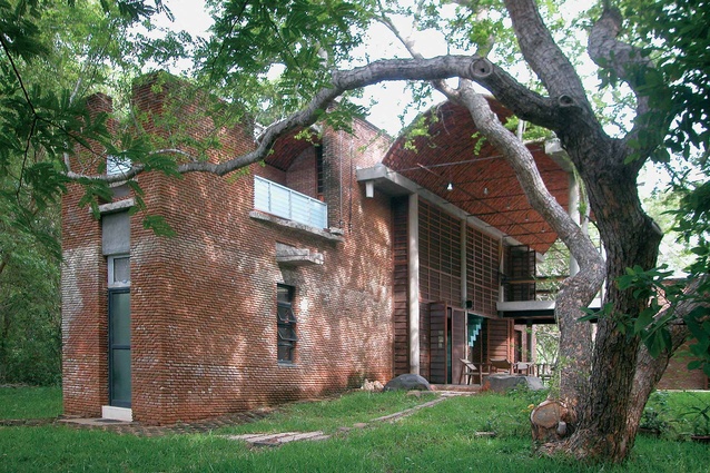
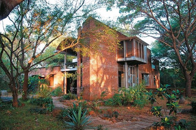
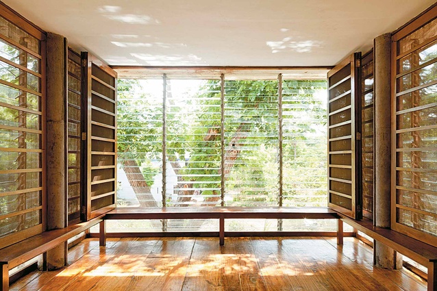
Each one will have their own journey and that is the richness. And, if they come again, they will see something else. I treated these columns almost like trees because the columns we see in nature – which, in that context, we don’t seem to mind as obstacles – make us feel very nice. But, in a building, we automatically see columns as obstacles and I wanted to make a provocation and say that we have to establish what is common and then the differences can be celebrated. So what I tried to do was to bring my Wall House from India – which is appreciated for fitting into its context and is obviously not supposed to fit into Venice – and make it not only look like it belongs to Venice, but like it’s absolutely built for the new context… It’s a funny irony when you say there’s a lot more ‘common’ than you think. anupamakundoo.com

