Welcome to the chocolate fish
Guy Marriage negotiates the black diagrid structure and sinuous, muscular swoops of Tākina’s confectionary-coloured façade and finds plenty of attraction in Wellington’s new convention centre by Studio Pacific Architecture.
Situated at Te Upoko o te Ika a Maui, the city of Wellington is literally the eye in the head of that great fish. Wellington’s curved pedestrian promenade around the edge of the harbour has long been the envy of other cities, making walking or cycling the quickest route from A to B. Laid out in a croissant shape, with Te Papa at the junction between city and Te Aro, Tākina will now take its place next to the national museum as another sparkling dollop of jam on that tasty lunchtime pathway.

Tākina has had a long and protracted genesis. Ever since Te Papa arrived at its present location, it has effectively been cut off by an urban motorway. The site opposite the museum offered the chance of linking back to the party zone of the city. Numerous architecture student projects were sited there over the years, all to no avail. Real life intervened. One developer was keen to create a hotel on the site, although looking out onto the backside of Te Papa was never going to be a major selling point for a Hilton.
When developers Willis Bond bought the site and offered to work with the City Council to create a long-desired film museum on the site, there was a chance for a sort of Wingnut Wizarding World. When push came to shove, however, the Council and the movie mogul could never quite agree on what or how so, eventually, the film museum idea was put to bed.
Instead, the Council settled on creating a mid-sized convention centre with an attached space for travelling exhibitions. A risky move, perhaps, in this age of Zoom and Covid but, also, a move that firmly said: “This city is alive and kicking—come and visit us”.
Tākina (its name meaning ‘to invoke’) is an impeccable example by Studio Pacific Architecture of ‘urbanism done well’. Filling in a gaping hole on the street front that had for years been a tawdry car yard, Tākina sits fortuitously on a bend in the road. Its position, directly opposite the front door of Te Papa, gives a great connection to Courtenay Place, which passes right through the site and past the huge ground-floor exhibition space. It will quickly become an integral part of the city, as long as the rest of the journey into Courtenay Central is completed.

Already, its future is guaranteed to be a success as it is booked solid for the first three years from its launch in June and you cannot help but be drawn to the presence of the opening attraction: Jurassic World by Brickman. Yes, indeed, dinosaurs made of Lego, created by that bloke off the TV show, will draw in every single girl, boy, woman and man between the ages of about three and 93. There will be giant gnashing teeth! There will be six million bricks…!
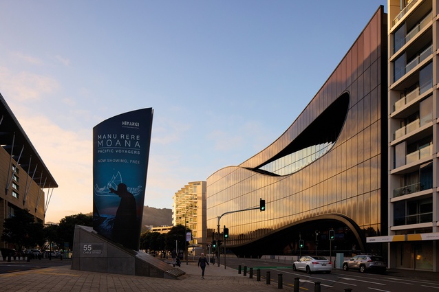
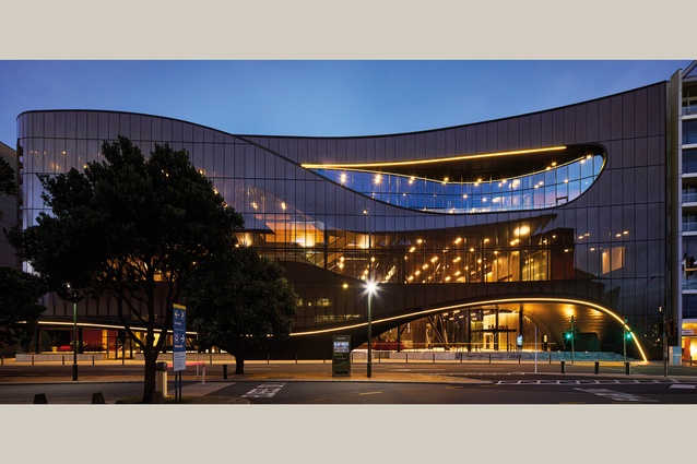
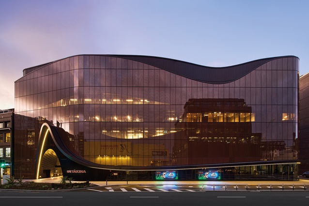
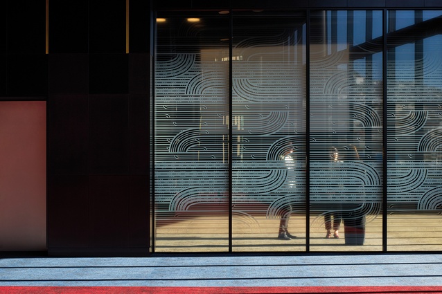
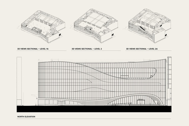
Tākina has only two visible sides, with the cornice line of the Cable Street elevation bookended by neighbouring apartment blocks. The front façade swoops up and down, drawing references from nature, such as currents and clouds, but also having qualities of a more piscine kind. In earlier renders, it was pale, not unlike the great white whale Moby Dick but the change of the cladding into a rich, warm, golden-brown hue means that it now summons to mind iconic Kiwiana confectionery like the peanut slab, shimmering in its golden wrapping. It is a sinuous, muscular façade, clad in glazed panels that somehow change colour slightly as you walk or drive past, courtesy of a Sefar membrane layer behind the glazing.1 This Sefar is stripped back in places for clear views out. From the outside, it is unclear how many floors are within, so it is somewhat surprising to find there are only three main internal floors. Ground floor stud is 5.5m, first is 5.5m and top floor is 6.9m high. As expected, these are lofty spaces.
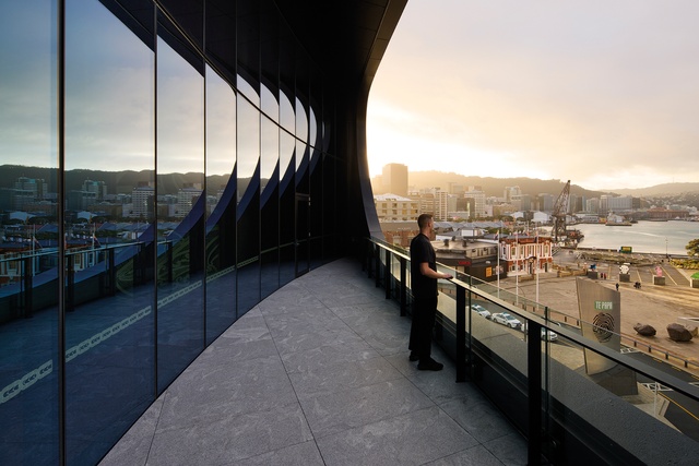
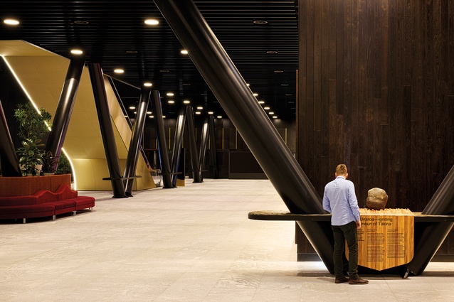
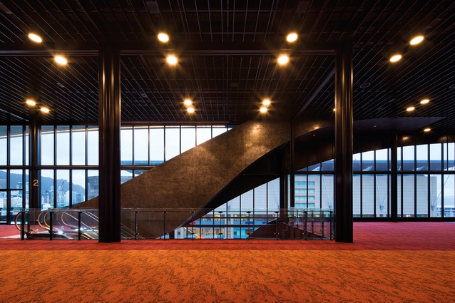
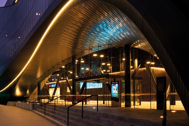
The verandahs are prominent features of the two façades, swooping down along the street and soaring high over each entry, doing a great job of protecting walkers from inclement weather. They also provide a location for some linear LED lighting to enhance that movement. High up on the Cable Street side, there’s a glimpse of an opening, encouraging exploration within. Visitors climb a few simple steps or take a ramp up and into the belly of the whale, to find a serene palette of materials inside. Flamed dark-grey granite on the ground-floor plane walks you through to the other, lower side. What strikes you first is the powerful black diagrid structure that holds up the building, with circular hollow-section diagonal beam/columns that march around the outer edge: a trademark of local hero structural engineers Dunning Thornton. Once the Lego dinosaurs are in full swing, I imagine that the visitors’ focus will be giant plastic fangs and rippling brick raptors, rather than steel structural members, but the diagrid is equally muscular, impressive and, of course, working much harder.

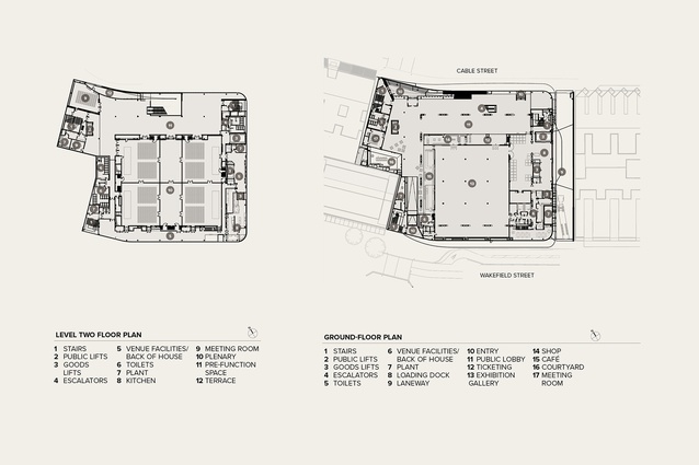
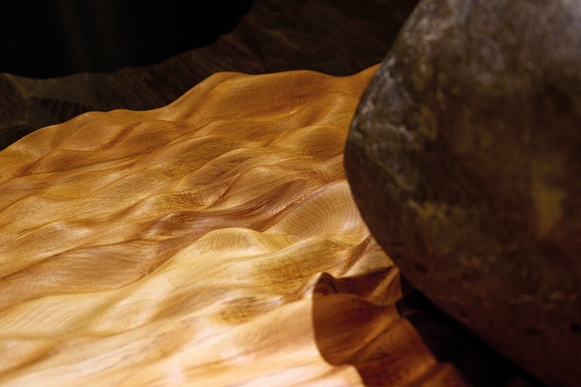
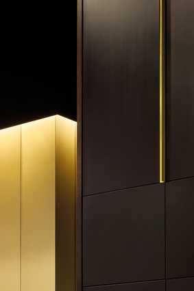
Internal walls are largely black, with vertical circulation, including the lift fronts and the undersides of the escalators, picked out in shades of gold. There is oak panelling, stained black, surrounding the exhibition area, while the end walls are simply black-stained hardboard, designed to melt into the background. There are brass highlights higher up, giving a minimal amount of decoration, tying in with the brass handrails up the steps outside. On the ground floor, there is a café and a generous seating area facing onto a surprising external courtyard garden. While the outside is showing off its curves to attract you in, the inside gently retreats from your focus to let the exhibition take the front row.
The first floor has several smaller function rooms surrounding a large central space, with a flat floor and tall, operable walls hiding in their specialist garages, ready to snake out across the room. This floor can be configured for trade shows, or for 600 people in a banquet or 700 seated, as flexibility is the key to success for a conference centre, with a minimal number of internal columns. The oak boarding has a lighter stain here while the big entry doors are spangled in a faded silver. The decor has a quiet demeanour that can be adapted to the needs of the exhibitors. Back of house includes vital facilities such as green rooms, catering, table storage, garbage disposal, etc., that venue visitors will never see.
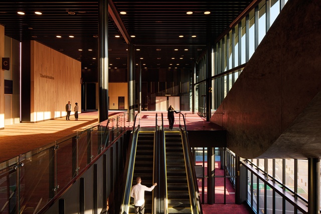

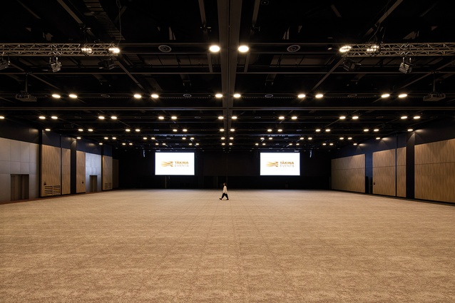
The top floor is where the main action will take place: a large open space that can accommodate up to 1400 people, seated. The diagrid at 9.6m centres creates a 45m x 45m clear, open space. It also features a splendid addition to the city’s space network: a large public deck that overlooks the city to the north where, in the old days, people would have gone to smoke during half-time. (Remember smoking? It’s what people did before vaping.) Great city views up and down the street and a comfortable, solid balustrade mean that this may be a frequently packed-out place for attendees. The architects have colour-coded the spaces, using brighter colours to denote space outside the main seating area. The carpet has the same pattern throughout but the colour changes from charcoal to orange or red, breaking up the floor space; this will be much more subtle when meetings are under way. The colour palette reflects the grunginess of Wellington, the range of hues and tones taken from a painting by Roy Good. There are no ceilings, just services toned in black and backgrounds packed with Autex sound-absorbing insulation. I’m really looking forward to going to some conferences here, perhaps even the in:situ conference of architects, if NZIA can ever bring itself south.

Large, hidden trusses in the roof allow the main space to divide effortlessly into six different volumes, meaning it can be configured almost any way you want. Beca has installed a lighting scheme that can swiftly be digitally altered to different hues to lend a mood to any occasion. A red tinge for the Labour conference and a blue rinse for the Nats? Green for the disarmament conference and a dirty brown for water infrastructure?
Tākina does exactly what a good mid-sized conference centre should do. It attracts you in from the outside, entices you upstairs, entertains you amply while you are there, and recedes into the background so that you can remember only the quality of the speakers and the morning tea. Its name in te reo is simple and easy to remember but its undeniable resemblance to a sea creature means that its nickname, already coined by the workers on site, is justly deserved. Welcome to the Chocolate Fish.
1. In the original review, published in Architecture NZ July/August 2023, the term CFAR was used in error on page 49, where the author was referring to a SEFAR® architecture vision fabric layer behind the glazing. CFAR is a continuous flow airlift reactor. Architecture NZ apologises for any confusion caused.

