Repurposed Wellington Zoo hub
Wellington Zoo has, over the last few years, commissioned a number of buildings from architects as it rebuilds itself as a place for people to have “encounters” with animals.
Zoos are funny creatures. Where once we would go to see an elephant and perhaps ride on it, we now pay to see the absence of an elephant and nod approvingly. Once we were captivated by animals caged in simulacra of their natural environments, and now we are held captive by architecture that tries to deliver an “experience” while the animals roam free in cageless compounds. Rich pickings for semioticians, anthropologists, zoologists and, more recently, architects. Zoos everywhere are undergoing major transformations to embrace contemporary attitudes to animals and how we relate to them, and they are looking to architects to help them do it.
The development has been somewhat ad hoc in spite of a strategic plan developed by Boffa Miskell. The new buildings are a mix of styles and there is no coherent or consistent street architecture for wayfinding (although this could be argued as being deliberately zoologically diverse). The Boffa Miskell plan identified the intersection of the two main circulation routes as the “hub” of the zoo. At this intersection was the tuckshop, tired and inadequate for servicing the growing number of catered corporate functions held at the zoo to raise money.
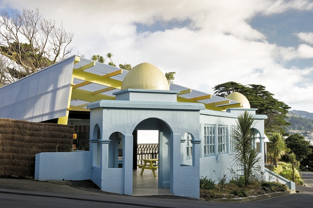
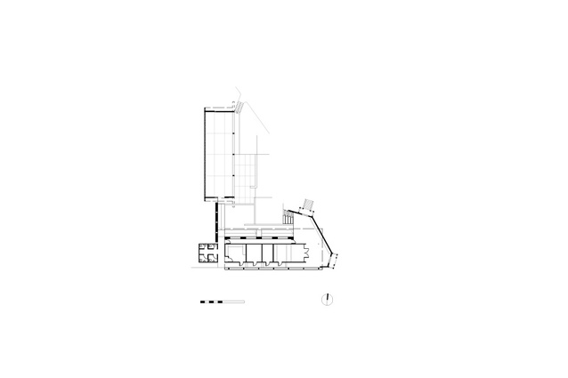
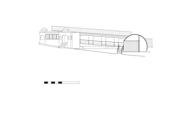
Justin and Louise Wright of Assembly Architects were engaged to update the tuckshop and address the catering functions. They quickly identified that the tuckshop was the wrong site because it floated like an island and would be inaccessible for service vehicles. Metres away stood the Elephant House, sans elephant, sans use. It was a peculiar yet memorable with a vaguely colonial interpretation of Eastern arches and domes, crudely constructed of concrete. The architect has colonised it for the tuckshop and a finishing kitchen for functions, and – as good architects are wont to do – suggested an additional building, an open-air permanent marquee. This would provide shelter for those eating their lunch but could also be used for corporate functions.
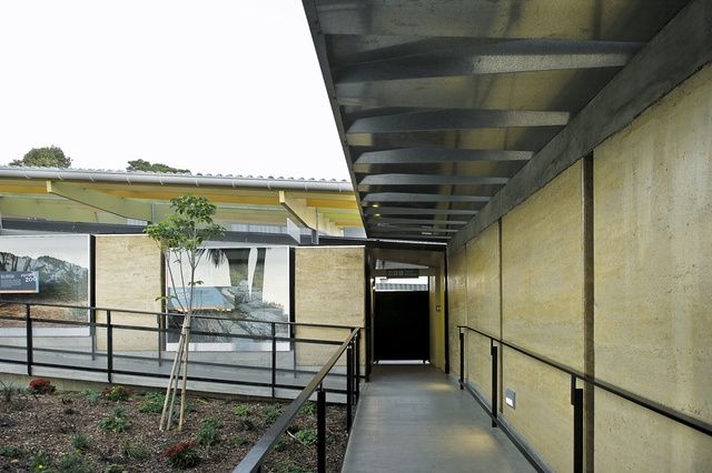
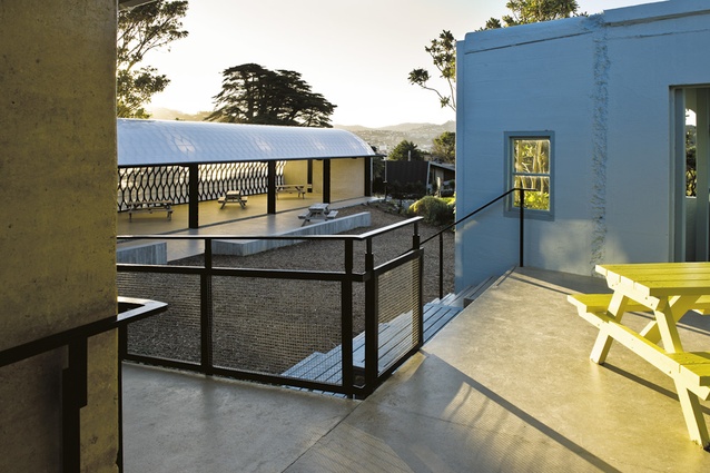
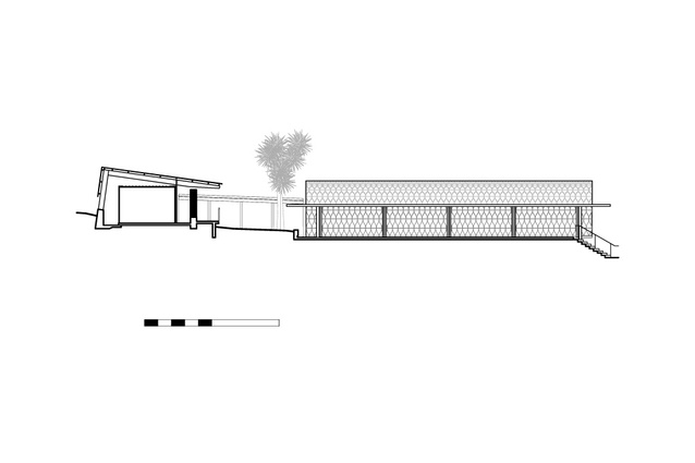
The tuckshop now has distinct public and private areas, facilitating truck access, and also houses the Scaly Nursery: a series of reptile enclosures. This small building is a simple box with a glass-walled tuckshop at the front, which houses a Mojo cafe (designed by Allistar Cox), as ubiquitous in Wellington as the slope of the site. Neatly concealed behind it is the finishing kitchen and a set of toilets. Along the north face is the Scaly Nursery where the reptiles can bask in the not-quite-so-ubiquitous sun. The box is enclosed lightly, with an L-shaped roof of transparent roofing on LVL timber frames and is clad in black baby corrugated iron with a roof of Super Six corrugated fibreglass. Moving through the building there is a delightful ambiguity between inside and outside, a light, airy feel giving the whole a sense of weightlessness.
Assembly was very interested in using the hub to unify details from elsewhere around the zoo, essentially cutting and pasting from the recent architecture. The LVL timber frames are borrowed from the Jasmax Wild Theatre across the way; the L-shaped roof is from the Nest and the handrail detail comes from the Giraffe House. This could have been quite cacophonous but it works well and it all seems to belong.
The zoo is committed to sustainability, and Assembly has risen to this challenge: the practice has reused the earth excavated from the site in a series of rammed earth walls that form the Scaly Nursery and the walkway to Kamala’s Marquee. The builder was initially sceptical about these walls and the process to build them, but the end result has the appearance of robustness in spite of its vulnerability. The walls are protected from extreme weather with wide overhanging verandahs.
The verandah over the walkway is intriguing. In its work, Assembly is very interested in making architecture out of single components. The verandah roof is made out of stock galvanised sheets folded diagonally to form the roof which becomes both a structural element and a wide gutter. These are cantilevered off the rammed earth wall and each sheet joins the next with two rivets. It is an extraordinarily simple solution of structure and shelter.
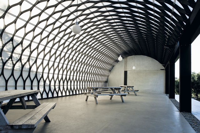
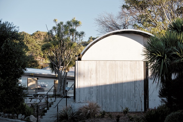
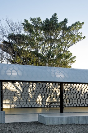
The verandah leads to the pièce de résistance: Kamala’s Marquee. Justin Wright was looking for a romantic architectural idea and started (as one does) by cutting curved bits of cardboard out of a Weetbix box. These were joined together and then pulled apart, much like a crepe paper lantern. His aim was to build an arched roof made out of the repetition of a single element. Scaled up, each element is stamped out of aluminium and then rolled in two directions. Each piece is joined at the hip to one piece and at the neck to another. Horizontal threaded rods hold the structure in place and stop it distorting. The whole structure was not built top to bottom vertically, but assembled horizontally from one end to the other like a slowly growing extrusion. Once completed it was covered by a single plastic membrane that keeps the worst of the weather out and allows light in.
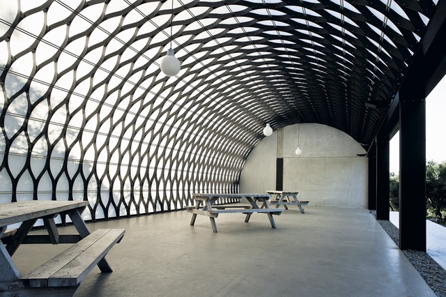
The power of this singular work of architecture lies not only in its conception but in the research and collaboration that brought it life. The scale and dimension of the vault was dictated by the maximum size of the roofing membrane available in New Zealand (made by Redpath in Palmerston North, which designs and manufactures agricultural tunnel houses). The structural metal elements were made on a turret punch (because the required curve couldn’t be guillotined) by Fraser Engineering, a specialist in designing and building fire engines. The turret punch can work to a maximum of four millimetres thick so the structural engineering had to factor this size in to the calculations. The complex engineering was done by Alistair Cattanach of Dunning Thornton who had to go back to the designer of the software he used and get it to expand the number of iterations necessary so that he could complete the engineering design.
This is a fair-weather marquee that can be enclosed with a plastic wall for functions. The setting sun casts the shadows of trees across the translucent walls and the reverse happens when the room is full of contented corporates in the evening. It is a giant occupiable light fitting, made from three basic elements and completely demountable. Like the Elephant House before it, it is peculiar and memorable but it is a long way from crude.
There is no elephant in this room. What you see is what you get. What you get is the future of architecture. One day there might be no animals left at the zoo to see, only architecture – would that it were all this exquisite.

