Wellness in design: Shortland Health
When redesigning a central Auckland medical clinic, the architects at Klein took the opportunity to re-examine the patient experience.
No one likes waiting in the reception areas of medical centres, so why do we have them? And, on the subject of waiting rooms, why do they all look so sterile and impersonal? Architectural firm Klein addressed these patient concerns in the design of Shortland Health medical clinic and attempted to turn the traditional general practice model on its head.
The ‘concierge’ system implemented in the Auckland CBD practice is a subscription-based system, which means patients pay monthly for the service and can visit as many times as they like. It’s an innovative approach to patient care and a new business model, implemented by the client, OmniHealth.
The new business model means each GP is expected to have a maximum caseload and see their patients far more often than is the norm. Hopefully, the result is improved relationships and, potentially, better health outcomes. This approach sits neatly with Klein’s design philosophy of ‘wellness through design’; four ‘wellness’ pillars – health, happiness, sustainability and purpose – are central to its practice.

Happiness, says Klein’s Dan McNelis, is somewhat intangible but, here, “we define it as something beautiful: something that makes you enjoy spending time in the space”.
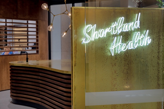
Experiencing happiness is not something you’d normally associate with a GP visit but this practice offers a patient experience that is like no other. It begins in the foyer of 51 Shortland Street where the bold neon signage, rich, aged-brass wall and lush plantings deliver a contemporary retail feel, marking a significant departure from the classic, white clinical experience.
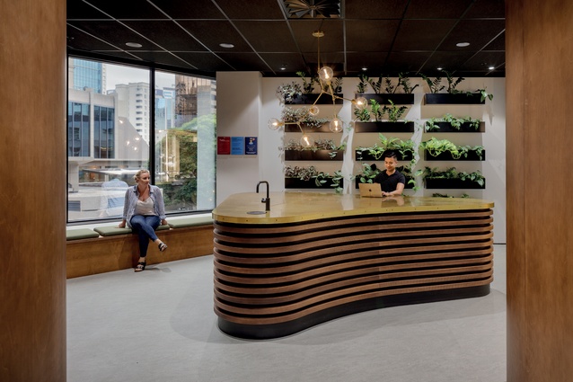
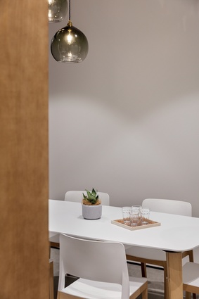
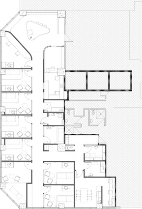
Inside the practice, the patient – or ‘client’ as McNelis refers to them – is greeted and the concierge system comes into play. Each client is asked to sign in on a tablet and offered refreshments before they are ushered to their own private room where their GP will visit them – an inversion of the traditional patient-care model.
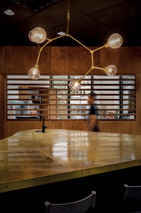
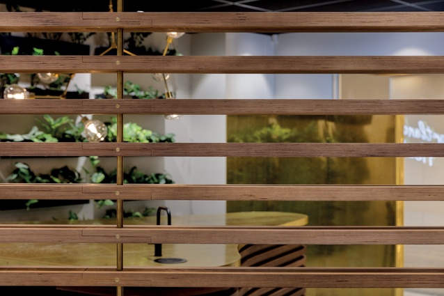
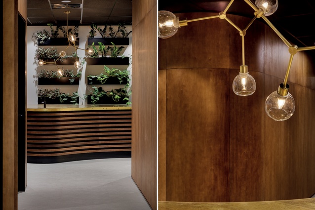
The sign-in desk in the patient lounge is a sophisticated and curved island with a brass top, aged with rock salt and malt vinegar (care was taken to avoid the use of harmful chemicals). The brass dowels on the edge of the counter and the stained European birch ply curved around the sides of the island demonstrate an attention to detail you wouldn’t normally expect within a medical space.

The peppering of plantings, planned alongside Outside In (which installed and takes care of the plantings), improves the air quality throughout the space.
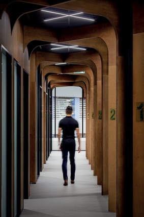
Moving into the corridor, archways of richly stained European birch ply suggest a forest of trees, adding another biophilic element, and the dark, acoustic-panelled ceiling is broken with minimal strips of bespoke lighting custom-designed by Klein. These imitate the crosses of the timber arches and emulate “sharp shards of light peeking through the forest canopy”.
It’s an environment that mimics nature’s serenity and a space that “kind of hugs you,” says McNelis. “You feel wrapped in a natural environment even though you’re in the middle of the central city.”
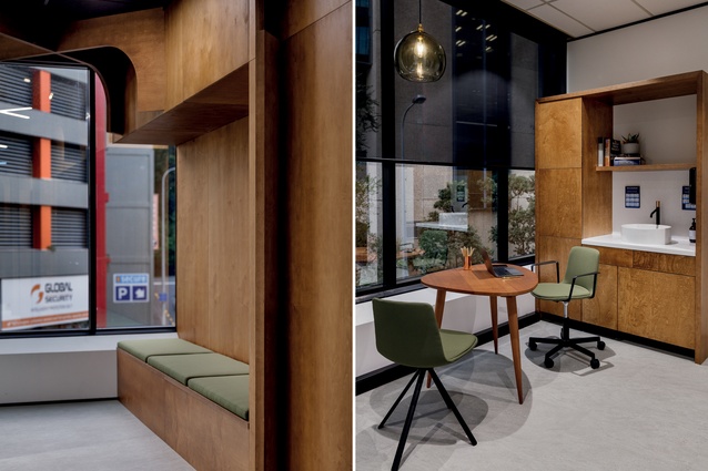
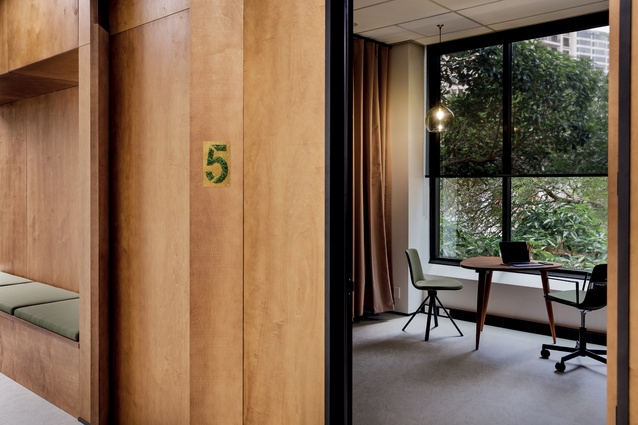
‘Health’ as a part of design philosophy certainly takes on a more profound meaning when designing a ‘health space’. The promotion of emotional well-being was addressed further by creating comfort wherever possible; the materials and furniture in the clinic rooms are soft, inviting and tactile.
The armchairs have covers made of antimicrobial fabric, which can be removed and washed; equally, the divider curtains are also made of fabric, rather than plastic, and are washable. The softness and tactility of the furnishings and gentle colour palette represent an anti-medical approach and contribute to an overall feeling of ‘care’.
In another rejection of convention, the patient and doctor face each other across a small table in the consulting rooms; this improves engagement. Separate back-of-house ‘write-up’ spaces mean there are no cluttered desks and the doctor can go away to write notes. To that end, the back-of-house spaces are as beautifully appointed as is the patient-side face of the business. The commitment to well-being through design means it was equally important to care about the experiences of staff members as it was to care for the patients.
In line with this approach, Klein paired with Living Future to administer the Declare label – all the contents of the materials are declared and are free of carcinogens – and this, in turn, improves the air quality in the space for both patients and staff.
The practice also achieved a Cornerstone accreditation – meaning the space has been judged as fit for purpose as a medical space – which is a key component of Klein’s design philosophy. But, while functionality is certainly key in a general practice, it’s those intangibles of ‘health’ and ‘happiness’ from which the patients will most benefit in this re-imagining of the medical practice model.

