Westpac
Picture if you will (although it is, to be fair, an unlikely scenario, unless of course you have a particularly high tolerance for parlour games); it’s the turn of the century (the most recent one) and you’re playing a word-association game. The word is “bank”. What comes to mind? Bricks and mortar, steel bars, jump wires, safes and security glass – words, most likely, that would be equally at home associated with the word “prison”. While they evoke notions of security, the overall connotations are negative and far from the ideals of comfort and hospitality, freedom and convenience, with which today’s businesses prefer to be associated. They’re certainly quite removed from “surprise and delight”, the hallmarks of those superlative retail experiences that are, disappointingly, very thin on the ground.
What a difference a decade makes. Today, it seems banks, and everybody else, are rethinking customer interaction, and given the flurry of bank-sponsored building activity in the marketplace, it seems these institutions, above everybody else, are in a better financial position to start tweaking the model. As with others in the retail sector, the idea of the flagship store as a repository of a company’s ideals and aspirations has made the transition to banking. In part, this new direction is derived from technological advances, internet banking for instance, and methods of in-branch money handling such as teller cash recycler (TCR) units, which are similar to an ATM in that they automate the transfer of money and remove open-cash-drawer scenarios of the past, allowing tellers to get out from beyond the security glass and walk the floor. TCRs “encourage people to come and stand next to the teller and look at the screen”, says Natalie Snowden, retail and interiors head at Context Architect, who has now worked on a number of projects for Westpac.
It is this signature Queen Street branch, which came to fruition after three months of construction in late 2012, that best illustrates the ideological shift from queues and zones to free-range banking, where the main idea is to move away from a transactional and queue experience to a brand experience.

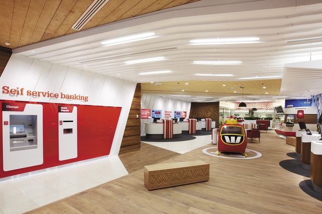
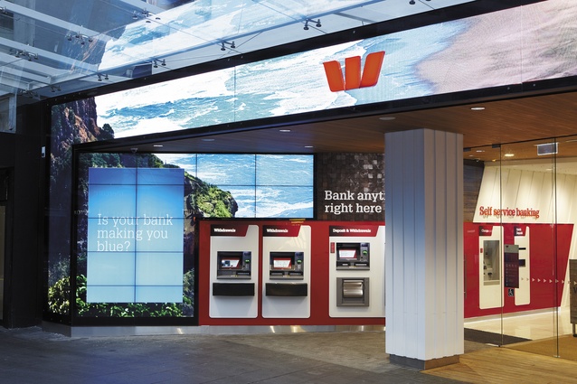
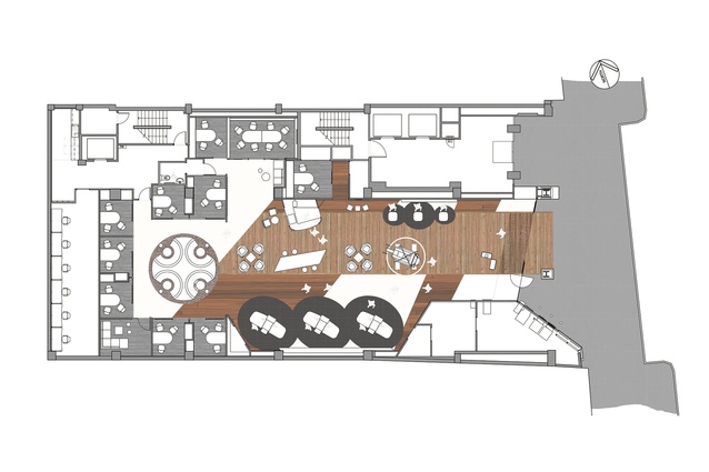
Snowden says that some layout aspects of this branch are fairly typical for Westpac – the self-service zone of ATMs at the front that you can get to 24/7, for instance, and the concierge welcome. What’s different is the section through the middle, where there is a mix of product space and places for informal interaction with staff.
“The branch design is contrary to what most people associate with banking,” says Snowden. “By opening up the entire front of house and making nothing ‘off limits’, it invites customers in and lets them own the space they are in,” she says. There are design devices to remove barriers at the threshold of the bank and there are devices to “draw the customer through the different spaces – from the front self-service area to the collaboration spaces at the back.”
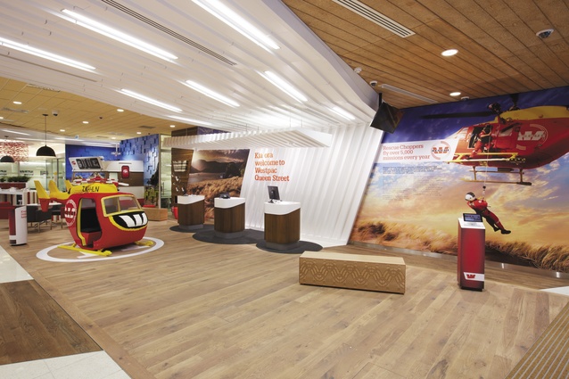
What does this mean in design expression? What does a “go anywhere” bank actually look like? Well, let’s begin at the threshold, where a technological facade treatment lays the groundwork for a more naturalistic interior theme that is based on a concept of “wharf and wave”. The facade is a mass of LED screens, which are seemingly impervious to the effects of bright light. It is, says Snowden, the same technology you might get at a rugby game but with higher definition, and it creates for the bank the possibility of an ever-changing message board. Currently, the preprogrammed images include the archetypal Christmas pohutakawa beach scene, the Westpac Rescue Helicopter in action and the dramatic cliffs of Piha and, like a surprise guest, a ghost of television past, the Goodnight Kiwi pops up at night with community safety messages for Aucklanders out on the razzle.
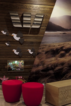
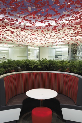
The exterior imagery sets up the interior design moves that Context has made inside. The “wharf and wave” concept might elicit a groan from those who think references to New Zealand’s flora and fauna in commercial interior design might be a little overdone but, in actuality, these devices are subtly hardwired into the organisation of the interior. The wharf is a “directional boardwalk” cutting through the centre of the space. This is where you find the interaction space. The “wave” is the clean white ceiling device that wraps overhead.
Snowden, who is not unaware of the dangers of metaphorical design, explains the motivation behind the concept, which was driven by the branch’s location close to the CBD’s current harbour edge, and its even closer proximity to Auckland’s historical water’s edge, which, pre-reclamation, was near Fort Street.
“This branch is about beach culture, and there is diversity across those beaches: east coast, west coast, black sand, white sands; Fort Street used to be called Fore Street. Then there’s Takutai Square office [Westpac’s headquarters at Britomart, designed by Jasmax], with its ‘strata’ story [the sequencing of levels of the building in relation to strata]. The interesting thing about having a strong concept story is that it gives people something to really buy into and then on sell. Sometimes, as designers, you resist that, you definitely resist labelling thing and having a tidy little package, but a good concept gives you the language to answer the design questions that come up, whereas if that’s not there, you can go down a Disney route of façade. We’re very happy with where this one ended up.”

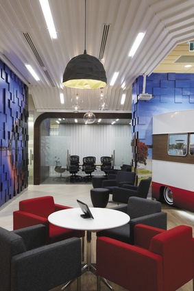
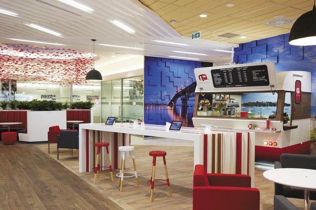
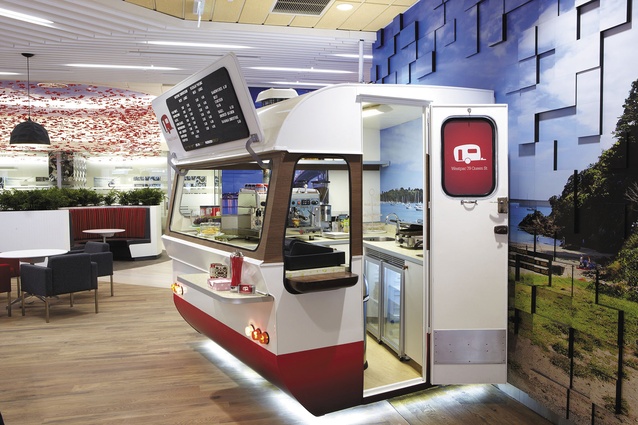
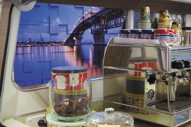
Finally, we should mention two great props inside the branch. There is a 4,500-piece Lego helicopter, which weighs in at 400kg. It took three days to build, has a functional rotor and sits three kids in its cockpit. One imagines the people it will pull off Queen Street will be pint-sized, with full-sized versions in hot pursuit. Westpac has been sponsoring the rescue helicopter since the early 1980s. It’s a familiar sight at a number of Auckland beaches, and this makes the overall theme selection seem quite relevant. There’s also a barista-driven coffee point, in caravan form, appropriately placed next to the “knowledge bank”, where customers can tap into the free Wi-Fi and read the news, et cetera, on their own or one of the bank’s proliferation of mobile devices, and formal and informal meeting and seminar spaces at the back.
Gai McGrath, Westpac’s head of retail banking, says this type of branch is a market leader: “Queen Street is at the forefront of what is happening internationally in retail banking”. It’s a a new style of branch that is less about operational activity and more about creating spaces that customers want to be in, she says.

