Volume and drama: White House
This crisp addition to a Federation home (a colonial Australian architectural style prevalent from 1850 to 1915) exuberantly manoeuvres light, space and monochrome materials to masterfully meet the brief.
The client’s brief for White House was to convert an existing heritage house into an open, light-filled home. To take on this task, they gravitated toward the classic architecture of Robson Rak. Although the practice’s projects typically value restraint over excess, the clients’ request for an all-white palette asked the architects to take this approach a step further.
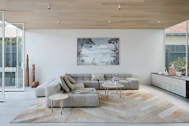
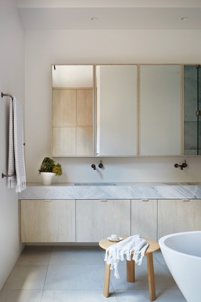
Here, the texture and material typically seen in Robson Rak’s work takes a back seat. With the exception of whitewashed oak linings and sparing touches of marble, the finishes are generally white, with very little colour variation. Between the powdercoated steel, porcelain floor and white render, the palette largely sits in a narrow spectrum between pure white and off-white.
Throughout the house, the detailing is important, ensuring crisp, clean edges and uninterrupted expanses of monochrome, but materiality and texture are less of a focus. Instead, the design response shifts its energy toward volume and light. The design also carefully considers view lines, intentionally choreographing what is seen and unseen as you move through the house.
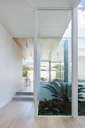
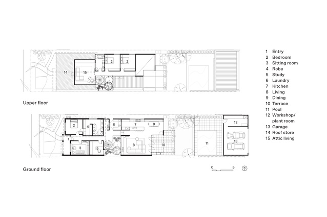
The partially retained original house is a double-fronted Californian Federation mix. The front four rooms have been retained, ensuring the new addition is set back significantly and almost invisible from the street. The concealed nature of the renovation amplifies the moment of surprise when you first open the front door. A new courtyard has been inserted into the centre of the plan, aligning with the axis of the door. It transforms the previously dark and enclosed entry space into an unexpected moment of daylight and green outlook.

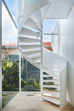
The rest of the plan radiates outward from the central courtyard, which is the threshold that connects the three main arms of the house: the original front portion, the new open living space at the rear and the new first floor above. While it is the connection point, the courtyard, which envelops a white spiral stair, also separates and partially screens the three arms of the house from one another.
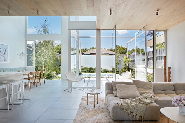
The courtyard filters the view of the living space from the entry. There are glimpses of something beyond through the foliage but it’s not until you dogleg around the courtyard that the expansive volume of the new living space is fully revealed. A dramatic double-height dining space with floor-to-ceiling windows is remarkably bright and open. The living space, flanked by both the backyard and the courtyard, has access to two aspects of natural light and green outlook. The all-white palette exaggerates the openness of this space.
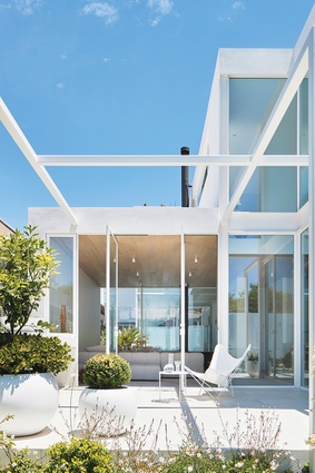
An exposed steel structure extends from the rear facade out to the external terrace, creating a skeleton that defines an outdoor room. Abutting the pool, this space operates as both part of the house (the fully opening pivot doors of the living room can open up and claim the space as its own) and part of the garden. These visually connected spaces create a dynamic social environment, supporting the way the owners like to live.

Upstairs in the children’s zone, the rooms are organized along a hallway that is anchored by natural light at both ends. At one end, the courtyard windows offer long-range views of the neighbouring rooftops. The other end hovers above the double-height void of the living space, with clear view lines across to the floor-to-ceiling windows at its terminating point. The balustrade effectively screens views between the ground and first-floor activity, ensuring privacy for the bedrooms above despite the openness between floors.
Again, the external exposed steel structure leads the eye to the outdoors, perhaps more dramatically here as a result of the converging one-point-perspective lines at the end of the narrow hallway. This view invites the outdoor space to be part of daily life upstairs, too.
In adhering to the brief to create an all-white house, Robson Rak has focused its efforts on dramatic volumes, daylight and considered view lines. Organizing the spaces of this house to both capture and exclude views, it has capitalized on favourable outlooks, filtered views that pique curiosity, excluded views to protect privacy and encouraged visual connections in the social spaces. By pairing these controlled view lines with high ceilings, generous glazing and a predominantly white palette, the bright and airy nature of the house has no doubt expanded on the clients’ vision for their home.
This article first appeared on architectureau.com.

