Appetite for change
The last thing you expect to see in a CBD office setting is a series of cutting edge food research labs and kitchens. That's just one part of what Goodman Fielder got when it moved into its new workplace designed by Futurespace and Wingate + Farquhar.
Auckland’s central city is not really where you’d expect to find a food manufacturing company like Goodman Fielder. You’d think that the need for research and development labs and test kitchens would preclude such a move, condemning the company to the more industrial locales from whence it came, East Tamaki and Penrose, and the like.
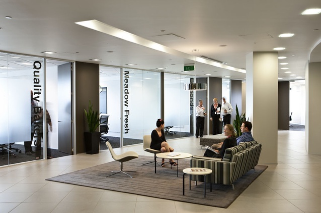
Not so. Goodman Fielder is the owner of brands that have been part of the retail landscape for what seems like forever: Edmonds (“sure to rise”), Vogel’s (“naturally delicious every time”), Kiwi bacon and Meadow Fresh among many others. However, it’s fair to say that the company has been better known for the parts of its sum — its products — so a project to consolidate various facets of the business into one head office provided an opportunity to raise the profile of the overall brand and define a real presence for the overarching brand in New Zealand.
The place Goodman Fielder chose to integrate its business was downtown Auckland. The previous tenant at the Nelson Street site, Deloitte, had since moved itself to 80 Queen Street. Australian architecture firm Futurespace handled the transition for Goodman Fielder in Sydney and it was also engaged to settle the company into its Auckland HQ. Goodman Fielder’s four distinct product divisions would eventually move in across five floors, including a series of test and demonstration kitchens.?Futurespace worked with local architect Wingate + Farquhar, specifically enlisted to impart a New Zealand flavour to the design. Wingate + Farquhar was also contracted by the project manager, Jones Lang LaSalle, to make improvements to the base building elements; the most obvious part of this job being the lobby — an unmanned space with a tricky jink that made it difficult for visitors to identify where they were to go.
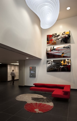
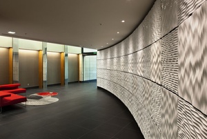
The trick there, says architect Blair Farquhar, was to find a way to drive people through the space and around the corner — and to make it interesting and civilised when no one actually occupies the space.?“When there’s no reception and nothing to look at it’s pretty hard, which is why I was paranoid about getting the artwork in to liven the space up. It can be difficult drawing people into the building. Compounding the navigational difficulty was the fact that the lobby is unmanned, so visitors, left to their own devices, need to wend their way in and up through the building.”? New lobby features — and signs of occupation — include a cracked plaster finish to the wall behind the artwork, a massive David Trubridge light, a lively red sofa and a designer rug. Another crucial feature of the space is a gently curving wall, clad in rippled white panels, that guides people on to the lifts.
“Interlam panels come in 2400 x 1200 mm sheets, but we thought that because of the curve of the wall that we needed to get that dimension down, so we cut them to 600 mm and quarter-turned them. It was a very efficient way to use the sheets and you get an interesting effect,” says Blair Farquhar.
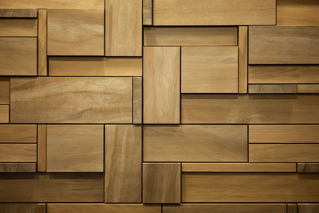
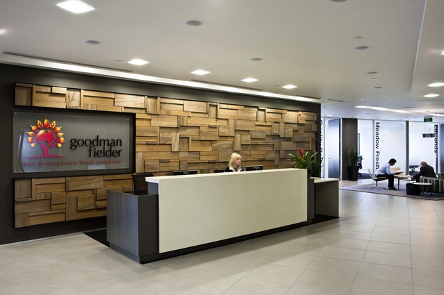
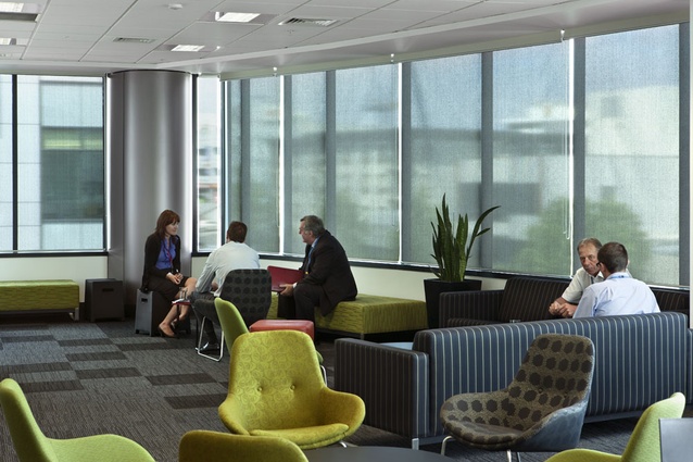
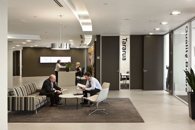
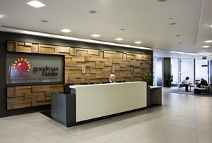
Concealed behind that wall are the Goodman Fielder’s test kitchens. Opposite are the lifts, where the architects specified a tile for the face of the lift surround that made a material connection with the tiles at the entranceway. Up the lift, to level eight, is the Goodman Fielder reception, where disembarking visitors can immediately enjoy an impressive swamp kauri-clad wall behind the reception desk. If you’re looking a for a material representation of New Zealand you couldn’t do better than this; it’s a warm and punchy entrance device, and the tones throughout the breakout spaces and meeting and board rooms on this level are quite complementary.
Neil Walters, senior associate at Futurespace, says similarities between the New Zealand and Australian arms of the firm meant that the experience gained from the Sydney project could be applied to the Auckland project. In terms of design, says Walters, the language is very similar between Sydney and Auckland.
“I would say there are probably two components to the design in terms of spatial design and provision of work positions — offices, support facilities, test kitchen, reception and meeting and training rooms are quite similar in space planning and language.
“Goodman Fielder liked the result in Sydney, so they said let’s take that forward to Auckland. It was quite a similar brief to what we had in Sydney, but slightly smaller, in terms of scale.
“Where Wingate + Farquhar came in, in terms of the visual design, was with the look and feel. Goodman Fielder in New Zealand wanted a New Zealand feel, not a carbon copy of Sydney. So we did briefings and spoke with the stakeholders and got involved with Wingate + Farquhar. We really relied strongly on Blair and Sarah [Murdoch] to help and assist us with that. That’s where the look and feel came from. Elements are similar, but there’s more of a New Zealand stamp on it. Blair and Sarah came back with extensive images of New Zealand, different colours, strong black and white, strong greens and blues, and we tried to bring that colour scheme into it.”
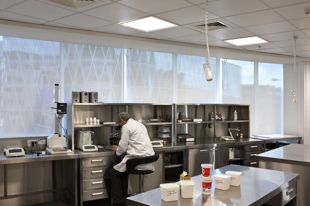
The process of Futurespace’s workspace analysis went something like this: Walters and his team met with stakeholders from each group at Goodman Fielder, and in particular looked at staffing flexibility and future growth, meeting and training requirements, and special requirements such as the test kitchens and demonstration rooms. These were then translated that into the layout design.
“We did maintain a lot of what was existing from the previous fit-out,” says Walters. “Just by chance we needed a certain number of offices and there were a number of offices on the one side of the building, so we kept those on all floors but plugged and played with that a bit to get them all to fit. Then we looked at the designs of the open areas, referencing what we did in Sydney in terms of space provisions.
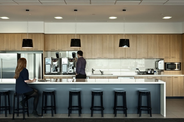
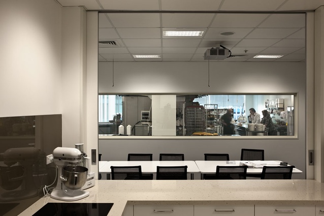
Then there were the specific requirements like the training rooms and meeting rooms up on level eight, and the test kitchen on level four. The test kitchen was the tricky bit — in particular the difficulty was in the exhaust provisions, trying to find a route suitable enough to take it out of the building. We eventually punched it through to level five and then ran across the roof of level five, put exhaust fans in the storeroom that sits at the back, and then punched through to the outside of the building. ?That was a tricky design to get right in terms of working with Wildfire, who did the kitchen design, and working with services engineer and the landlord to approve the routing.”
Despite the difficulties, the kitchens are one of the new office’s great strengths — a critical part of the idea of an office as a unifying device to help portray Goodman Fielder as a smart, research-focused food company. One imagines this importance can’t be overstated in terms of the perception, as rather than taking clients into industrial factories it’s welcoming them into modern research and development facilities, which must be a solid investment in company’s own brand.

