Winners revealed: 2017 Dulux Colour Awards
The 2017 Dulux Colour Awards were announced on 10 May at a ceremony held in the Touring Hall at Melbourne Museum, recognising outstanding use of colour in commercial and residential spaces across Australia and New Zealand.
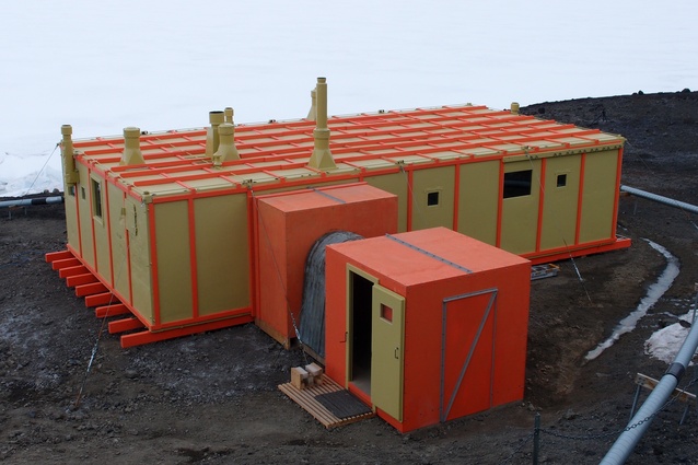
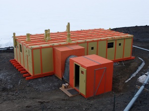
The two winning New Zealand projects were Hillary’s Hut from the Antarctic Heritage Trust (winner of the International category) and Carrara Baths from Taylor Chan (winner of the Student category).
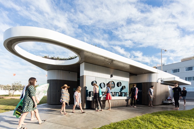
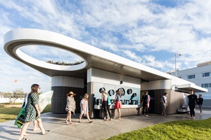
The winner of the overall prize, the Grand Prix, was North Bondi Amenities by Sam Crawford Architects with Lymesmith. The judges said the project was “A timeless accomplishment that has been created for the masses, yet is still so beautifully considered”.
Dulux Colour planning and communication manager Andrea Lucena-Orr said that this year’s finalists delivered on the theme of “Bold, Forward, Titled.”
“The Dulux Colour Awards look to uncover the most inventive use of colour in built environments across Australia, New Zealand and beyond. Each year we look for the submissions that take creativity to new heights and this year’s award winners broke free of all tradition to deliver concepts that truly represent the future of colour and design.”
The winners are:

Grand Prix and Commercial Exterior
North Bondi Amenities – Sam Crawford Architects with Lymesmith
Judging panel comment: The building’s colour scheme was the result of a collaboration with Sonia van de Haar of Lymesmith – Polychromy who utilised the Australian Standard colour palette. Nodding to the assertive presence of the horizon over Bondi, the datum line created in the building is just one of the well-considered design elements that makes this building work so well within its natural setting. A timeless accomplishment that has been created for the mass, yet is still so beautifully considered.
Student
Winner
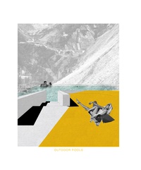
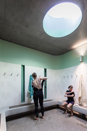
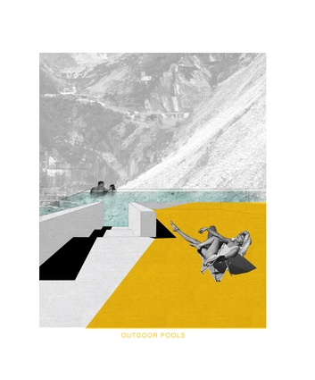
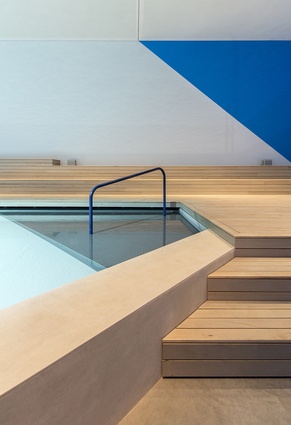
Carrara Baths – Taylor Chan, University of Auckland
Judging panel comment: Aiming to envision the afterlife of marble quarries in Tuscany, Italy, these baths create a sensory experience of light and colour and texture. A clever use of colour palette to offset the raw and natural location setting. It has a simple, yet in-depth, earthy feel that draws its audience in.
Commendation
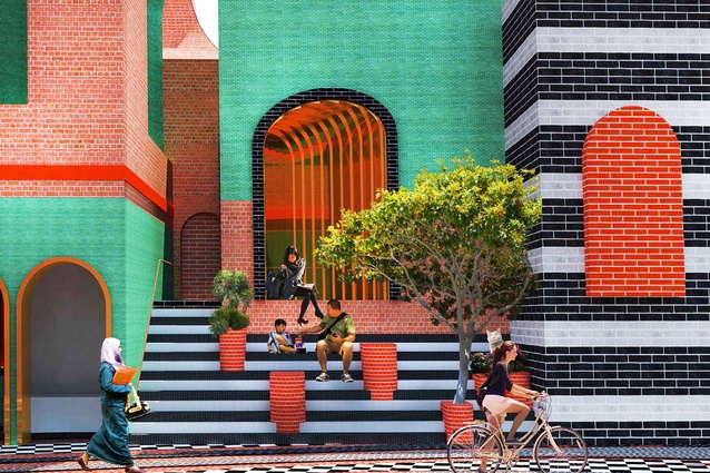
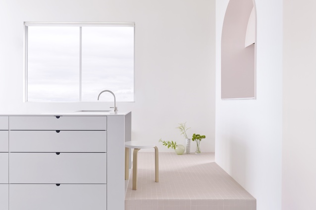
Arched - A Civil Union – Jun Chang, RMIT University
Commercial Interior – Public Spaces and Hospitality
Winner
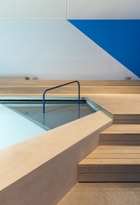
The Pool – Aileen Sage Architects with Michelle Tabet
Judging panel comment: As a celebration of a distinctly Australian space, this submission really meets the brief and truly depicts Australia. This complex use of colour shows the architect has really considered how varying light might bring the chosen colours to life to mimic the changing patterns of light around a pool over the course of a day. This submission epitomises why investing time in colour selection is so important.
Commendation
Karratha Super Clinic – Coda Studio
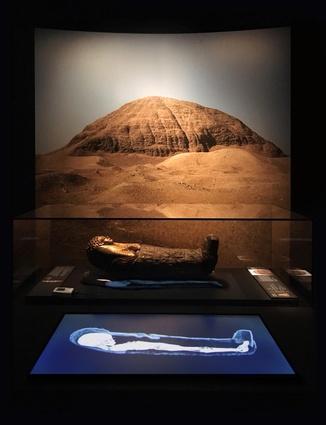
Egyptian Mummies: Exploring Ancient Lives – Studioplusthree
Commercial Interior – Workplace and Retail
Winner
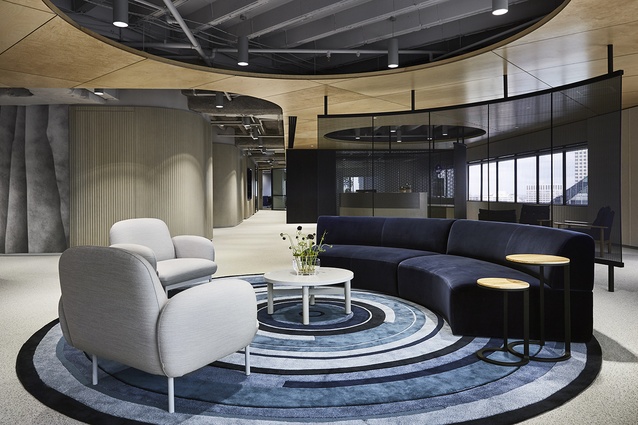
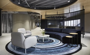
Financial Services – Futurespace
Judging panel comment: As a workspace of one of Australia’s most successful investment management companies, this is a difficult space to make something of. Briefed to create a space which connects people whilst adhering to the brand values, the architect has shown restraint in matching an interesting palette, using a lighter substructure to offset the darker tones. The result is outstanding as the architect has created an environment that is comfortable to be in all day.
Commercial Exterior
Winner
North Bondi Amenities – Sam Crawford Architects with Lymesmith
Judging panel comment: Belonging to the sand and surf of Bondi Beach, this building is exposed to the relentless coastal elements. The building’s colour scheme was the result of a collaboration with Sonia van de Haar of Lymesmith – Polychromy who utilised the Australian Standard colour palette to compliment the building’s environment, nodding to the assertive presence of the horizon line and the vast expansion of sky. A beautifully detailed scheme that complements both its environment and its purpose.
Commendation
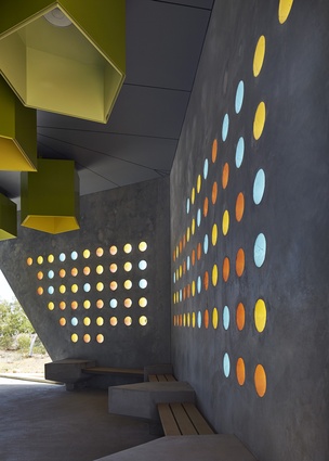
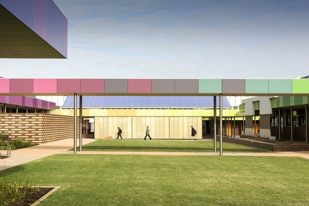
Byford Secondary College – Donaldson and Warn
International
Winner
Hillary’s Hut – Antarctic Heritage Trust
Judging panel comment: In the middle of a snow storm, finding shelter fast can be the difference between life and death. In 1957, the intense orange and yellow of Hillary’s Hut was a beacon to those caught out by the weather. This submission shows a creative use of heritage colours for the purpose of safety and longevity. The interior design is particularly commended here as the architect has used a different colour for each plane, demonstrating a completeness in the architect’s idea of offering guests a stark contrast to the ice conditions outside.
Single Residential Interior
Winner
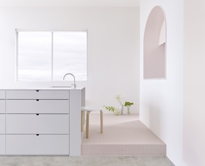
Footscray Apartment – BoardGrove Architects
Judging panel comment: To create a joyful apartment renovation in Footscray, Melbourne, the palette was selected to compliment and soften the tones of the existing structure to add warmth and visual interest to the space. Aligning with sensibility by using very muted palettes, this witty and effective design is refreshing.
Single Residential Exterior
Winner
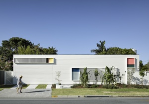
Burleigh Street House – ME
Judging panel comment: Rather than demolishing this building, the job at hand was to retain the existing bungalow and inject a new lease of life to the building. Whilst still reinforcing the historical precedent of the region, the architect has presented a livable colour scheme. This submission demonstrates the importance of why people should be inspired by and explore colour matching.
Multi Residential Interior
Winner
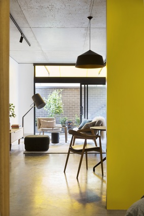
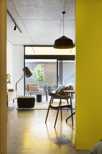
Coppin Street Apartments – Musk Architecture Studio
Judging panel comment: Dubbed the “Richmond six-pack” the Coppin Street apartments replaces a dilapidated single dwelling. Now home to six unique apartments, each uniquely personalised. We’re seeing a shift towards people changing colour palettes more regularly to align with fashion trends. The bright colours on the doors are a key focus in each apartment and offset the industrial material palette of the background. This submission pulls together its colour scheme in a refreshing way whilst ensuring all elements work well together.
Multi Residential Exterior
Winner
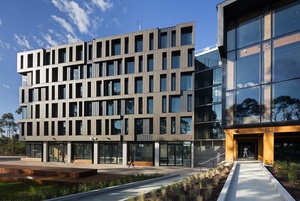
RMIT Bundoora West Student Accommodation – Richard Middleton Architects
Judging panel comment: A wonderful example of creativity, whereby the architect has utilised materials to create colour shading and has deployed the colour on differentiated textures to deliver two tones from just one hue. Situated within an aboriginal heritage site, amongst ancient red gums, the bronze exterior colour works to create texture and lustre in certain light conditions, complementing its environment.

