With the grain: Tairua Insitu House

Click to enlarge
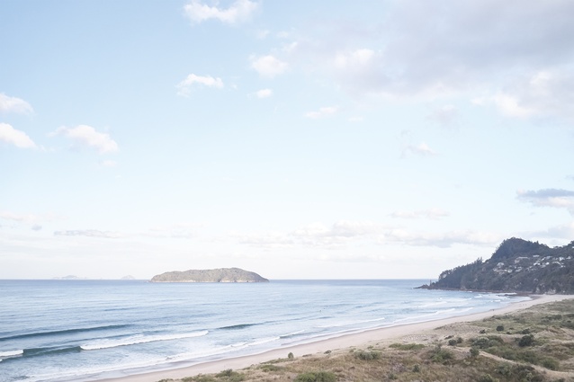
A picturesque beachscape washes into the lounge, cloaking it in a dreamy haze of seashore beige and sand-binding grasses.

A picturesque beachscape washes into the lounge, cloaking it in a dreamy haze of seashore beige and sand-binding grasses. Image: Matt Quérée

1 of 12
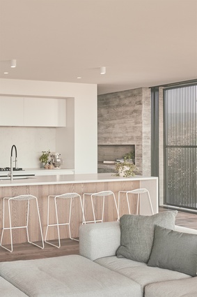
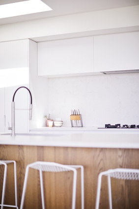
The kitchen, designed to be both fresh and light, was manufactured by <a 
href="https://www.neodesign.co.nz/"style="color:#2250e5"target="_blank"><u>Neo Design</u></a>. <a 
href="https://simonjames.co.nz/anotherproject/pedro-stool"style="color:#2250e5"target="_blank"><u>Pedro stools</u></a>, designed by AnotherProject and from Simon James, line the breakfast bar.

The kitchen, designed to be both fresh and light, was manufactured by Neo Design. Pedro stools, designed by AnotherProject and from Simon James, line the breakfast bar. Image: Matt Quérée

2 of 12
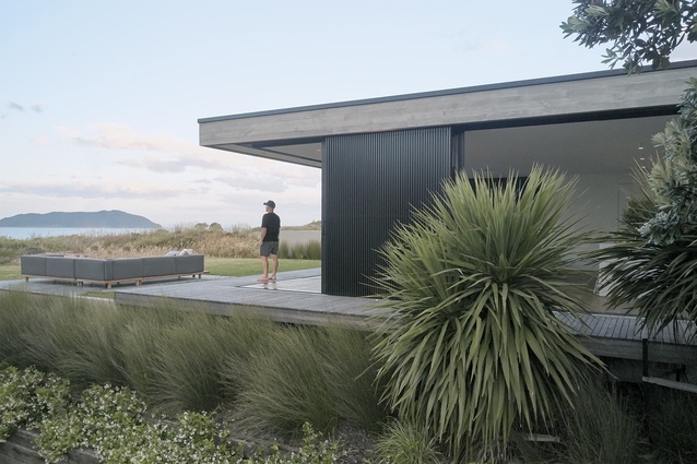
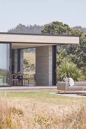
The living area is spread across the full width of the building to utilise the site’s connection with a dune reserve.

The living area is spread across the full width of the building to utilise the site’s connection with a dune reserve. Image: Matt Quérée

3 of 12
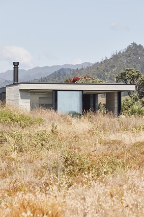
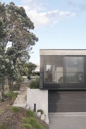
The home relates and connects to its environment, not only through its layout but also through its distinct material palette.

The home relates and connects to its environment, not only through its layout but also through its distinct material palette. Image: Matt Quérée

4 of 12
The client's didn’t want a home that presided over its surroundings, the architect says of creating a design that blended into the surrounds.

The client’s didn’t want a home that presided over its surroundings, the architect says of creating a design that blended into the surrounds. Image: Matt Quérée

5 of 12
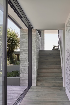
Inside, expansive white walls tone down dark porcelain panels and a swathe of features donning exposed concrete.

Inside, expansive white walls tone down dark porcelain panels and a swathe of features donning exposed concrete. Image: Matt Quérée

6 of 12
The home's three levels blur and blend, united by an exterior palette that anointed in-situ concrete.

The home’s three levels blur and blend, united by an exterior palette that anointed in-situ concrete. Image: Matt Quérée

7 of 12
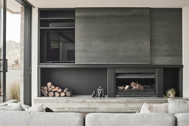
The dark and light spectrums of the neutral palette are juxtaposed throughout the interior.

The dark and light spectrums of the neutral palette are juxtaposed throughout the interior. Image: Matt Quérée

8 of 12
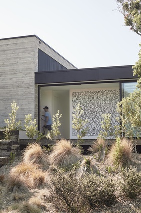
Part of the project’s magic lies in the juxtaposition of this rough-sawn grain, similar to that of wood planks, with a series of glazed and slatted sliding screens.

Part of the project’s magic lies in the juxtaposition of this rough-sawn grain, similar to that of wood planks, with a series of glazed and slatted sliding screens. Image: Matt Quérée

9 of 12
An <a 
href="https://simonjames.co.nz/simonjames/simon-james-arcade-sofa"style="color:#2250e5"target="_blank"><u>Arcade sofa</u></a> by Simon James and a <a 
href="https://simonjames.co.nz/massproductions/ferric"style="color:#2250e5"target="_blank"><u>Ferric table</u></a>, designed by Massproductions and from Simon James, take centre stage in the living and dining room.

An Arcade sofa by Simon James and a Ferric table, designed by Massproductions and from Simon James, take centre stage in the living and dining room. Image: Matt Quérée

10 of 12
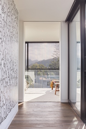
A mural by Andrew J. Steel, commissioned by the clients, brings edge to the main entrance wall.

A mural by Andrew J. Steel, commissioned by the clients, brings edge to the main entrance wall. Image: Matt Quérée

11 of 12
Mural artist Steel says the work “accentuated the features of the architecture – clean lines, minimalistic and modern.”

Mural artist Steel says the work “accentuated the features of the architecture – clean lines, minimalistic and modern.” Image: Matt Quérée

12 of 12

The Coromandel’s gritty persona marries smooth-cut family living in this neutral-hued home, designed by Neu Architecture.

Sand is fickle; it moves, adjusts. A house is more constant; there’s a groundedness to its bearing. How these two work together is not an art so much as a balance between opposites and elements.
The living area is spread across the full width of the building to utilise the site’s connection with a dune reserve. Image:  Matt Quérée

In Tairua, hugging a dune reserve on the Coromandel, Gavin Donaldson’s recently finished coastal project has this sense of equilibrium. A picturesque beachscape washes into the lounge, cloaking it in a dreamy haze of seashore beige and sand-binding grasses. The residence appears as if it’s content to fall into its environment, to flow with the site typography and its gentle slope upwards from the street, and connect to the beach. At a glance, the dunes and home are a perfect pairing: mutable and solid, and in touch with one another.

This was what Donaldson wanted to achieve from the start, three years ago. “It was important that the [structure] did not develop into a box-on-box form,” says the director of Neu Architecture, explaining that the clients, an active couple with twin boys, didn’t want a home that presided over its surroundings.

Instead, three levels blur and blend, united by an exterior palette that anointed in-situ concrete – “developed from the idea of [having] a pure form that was robust plus low maintenance” – as its material crown prince. It was a choice as much about creating a four-bedroomed home that could withstand the harsh conditions of a littoral area as it was about texture: to register, in a single finish, the coarseness of the dunes.

Part of the project’s magic lies in the juxtaposition of this rough-sawn grain, similar to that of wood planks, with a series of glazed and slatted sliding screens. Apart from providing privacy and shade, the screens, made of matte-black aluminium, have the elegance that comes with a technically difficult feature that doesn’t look technically difficult. Mechanics meet aesthetics, as well as some clever design solutions. Earthy raggedness – those irregular, uneven surfaces – is tempered simply by sheer proximity.
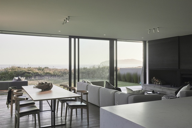
An Arcade sofa by Simon James and a Ferric table, designed by Massproductions and from Simon James, take centre stage in the living and dining room. Image:  Matt Quérée

White has a similar effect on the interior. Expansive walls in the achromatic colour tone down dark porcelain panels and a swathe of features donning exposed concrete, from an internal stairwell to a rebated shelf, a dining room wall and a lounge fireplace. The kitchen, in this sense, softens even as it stands out for its polish (it is markedly sleek and almost entirely white) and its five-metre-long island that runs parallel to the beach.
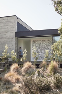
A mural by Andrew J. Steel, commissioned by the clients, brings edge to the main entrance wall. Image:  Matt Quérée

While the house is, in many respects, a set of quilted contrasts well-stitched together, it has one bold statement piece: a mural on the main entrance wall by Andrew J. Steel. “I was on site alone, brush in hand, ready to paint, and basically told to go for it,” says the Auckland-based artist and graffiti wunderkind, who possesses that rare kind of brush-to-canvas confidence.

The result is not just a work that “accentuated the features of the architecture – clean lines, minimalistic and modern,” he explains, “but a work that also allowed for subtle personalisation through including several Easter eggs.” Conceptually, it is distinctly Steel’s, filled with the charm of his signature world of cartoonish folks and anthropomorphised dogs, and covertly the home-owners’, with nods to them, Tairua and nearby Mount Paku.

For all of this, arty pop included, the home doesn’t veer away from being, foremost, a family home: one built with a living room intended to be as wide and elevated as possible for the views, and with what Donaldson calls “a floating outdoor sitting area” to reap them even more. It has nestled into this category as it has done into its environment. It has also settled into a lifestyle of comfort – and of salt.


More projects