Xero
It’s all about the people. An ethos instilled company-wide at Xero, the Wellington-headed global IT operation, a continual focus on staff is integral to the successful running of one of New Zealand’s top companies. It’s also the brief that Studio Pacific Architecture received to complete the central Wellington Xero headquarters.
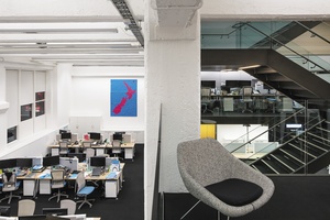
“The vision of the CEO [Rod Drury] is that Xero is a Wellington-centric company that supports its environment and opportunities,” says Stephen McDougall, architect for the project. “Xero exists to encourage innovation and excitement, and foster Kiwi ideas. All the brains are here in the global HQ, and essential is a space to celebrate that.”
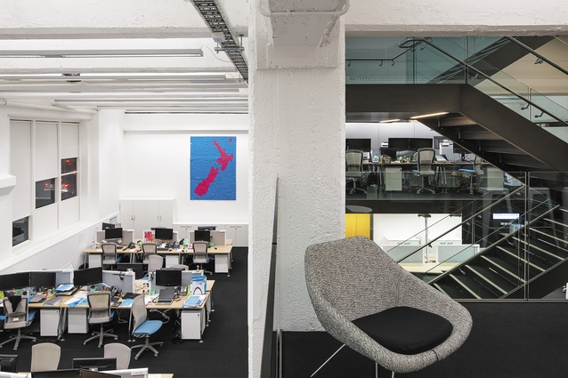
The 94-year old former John Chambers Building on Market Lane is now occupied by the aforementioned accountancy software company, save for two conjunct spaces. Three floors tall, the wedge-shaped 1918 edifice, now known as Xero House adds to a waterfront nucleus of powerhouses comprising Trade Me’s headquarters, NZX, Goldman Sachs JBWere, and Willis Bond.
As Xero House is a corporate hub of intellectual excellence, it was only just that it be tailored to allow for its people to work (and play) without restriction. Studio Pacific’s refurbishment of the space – originally an engineering workshop – preserves its architectural integrity. “The building is strong in itself; its concrete construction and ribbon windows give it grandness and scale,” says McDougall. “We endeavoured to work with the existing structure to create something that sits within, without interrupting the shell.”
The lobby entrance, formerly a truck dock, introduces Xero with simplicity: a logoed flat screen with Xero Blue call button and adjacent lift and stair, lined by timber flooring. Once access is granted to the front of house, on level two, the articulated Xero House interior is brought to light.
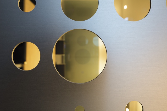
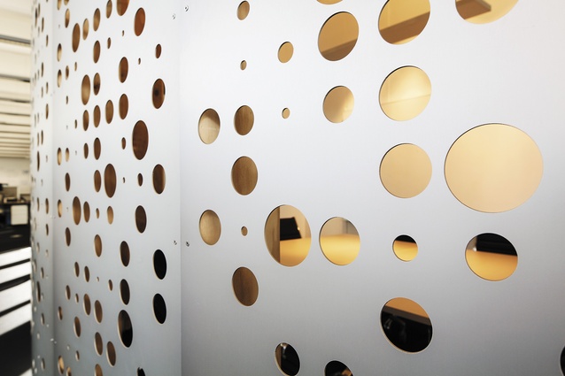
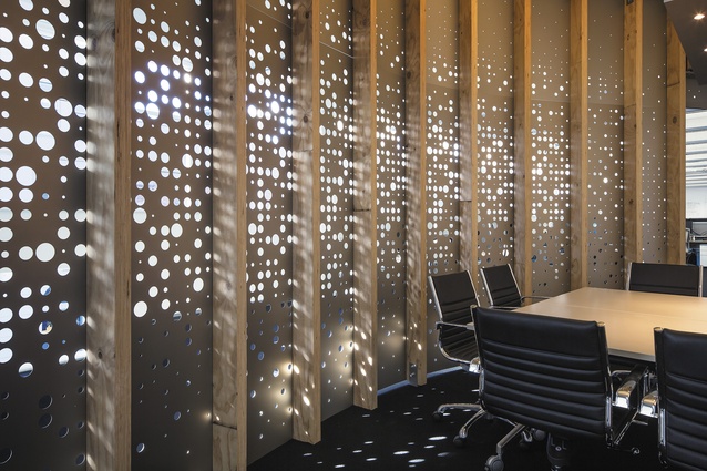
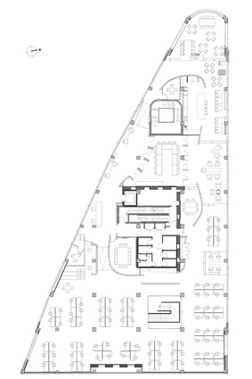
Focally situated in the centre of this main level is the aluminium screen, anchored to the floor by rough timber posts. This acts as an insert that delicately touches the building’s internal structure, but does not dramatically change or compete with it.
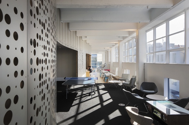
“The screen, perforated with ‘xeroes’ (the company’s signature circle shape), completely encapsulates the central meeting rooms, utilities and bathrooms,” says McDougall. The south-end workspace area looks to the building’s nose as the floor declines in three 300mm drops. Drawing the eye down the lining aluminium screen, this offers a ripple-like aesthetic towards and around the lounge and café area. “The screen acts as a unifying device which wraps around the meeting rooms, disguising them in order to let all other spaces flow,” McDougall explains, noting that the aluminium screen is replicated throughout the lower mezzanine and ground floors, which “ensures the business units each feel a part of each other, equalising the workplace”.

The existing concrete floor was retained in parts of Xero House, complemented by locally sourced timber flooring which extends throughout the joinery at front of house (western side) and in the east-side kitchen. “This brings warmth and character to neutralise the cool, white-painted concrete walls,” says McDougall. “A dull top coat, rather than a gloss, has been used for a ‘drier’ feel – almost like more of an outside space.”
The central boardroom, which is contained by echo panels to reduce acoustics, utilises the internal building structure. “The walls are simply gib and concrete; we haven’t tried to dress them up,” says McDougall.
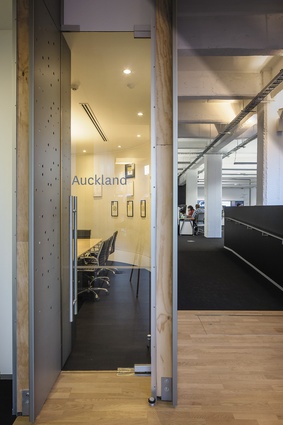
Spread throughout the floors are smaller glassed-in meeting rooms, each named after one of Xero’s other offices – from Auckland to Atlanta. Adjacent to the reception area, a ‘quiet room’ is raised 1,500mm upon timber bleachers, “adding to the height and depth of the whole area”, says McDougall.
The off-centre stairwell, which adds to the unification of the business units, further links the staff together. “Like the break-out spaces, the stairs are also to be used as a meeting space,” adds McDougall.
Metal chairs and stools scatter the café area, located in the building’s rounded nose. These complement other selected chairs in mid-century modern styling, which are all covered in pared-down, natural fabrics. “The seating is all rounded and fine, not square – so it works with the aluminium, not against it.” To allow for the screen to be the primary standout feature of Xero’s interior, colour was seldom used, “except for a chair here and there in Xero Blue”, McDougall confirms. Facing north, this quarter gets the best sun, so it was important that it be used as a space for Xero’s 180 staff, rather than for visitors.
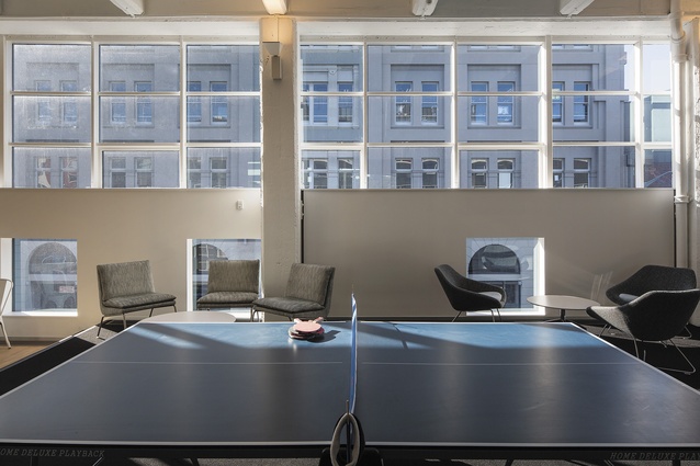
Amongst smaller circular tables, a white Formica leaner bench is prominent. “The leaner is Rod [Drury]’s workspace,” says McDougall, referring to Xero’s founder and CEO. “He doesn’t have an office.” The adjacent coffee bar flanks the Formica and timber kitchen, which is cut into the aluminium screen and overlooks lunch benches, the table-tennis and foosball tables, and a stand-alone video-game machine.
“Social interaction is the engine of innovation,” McDougall emphasises. “So Xero House isn’t an opulent or slick space; it provides personality and warmth so everyone feels at ease and can work together in encouraging surroundings.”

