
Aviation Institute
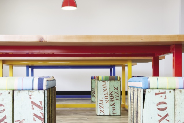
Colourful seating on referencing a classic New Zealand soft drink – Foxton Fizz.
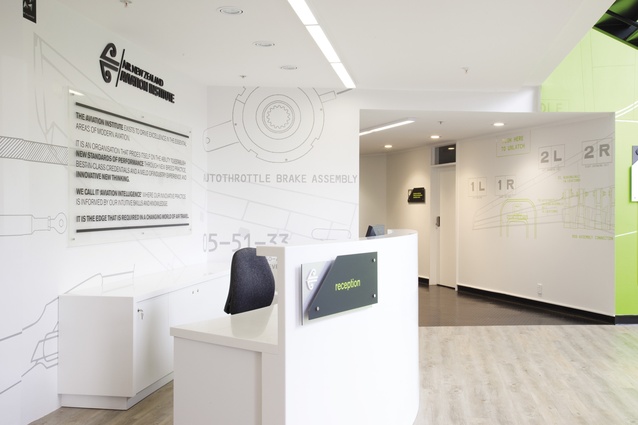
The facility’s reception with graphics drawn from training manuals.
Circulation areas and a glimpse at a large inhouse training tool – a flight simulators, one of eight at the complex.
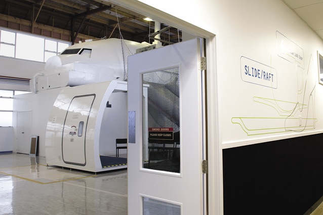
Circulation areas and a glimpse at a large inhouse training tool – a flight simulators, one of eight at the complex.
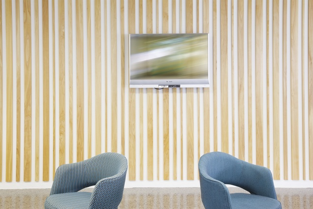
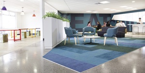
Breakout areas demonstrate a burst of colour and texture in comparison with the more utilitarian training rooms.
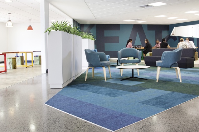
Breakout areas demonstrate a burst of colour and texture in comparison with the more utilitarian training rooms.

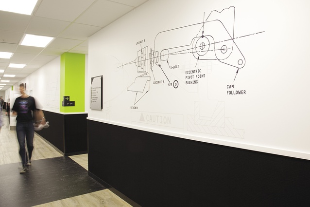
A graphic detail.
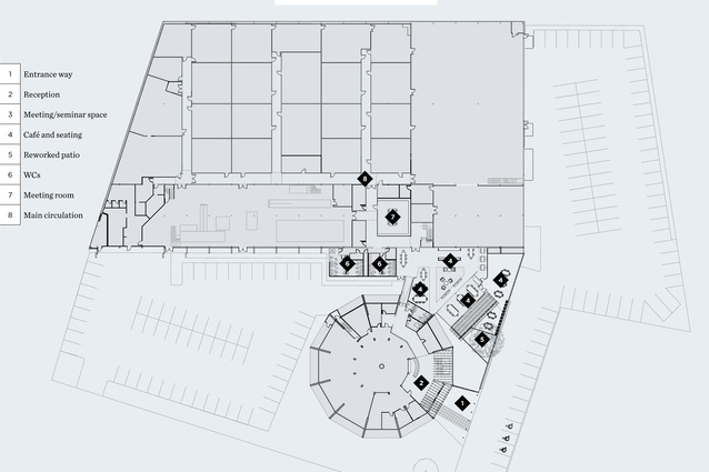
Floor plan.
Air New Zealand’s training facility is modernised and improved to be on song with the national carrier’s front end.
Rob Fyfe may be going, but his legacy lives on, represented by the use of quality design differentiating Air New Zealand from its competitors. That focus on design has seeped right through to the roots of the business. The Aviation Institute, for instance, Air New Zealand’s rebranded training academy, was last year upgraded by Stack. This refurbished facility is, as they say, “on message” – designed to be a tight fit with the carrier’s public face.
In a fashion, upgrades at the Aviation Institute reference the aesthetic cues experienced at Air New Zealand’s airport environments, says David Morgan, head designer at Stack. “This was achieved through the use of similar materials, finishes and furnishings found in those environments. The design also incorporates a high degree of environmental graphics that reference both the classroom environment and the Air New Zealand customer experience.”
Stack’s ambit on this project included a reworking of the main entry, the primary circulation from entry to café and lecture rooms, the student and staff cafés, and the main auditorium and external courtyard. The refurbishment, says Morgan, was focused on design cohesion – supporting and expressing the new brand within the built environment.
“It was also a good opportunity to address shortcomings both internally and externally with how the spaces impacted on the ability of students and teaching staff to better use the campus,” he says. “A key driver was for Air New Zealand to provide an environment which engendered more of a modern campus-style aesthetic, rather than the bland 1980s’ industrial back room feel it had come to embody. It needed some life!”
Life, in terms of numbers, was something the institute didn’t lack. More than 400 people pass through the facility each day, including ground crew, cabin crew, engineers and flight crew. To expedite progress throughout the building, Stack made some modifications, removing two toilets directly off the main reception’s entry lobby (the dodecagon-shaped structure, see plan) to increase the width of the primary circulation route between the entry and student café. Walls that previously separated the student cafée from primary circulation were removed also, to allow the creation of a new lounge area.
New finishes include wood-look flooring to main entry and corridors outside classrooms, with black marmoleum details inserted at junctions to complement wayfinding graphics. Both were selected for visual warmth and durability. Carpet tiles and polished concrete were used on the floors of the student café, both chosen to introduce a reference to the colourways found in terminal environments. Similarly, macrocarpa wall panels also reference some of the detailing and materials found at Air New Zealand’s Premium Check-In. At lower levels on main corridor walls outside classrooms, carpet tiles were positioned to break up the long expanses of the circulation space and to provide sound absorption and protect the walls in high traffic areas.
“The end result,” says Morgan, “has been an environment that supports the new brand and also provides a series of greatly improved communal spaces, which not only reflects aspects of the Air New Zealand customer experience, but offers a place where the student experience is enhanced.”


