Colour Collab: Charlotte Minty
In this colour collaboration with Resene, this Wellington-based interior designer discusses the colours of her childhood and how they still hold a place in her imagination.
This colour selection was inspired by a house your dad built in the 1970s. Tell us a little about the colours of your childhood.
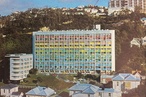
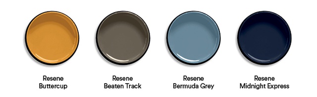
Charlotte Minty (CM): You always remember the colour of your childhood house because, often, this is the defining feature of when you were young. In my case, our house’s exterior cladding was in Burgundy, accompanied by the corrugated iron roof in Coffee and finished with the front door in Buttercup. All of these colours were, at the time, from the first and only Resene chart BS 2660:101 colour range.
Inside, the open structure and central staircase were in exposed timber. Cork flooring and hessian ceiling panels were also part of the palette and were offset by pure-white walls and shots of colour throughout – interior doors in Buttercup and Red Berry, and the cosy snug by the dining room in Midnight. My fondest memory is of my bedroom’s bifold shutters, which overlooked the double-height dining space below. This was painted in Bermuda Grey, which Dad finished with crisp white clouds.
How did that house influence your current profession?

CM: The fact my father designed and built the house, and my mother was in charge of the interiors, did not go unnoticed, even when I was at an early age. It was always part of my life growing up and now it is my professional life. While I haven’t used the same bold colours, the Resene BS 2660:101 is my favourite colour chart and I refer to it often. Whether it was influenced by seeing Mum and Dad looking over it, or being used in the home I grew up in, one can only wonder.
Tell us how you go about colour selection and whether or not you try to influence your clients in a particular direction when it comes to colour.
CM: There is usually a jumping-off point in the project; whether it is the existing architecture, the surroundings, an intended part of the new design or an existing item, something will spark the selection. Recently, on an extensive villa project in Wellington, most of the interior colours came from a contemporary rug the clients owned.
I encourage my clients to look at colour as part of the whole package and to create a cohesive visual ambience. This usually starts with an underlying neutral palette, which is then layered with stronger, muted colours. This tends to result in calm, harmonious spaces.
Your Herd Street office recently received the Resene Total Colour Awards – Winner Neutrals. Tell us about how you selected those colours and why you think the palette impressed the jury panel.
CM: I worked alongside my architect sister Amelia Minty and the brief for the Herd Street office was to create a versatile, modern office free of the traditional trappings of corporate life. To incorporate the comforts of home, the kitchen was made a centrepiece of the design. Its location took advantage of the natural light and the prevailing views of the neighbouring marina. Like any household kitchen, this one was to act as the focal point of the office. In order to satisfy the functionality element of the brief, a large ‘box’ was inserted; it houses the utilities (i.e. bathrooms, meeting room, storage) and allows for the main open-plan space to be flexible in its use.
With the backdrop of a busy marina, the colour scheme was pared back to two simple-but-striking colours. Resene Ship Grey was used to provide emphasis to the inserted box. The kitchen formed a key feature of the box and also inherited the dark colour. This palette was applied again to the bathrooms to create a deep canvas to let the brass fixtures shine.
In contrast, the rest of the office is finished in classic Resene Black White to allow the box to stand out and the attention to be drawn to the unique maritime-inspired artefacts. The steel beams and concrete floor were both finished in Resene Uracryl clear. It seems the judges responded well to this scheme and felt that the chosen neutral colours helped to make the commercial space feel more domesticated and restful.
See more from the Resene Colour Collab series here.
ArchitectureNow works with a range of partners in the A&D supply sector to source appropriate content for the site. This article has been supported by Resene.