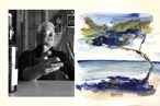
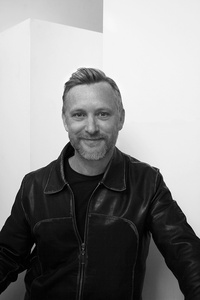
Colour Collab: Nick Eagles
In this Colour Collab with Resene, Nick Eagles – co-director of multidisciplinary design studio The Letter Q – discusses collaboration, turning transience into sculpture and the importance of colour.
The Letter Q produces work in graphic, print, installation (such as Pete Bossley’s 40 Years Drawn at Objectspace), spatial and even public art. What is the connecting thread?
Nick Eagles (NE): Many of my favourite projects show a theme that resurfaces while the media, material or context shifts. Trying to maintain originality and a unique perspective while these forces change can come from maintaining sketchbooks, exploring your obsessions and allowing those things to enter into the project. While technology might change the way we make things, the processes for finding the right concept are fairly timeless. Many influential creative thinkers essentially produce recipes or sets of instructions allowing for each work to be made in the most appropriate way by technical specialists. That appeals to me because it opens up opportunities for collaboration that reach beyond the scope of your own training and resources.
Your workplace also seems to be quite conducive to cross-disciplinary collaboration, right?
NE: Yes; much of my practice has taken place in studio environments that bring creatives and makers together under one roof. For example, now my studio sits alongside Finework, which is an architectural model-making workshop run by Minka Ip. If I want to test the viability of fabricating or colouring a material or design, I have expertise close by. We have sculptors, jewellers and artisans working in the building and I think that it makes for a lively and inspiring environment.
In 2019, you worked on the exhibition design for One Man’s Treasures at the Maritime Museum and it won the Resene Total Colour Award for Installation – Experiential – Product. How was colour decided on for that project?
NE: We wanted to transport people into the recesses of one of Auckland’s best-known and much-loved old shipping chandleries. The darker Resene wall colours provided a deep envelope where lighting could bring drama to discovered objects. Artefacts were made of brass, rope, leather and wood so the cooler maritime paint palette allowed the warmth of the material tones to occupy the foreground.
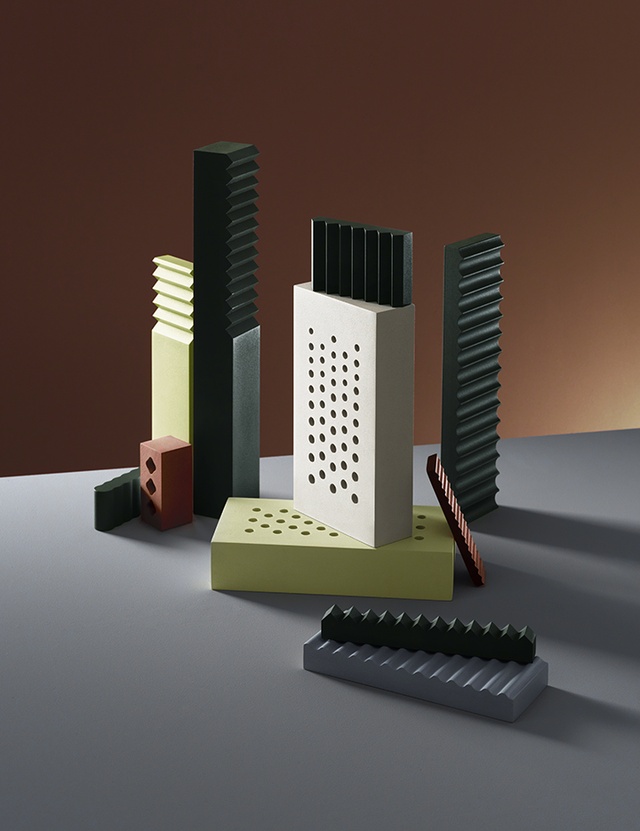
What was the impetus for the photo that’s been created for this collaboration? How did you come up with the shapes and the groupings of forms, etc.?
NE: I have been exploring many of these elements through a number of projects over the years. Perforations, for example, can bring the idea of a soundscape into play where the objects are arranged in an ensemble. Harmonic interactions between sounds have plenty in common with the ways in which colours interact. I’m often looking for ways to capture something transient in a motionless form. For example, here in Auckland we’re surrounded by volcanic rock where you see something fleeting and explosive literally set in stone: something leaving a trace and, in this, case the possibility of sound and light leaving an impression on the collection of forms.
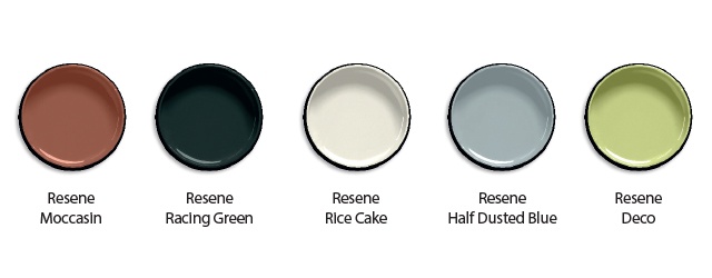
How were the colours selected and what were you hoping to accomplish colour wise?
NE: I wanted to see what would happen if some fairly elemental pigments were used to unify a family of related-yet-distinct forms. The tonal range of colours has allowed me to decide which shapes will recede and which will emerge from the surrounding colours. It’s like you’re looking for a way for the shapes to be comfortable with one another and the palette brings that necessary cohesion.
See more from the Resene Colour Collab series here.
ArchitectureNow works with a range of partners in the A&D supply sector to source appropriate content for the site. This article has been supported by Resene.