
Daring to be different in a post-Covid world
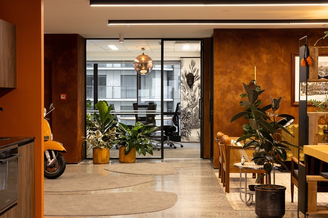
Porter’s rust-effect orange lends warmth throughout.

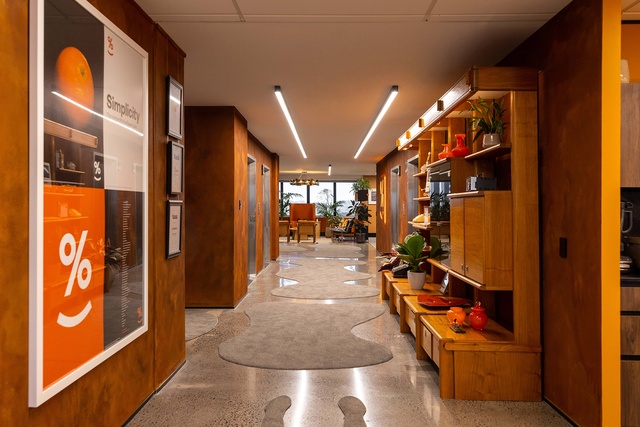
Shaped off-cuts are used in the entry space as a cost-saving initiative.
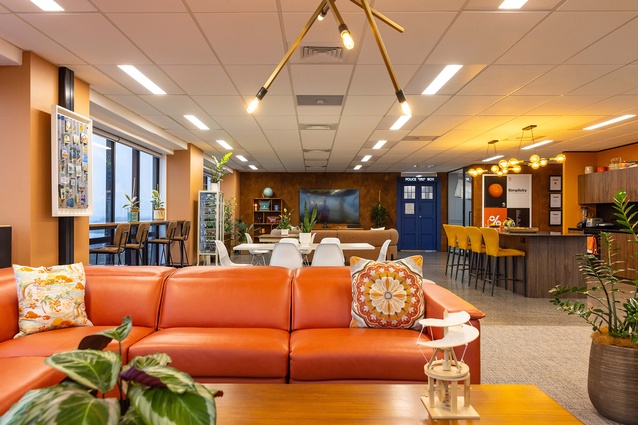
Much of the furniture used in this feel-good Simplicity fit-out is upcycled.
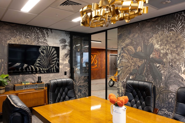
The board room is wallpapered in ‘Dreamlike Landscape’ by Casadeco from James Dunlop.
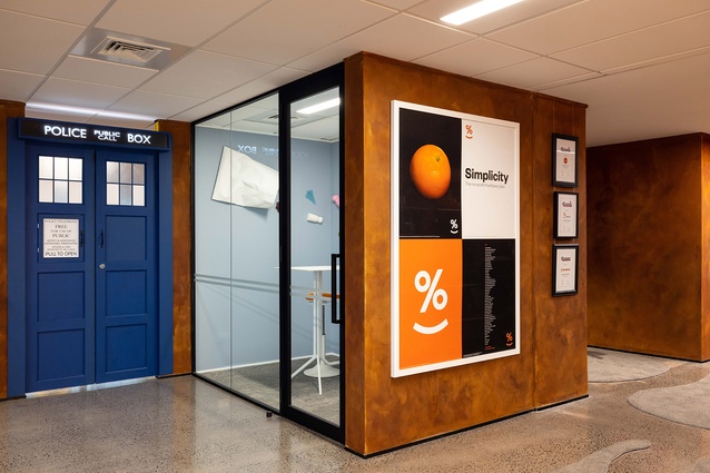
The tardis doors open to a playroom space.
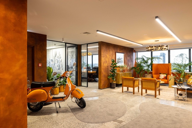
A Simplicity-orange Vespa adds to the retro feel of the space.
Non-profit financial organisation Simplicity invests its clients’ money while at the same time giving to community groups in need. We look at how this thoughtful approach to business translates into the organisation’s new working environment.
“The brief was to create an office environment that is the exact opposite of the usual office interior,” explains the project’s lead designer, Donna White of Donna White Interior Design. “We wanted to echo, from an interior design perspective, the company’s manifesto, which is all about doing it differently, turning things upside down and ensuring working with money makes smiles, not frowns.”
White says that Simplicity founder and managing director, Sam Stubbs, describes the ethos of the organisation as one in which people are more important that material goods, which led to her studio acquiring pre-loved furniture, where possible, rather than new for the fit-out. “We asked the employees what they would like in terms of fixtures and fittings,” says White, “which was significant, given the design process began immediately after the first extended Covid lockdown, so their thinking might have been influenced by spending so much time at home.”
One important stipulation within the brief was to create an interior that brought a smile to people’s faces as they stepped out of the lifts. The space also needed to be working-parent friendly, respectful of religious beliefs (there is a prayer and meditation room), include lounges for informal meetings and relaxation, have a ‘playroom’ with a table tennis table (where problem solving takes place) and a room for employees’ children to do their homework.
Entry into the playroom is through a bespoke replica of Doctor Who’s tardis. Continuing on the theme, the head of human resources is found behind a custom-made Doctor Who dalek. “The budget didn’t extend to runners to soften the entry’s polished concrete floor,” explains White, “so we drew organic shapes on leftover commercial-grade carpet and and finished with a concealed edge binding. These quirky touches all contribute to making people smile, and represent a client doing things differently.”
The client had acquired a range of memorabilia from the ’50s, ’60s and ’70s, which led to White embracing a ‘retro style’. “Most of the furniture and accessories have been pre-loved, which supports sustainability and a reduction in landfill. For example, the 1980’s boardroom table and chairs are a TradeMe purchase and we recycled older furniture, showing a real respect for well-made New Zealand furniture of the past. The company could in time, be recognised as the keeper of significant national collectables.”
Simplicity’s branding is orange but, rather than matching it explicitly, White commissioned Mandy Heasley to paint the entry and reception area in a Porter’s ‘rust-effect’ paint to meet the brief of ‘expect the unexpected’. Other colours were selected to either complement or contrast with the orange. The staff locker and meditation rooms are housed behind brick-red velvet curtains, in keeping with the rich, intense colours found throughout the space, “and in marked contrast to the usual subdued office interior,” says White.
Simplicity’s ‘unexpected’ interior is well appreciated, by both visitors and employees, who love their work environment, says White. “Pre-loved, upcycled, TradeMe and collectable shop purchases for office interiors should be adopted for future commercial interior design fit-outs, as the world is becoming more aware of waste,” says White.


