
Finding place: Te Āhuru
Environmental graphics inside the new AUT Te Āhuru recreation centre by the Jasmax Brand Design team.

Environmental graphics inside the new AUT Te Āhuru recreation centre by the Jasmax Brand Design team.
Environmental graphics inside the new AUT Te Āhuru recreation centre by the Jasmax Brand Design team.

Environmental graphics inside the new AUT Te Āhuru recreation centre by the Jasmax Brand Design team.
Environmental graphics inside the new AUT Te Āhuru recreation centre by the Jasmax Brand Design team.
Environmental graphics inside the new AUT Te Āhuru recreation centre by the Jasmax Brand Design team.
Environmental graphics inside the new AUT Te Āhuru recreation centre by the Jasmax Brand Design team.
Design Assembly speaks with Clem Devine and Jarrad Caine at Jasmax about their incredible environmental graphic work recently installed at AUT's Te Āhuru recreation centre. The graphic system is built upon MuirMcNeil‘s Intersect type system and richly layered patterns, that speak to place, culture and function with a lens on the future of play.
What was the brief for this project?
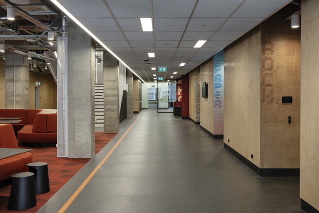
Jasmax Brand Design was introduced to the Te Āhuru (WQ) project by our architecture team when the building was in the final stages of construction. Within Te Āhuru are a series of carefully designed recreation areas for students that reflect the changing nature of play in a digital world. Brand Designs assignment was to name the different spaces and create a suite of supergraphic treatments that integrate into the architecture and create a sense of place for students and staff.
Who developed the strategy around the notion of exploring the future of play?
During the early design phases for the overall project, AUT and Jasmax architecture teams spoke to students about what they wanted in a recreation centre to inform the building brief. From that research it became obvious that what current and future generations students want from a rec-centre are changing.
Traditional assumptions of what student recreation building should be are shifting with the rise of gaming and the different (and unexpected) ways younger people engage and socialise with each other. The building itself has been designed to change over time and AUT wants students to make the spaces with Te Āhuru their own as youth culture changes and develops.
From a wayfinding and place-making perspective Brand Design explored and imagined how the future of recreation and play might be interpreted through space naming and supergraphics.
Tell us about the layered type (and grid) system you developed and deployed for this project?
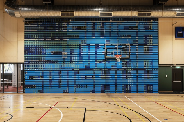
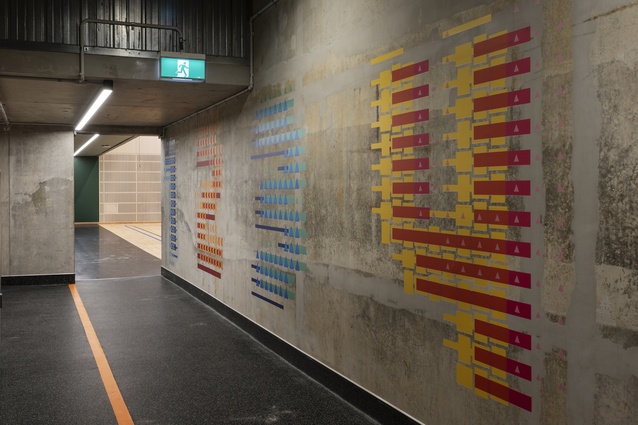
Good design is about creating systems and experimenting with them. The brief for the place-making supergraphics evolved into a framework that spoke to the changing nature of play. The typographic approach began with examining lettering which spoke to early digital culture and referenced the large gaming screen and LED scoreboard on the ball court.
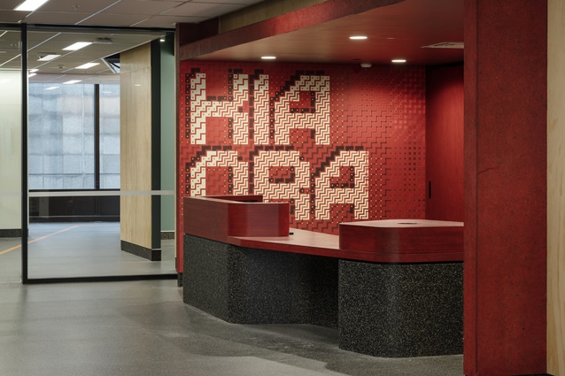
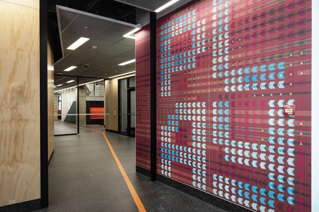
In consultation with the architecture and client team we settled on a suite of shaped motifs such as the poutama, triangle, chevron and tukutuku which led to abstract expressions that acknowledge Te Ao Maori and suggest weaving and carving. These are motifs Brand Design engage with regularly through our work in delivering integrated artworks for our clients in association with artists and the Jasmax Waka Māia group.
The next step was testing visual depth and drama. This was achieved by layering up the grid typeface adapted from MuirMcNeil‘s Intersect lettering. The intention was to create a highly visual pattern based language. Something where the word could be comprehended from afar but as you get closer to the graphic the pattern and detail reveals itself and captures the viewers focus.
What application did you use to build the typeface and test the layering?
The scale of the graphic treatments really called for a vector-based approach. We built everything in Illustrator so we could work at a 1:1 or 1:2 scale.

This mahi is vibrant! What drove the colour choices?
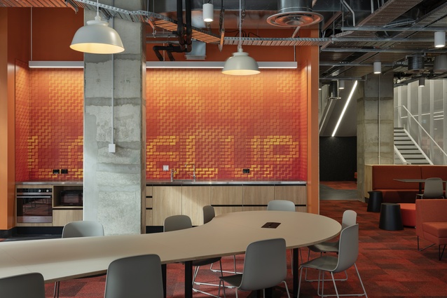
A few factors informed the colour. The first was the interior architecture palette. We considered what materials and colours were used in the different spaces, for example the podium level features a warmer palette the lower levels a cooler series of colours.
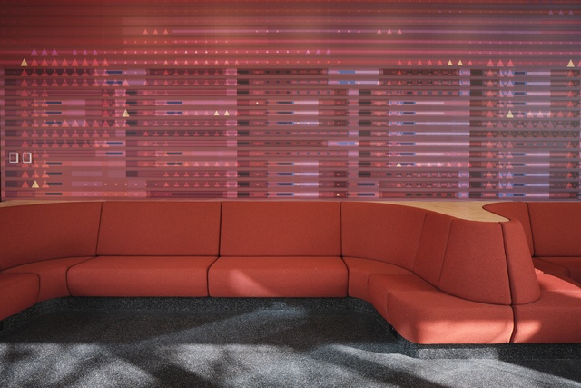
We also considered the use of the different spaces. For example areas that are livelier like the kitchen or that need to announce themselves like the reception are bolder or brighter, areas for relaxing like lounges are a lower contrast and more subtle.
With so many possibilities of pattern, weight, transparency and colour within the system how did you select and curate the final graphics for install?
We experimented and prototyped to find the right balance of colour and form. The colour transparency has been varied through software colour filters like burn, dodge, multiply and overlay – when these are layered up again and again the hues shift to create serendipitous moments. SWISH on the basketball court wall for example works with the tukutuku and chevron motifs in all three weights of the typeface using two colours. The challenge was working with colour and form to find the balance between order and chaos.
How was it produced and installed?
Global Signage installed the supergraphics. Everything was digital print on self-adhesive vinyl with a matte overlaminate. The install took about a week. The SWISH on the basketball court wall graphic took about nine hours. It was a real challenge to ensure all the patterns lined up.
What was the most challenging part of the project?
Knowing when to stop. It was easy to just keep going down the rabbit hole and moving bits of pattern back n forth up and down. A full day of work could be binned at the end of the day out of frustration. At about number six it became easier to determine when to stop but the first half were a challenge.
Which of the design outcomes are you most proud of and why?
Firstly, the narrative, From the building proposition we defined ‘An aspirational place for wellness and play’. The nomenclature developed for the various spaces and the graphics that express the narrative all holistically tie together to create a great user experience. That’s where the magic is. A strong conceptual idea.
Secondly, the harmony between the graphics and the architecture. By acknowledging and working with what’s happening spatially there is a harmonious balance. There are moments of liveliness and there are moments of relief.
How did Jasmax secure the AUT WQ Building Wayfinding & Graphics project?
Jasmax has a long association with AUT, with the practice completing a number of major projects for both the central and south Auckland campus’ including Mana Hauora, Sir Paul Reeves and Ngā Wai Hono. The Brand Design teamwork across a number of different practice groups within Jasmax and exist to identify opportunities within that project flow where our skillsets can enhance the built experience through visual communications, wayfinding, signage and place-making.

What was Jasmax internal peer review process for this project?
We are a highly collaborative practice and love learning from each other alongside discipline leads managing client assignments. Brand Design led the wayfinding and supergraphics on Te Āhuru with input from the Education team.
What user testing or external feedback shaped the strategy and design outcomes for this project?
During the strategy phase Brand Design shared our early thinking with staff and students to ensure we were aligning to our brief set by the AUT project team.
This article first appeared on designassembly.org.nz and was republished with permission.


