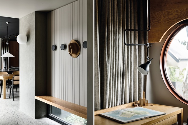
Hint of oak: Victorian alteration
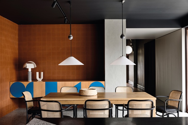
Abstract blue shapes are part of Kennedy Nolan’s aim to create an interior that is both dramatic and tranquil.
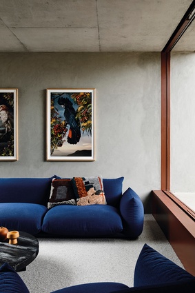
The lounge features an Arflex Marenco sofa from Poliform and artworks by Joseph McGlennon from his Eclectus Australis series.
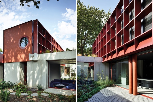
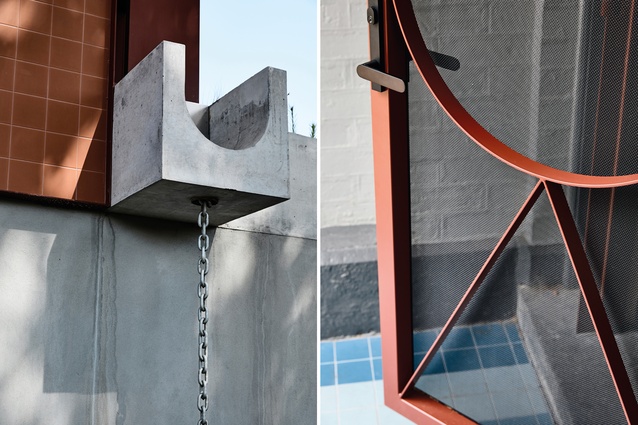
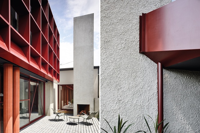
The addition of a brise soleil adds texture and visual interest while providing shading; a concrete roof form adds a raw, brutalist edge.
“The house has no shortage of northern light so we weren’t afraid of creating some darker spaces,” says designer Rachel Nolan.

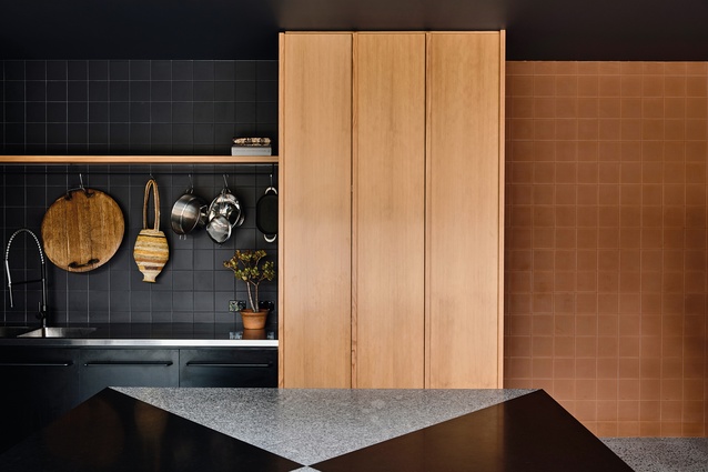
Terracotta tiles and steel in oxidised red bring a warm, earthy feel to the fore outside.
Aggregato Saliscendi pendants by Enzo Mari and Giancarlo Fassina for Artemide hang above the dining table, which is surrounded with Hoffmann chairs by Thonet.
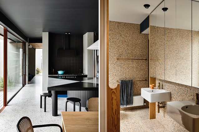
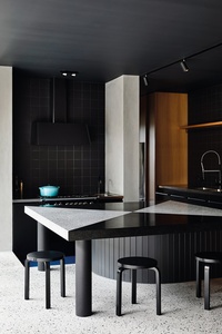
The kitchen bench is paired with Artek Stool 60 stools by Alvar Aalto; terrazzo is the life-force of the home’s bathrooms.
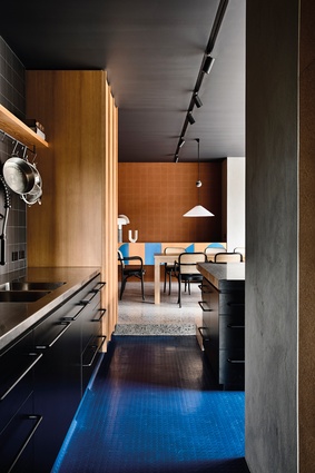
The absence of white in the kitchen has resulted in a hub that’s dark without feeling dull. This is ensured by a blue Pirelli floor.
Concrete and industrial accents sit as comfortable parts of the Victorian home.

The kitchen’s island bench was custom-designed by Kennedy Nolan for impact: to showcase graphic shapes rather than house amenities.
The exterior of the home, including an internal courtyard, finds material cohesion with the distinctive interior palette.
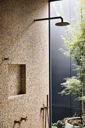
One of the home’s bathrooms includes a small garden.
A double-fronted, heritage Victorian house with a mature oak tree at its heart receives an alteration that injects plenty of joy and vibrancy.
“When we first spoke to the clients, we met in their kitchen – it was the heart of their home,” says Rachel Nolan, founding director of Melbourne-based firm Kennedy Nolan.
“The house itself was a typical double-fronted Victorian but it was all centralised around spending time in the kitchen. They’re very hospitable people so it was nice to start with an important space in the house: a space that was really going to be used.”
This idea of the centrality of the kitchen as a hub for family life structured the design of a new addition at the rear of the original Victorian – a two-storeyed volume that captures the rigorous space-planning and material invention that have come to characterise the practice’s work.
The front of the house retains the four-room arrangement typical of Victorian houses. “Whenever we can retain the original fabric, we do,” says Nolan. “There’s a kind of scale, a handsome quality, to a Victorian house that you need to address in the new build.”
Stepping through to the new volume, a kitchen and dining zone connects to a new courtyard to the north, accessed via large sliding panels. A delicate pattern of geometric lines traces across the doors’ surfaces, hinting at the geometries evident throughout the house.
It is in this courtyard that you encounter possibly the house’s most expressive design gesture – a striking, overscaled brise soleil in terracotta-coloured aluminium. While it’s certainly striking, its role in this house is about more than aesthetics. Facing north, it moderates summer sun, provides privacy and unifies the façade.
The family’s two living spaces bookend the courtyard. In the front section, one of the original Victorian rooms has been converted into a TV room while, at the rear, a new sunken lounge, a bunker-like concrete structure, gazes into the courtyard and out to the rear garden. “It sits a few steps down; it’s low, almost like you’re sitting in the site, almost at the level of the garden,” Nolan adds. Above, a planted roof will eventually cause greenery to cascade over the edges of the concrete walls.

Back inside, it is the kitchen that perhaps best exemplifies the practice’s masterful use of sometimes-unexpected materials. A generously scaled island bench, fashioned from two types of granite, sits atop a drum-like black unit. On one side, it accommodates informal dining and family interaction; on the other, a step down positions it at working height. “We didn’t want the island bench to house a sink or any amenity. Instead, it’s like two big, strong graphic shapes. We wanted it to have an almost civic scale,” says Nolan.
Rather than being hidden away, the appliances play a prominent role in the kitchen’s aesthetic. “It wasn’t a kitchen that needed everything to be hidden. They didn’t want to hide anything,” Nolan says. “We liked that you can see the oven from the door – it tells you that it’s pretty well set up for people who like to cook.”
Instead of stark white or neutrals, this kitchen celebrates texture and colour. Dark wall tiles contrast with Oregon joinery, concrete panels and, underfoot, an irreverent blue Pirelli floor. “We specified a lot of real, natural materials, where the colour is part of the material itself – like the terracotta wall tiles in the dining zone. Using these natural materials gives you a variety of textures and colours that are pretty tough,” says Nolan.

The light in this space is carefully modulated to create a sense of theatre. “The house has no shortage of northern light so we weren’t afraid of creating some darker spaces,” Nolan adds. “There’s really no white in the house. Some of the graphic qualities come from experimenting with beautiful, bright block colours.”
The house’s bathrooms, too, evidence the practice’s commitment to squeezing the maximum value from the available space. On the ground floor, the room in the south-east corner of the Victorian volume was converted into a walk-in robe and en suite for the master bedroom. This en suite doubles as a powder room and guest bathroom when required.

It is a serene spot, with a warmth and texture uncommon in such spaces. “It’s a very pretty bathroom, with Oregon details, brass tapware and a terrazzo floor. Everything here has a gentle materiality – it’s quite pink and human. It’s warm and flattering,” Nolan explains. At the rear of the bathroom, a small pocket of greenery – “a breathable garden,” as Nolan describes it – brings light and air into the room.
Upstairs, a second bathroom sits alongside the stairwell, dividing the two children’s bedrooms located at the front and rear of the extension. Adjacent to the bathroom, a built-in day-bed provides a moment of respite, along with fulfilling the important job of Lego storage. “We talk about these spots as being perfect for the in-between seasons. It’s the kind of place where you’ll find the family cat,” Nolan says. To ensure cross-ventilation, the daybed is enclosed by painted shutters instead of windows. They can be opened just enough to pull the breeze through.
“We use spatial organisation to hide services. If it’s done right, you never notice it and that’s the point,” Nolan reflects. “It’s made so you can live your best life. There’s peace in these houses.”
This article first appeared in Urbis magazine.