
Houses Revisited: Core values
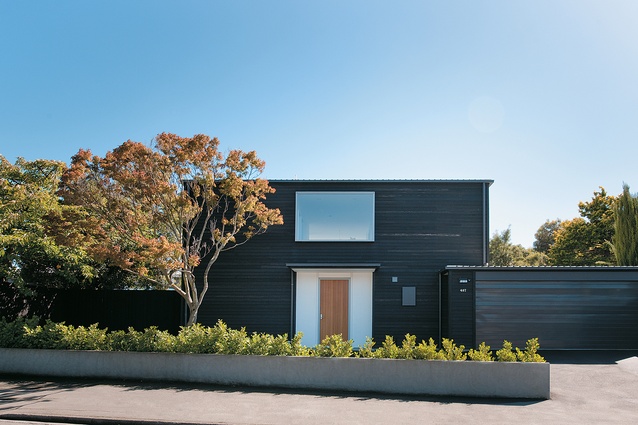
Sense of arrival – the formal entrance gives focus to the street elevation.
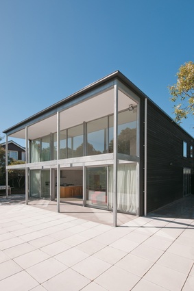
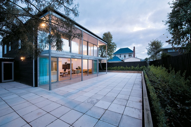
The rear (north) elevation of the Christchurch house designed for his son’s family by Guy Sellars.

Looking east along the north elevation and into the living and kitchen areas.
Looking west along the rear elevation, across the courtyard to some local context.
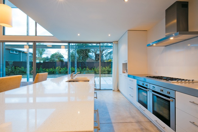
Looking out from the simple, modern kitchen into the courtyard at the rear of the house.
From the 2009 archives: The late Guy Sellars solved the planning puzzle in a two-faced Christchurch house for his son’s family.
There is something refreshing about talking with an architect with more than half a century of practice. Such experience with building generates a confident sense of context and space, which in turn makes for much more simple communication. All the archi-jargon that’s resorted to by younger architects trying to justify themselves and their designs doesn’t matter anymore. (After all, if you’ve lasted this long, you must be doing something right.) A building is pared down to what the spaces literally are, rather than what they metaphorically could be. The house designed by Guy Sellars for his son and family exemplifies this straightforward approach.

The brief asked for an average-sized three-bedroom house sited on a flat section in a Christchurch semi-urban suburb. At first glance, such a proposal seems simple, but smaller briefs, along with their smaller budgets, often become the most challenging projects. Smaller spaces require much more careful consideration: the design needs to include all the functional essentials within a confined space as well as some architectural excitement, which Sellars believed was one of the most essential elements in a successful smaller house.
Along with this inherent challenge, Sellars faced another hurdle. Having family members as clients, he sais, was much more difficult because, “a) you don’t get paid and b) they are super fussy”. The built design was not the first considered – several schemes were discussed before the final one emerged after much discussion between client and architect, with input from Guy Sellars’ other son, Richard, who is also an architect.
The final result is a statuesque cube (although the garage escapes this form). Rather than being explained by some long-winded story or history lesson, the form of the house is somewhat simply described by its architect as being derived from planning restrictions and programmatic requirements. The spatial planning of the house became a series of interlocking three-dimensional spaces, reminiscent of a wooden block puzzle. Although the final output is relatively simple, there is definitely a sense that the puzzle took some time to solve.
Approaching the house, you encounter the bold dark-stained-cedar façade, which is only broken by the centred and recessed front door and the window directly above it. The success of this facial treatment is that the common eyesore of a street frontage, the garage door, blends seamlessly into the façade and, as with the older styles of houses surrounding this building, the formal entrance, once again, becomes the focal point. The lightness of the recessed front entrance also gives a clue to the type of space inside, although it is still a surprise to be confronted with an abundance of white and light upon entry to the house.
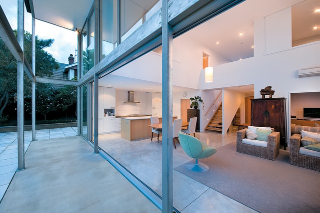
Once inside, you are immediately drawn through to the back of the house by the opposing northern façade, which is double height and entirely glazed. Entering this space you quickly realise that this is the architect’s moment of architectural excitement, the element that makes the house successful.
This area, with its polished concrete floors and stark white walls, has drama; comprising nearly half the house, the space is what all the other rooms and elements revolve around – they either come off the space or open out onto it. The primary function is living/dining/kitchen; as the entire room, apart from the kitchen, is double height and as it all lies against the glazed northern façade, it has air and light, and plenty of them.
The outlook to the north is unexceptional, neither bleak nor exciting – after all, you are in middle-class Christchurch suburbia. Outside, nearly all of the section is covered in concrete tiles, as the house was intended to be as maintenance-free as possible. The glassy rear façade is entirely different to the closed street face, and as in the interior, Guy Sellers explained, all major design decisions followed from an organizing principle. The use of extensive glazing on the north façade led to the design of the extended eave, which in turn prompted the employment of the slender galvanized steel frame.

Back inside the house, tucked into the south-west corner directly off the core space, is a second lounge or study space. A standard height room, in contrast to the dramatic space beside it, this space feels comfortable and cozy. It’s a space that can become a haven, when being on show becomes a bit much. The open-riser timber stairs that seemed a little awkward in going against the grain upon entry, now seamlessly link the main space to the first floor, smoothing the transition from the dramatic open space below to the warmer, tighter spaces above.
Three bedrooms fit neatly into the first floor with the minimal corridors being testament to the success of the planning. Again, occupants are confronted by the drama of the core space, as two of the bedrooms (one of which is the master bedroom) and the corridor open out on to the double height living space below. The vertical spatial flow thus created makes use of the wonderful northern light and confirms the impression that this house is a neatly solved puzzle. This project is really one big space; the tight and compact nature of the house, along with the strong and steady concentration on the focal space, is what makes it a success.
Click here to see more Houses Revisited.


