
Houses Revisited: Villa redux
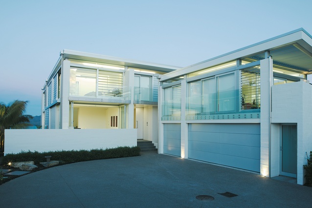
The house from the landward side.
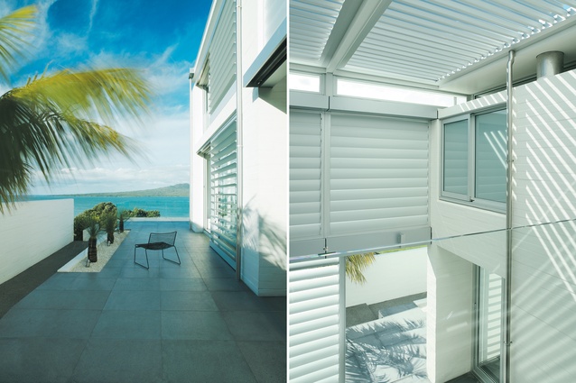
A quintessential Auckland prospect: the Gulf, and Rangitoto; the roofed courtyard that opens to the north.

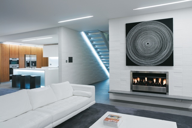
Living room and kitchen. The designers’ dextrous lighting treatment is evident on the stairway in the hall leading to the front entrance.
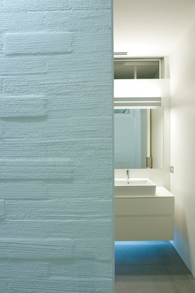
Inside, bricks laid offset and “finished with a sandy sideways sweep of plaster” lend the seaside house a beachy feel.
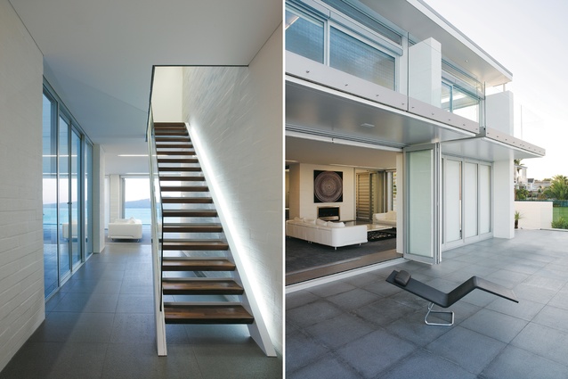
The stairway in the entry hall; looking into the living area from the terrace at the front of the house.
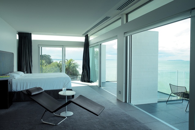
On the upper level the main bedroom gives out onto small terraces, and looks northeast across the Gulf to Rangitoto.
In this home that was originally published in 2007, Palladio, not Ponsonby, is the precedent for a Devonport house by Jane Priest and Vanillaspace.
This is one of Auckland’s slicker harbourside houses, cool as two ice cubes on a tray. I had feared it might be another of those grandiose piles that gracelessly clog the North Shore cliffsides, but no: it’s a nicely scaled and, at heart, a simple design. The house is in two parts: an apartment over garaging, and the separate two-storeyed house itself with a terrace that cantilevers out towards the blue waters of the Gulf. The house is essentially a flat roof hovering over a series of deep columns of plastered brick and large areas of cool glass screened by sliding banks of aluminium louvres.
From the front door you can see straight down the hall, through the skinny stairway and out to sea. Walking down the hall here, where you would expect a second room to be, you immediately come upon a kind of roofed courtyard like an atrium, opening to the north and a small pool. It’s rather like a villa, not so much those draughty Ponsonby boxes but rather their Palladian precedents in the Veneto – those grand but simple houses, open to the countryside and aligned with the vista.
Here, every room has some aspect of the view and, as with a villa, all the rooms seem interchangeable in use; they can be bedrooms or studies or little living areas. This is a rare thing today. One of the virtues of the villa is that we can swap rooms around seasonally or as family circumstances shift. This flexibility is one of our losses in the culture of contemporary custom-designed architecture. Who wants to live in the same room forever? Unless you have a great view, of course, and then, as in this house, the living area naturally occupies the seaward end of the building and upstairs the parents’ bedroom also claims prime frontage. But none of the living areas or bedrooms of this house are vast, and that’s a relief. The good things about this house are its sensible plan and the sophistication of its interior detailing.

It’s nice to see a house that isn’t just a big fat thing gobbling up the view. The grace of this house lies in its scale in relation to the neighbours and its plan; it is simple and well laid out. The house is a regular grid of rooms around a central corridor, but wherever you are in the place there are moments where the outside is brought in. Glimpses of sea and sky are offered through the atrium and other gaps, particularly upstairs where the roof floats off its columns on a strip of high glass around the perimeter. The ubiquitous aluminium louvre does a good job here where it is used in moderation to provide privacy and shade; in the atrium, though, there are rather more banks of the big blades stacked up than are really comfortable. The original design was by architect Jane Priest, although there have been some changes to her original vision in the execution of her design.
What I do like inside is the attention devoted to finishes, such as on the walls and ceiling. The inside of today’s house is normally an endless sea of seamless plasterboard, but this house has a texture and sensitivity to light. The exterior walls and the central spinal interior wall of the stairwell are bagged brick, the bricks laid slightly offset and finished with a sandy sideways sweep of plaster. This gives the place a nice beachy feel; the house responds with subtle, tidal shifts in light to the path of the sun through the day, and the warmth of the bagged brick texture contrasts nicely with the cool green of glass.
The lighting demonstrates the same sensitivity. Usually, a ceiling is the last place you’d want on your mind but there is a Zen calm to the one here, the lighting being corralled into long slots rather than the hundred choppy pools of downlight that we usually live in. These slots are often placed along the junction of ceiling and wall and appear like little skylights, as if cracking the lids of the rooms open. The kitchen units have the same built-in strips of concealed luminaires which make them appear to float in space. Its even better upstairs where a slight step in the ceiling washes light across the bedroom ceilings leaving a cool square of shade over the bed like a calming canopy. There is a generous, natural grace to Vanillaspace’s lighting and other detailing – doors on pivots with custom-folded steel handles, for example, rather than the usual squeak of hinges and levers. The extensive use of walnut veneer joinery and flamed finish stone floor tiles give the house a natural warmth; it is simple, but not stark.
The house is built on an old gun emplacement still visible down in the basement. This space is chocker with the technology that runs the house: air conditioning and a home automation system. I wonder sometimes about the faith placed in technology to hold our lives together when a more sensitive approach to the realities of acres of glass and the well-known effects of the sun might result in a more relaxed and symbiotic relationship between house and world. This house does have the combination of overhangs, movable screens and thermal mass of concrete to moderate sunlight and temperature, and stay cool passively during the day, storing warmth for release at night. The high-tech life support system is undeniably comfortable, but a little at odds with the natural character of the place.
The house occupies a spectacular site and certainly it is a slick and sophisticated response, but concept and finishing of the design have not sought to aggrandise its situation. Rather, the designers have responded in an understated way with a simplicity of approach to the plan and a subtlety of detail, exploring, for example, the effects of light. These are the old-fashioned things that make a house a good home, rather than just great real estate.
Click here to see more Houses Revisited. And sign up to our email newsletters to receive Houses Revisited straight to your inbox.
Note: These are stories from our archives and, since the time of writing, some details may have changed including names, personnel of specific firms, registration status, etc.


